Neutral Sans Workhorse

Hippie in Love + Olline
Lets Hippie in Love own the focal silhouette while handling secondary copy, sizing and subheads cleanly.
Inspect Olline specimenDisclosure: MakerFileHub may earn a commission from qualifying purchases via paid links on this page. How our links work.
1970s groovy bell-bottom display with matched Extruded font
Hippie in Love is a chunky 1970s retro display family bundled with a dedicated Extruded shadow font for instant 3D poster lettering.
Paid link
Get this fontProject & layout blueprintsAt-a-glance maker compatibility
Cut solid base, outline, and shadow layers in separate vinyl colors and align on registration marks.
Visual anatomy & craft review
Hippie in Love is a nineteen-seventies bell-bottom display with a matched extruded cut: soft flared stems, a rounded shoulder, a small kick at the foot and a second shape that sits behind the letter as a solid extruded depth. The extrude is fixed to the skeleton, so the two cuts must keep the same spacing. It needs roughly 28 mm for the flare and the extrude edge to read, and it is best in two warm inks on cream, or one ink with the extrude left as bare paper on coloured card.
Groovy · Extruded · Nostalgic
Two-font hierarchy recipes
Tested contrast partners — pairing Hippie in Love with grounded secondary typography.
Hippie in Love + Olline
Lets Hippie in Love own the focal silhouette while handling secondary copy, sizing and subheads cleanly.
Inspect Olline specimen
Hippie in Love + Orvelia
Grounds bold display lettering with classic typographic authority on posters, badges and apparel.
Inspect Orvelia specimenPractical applications
Concrete hierarchy, scale and production guidance tailored to Hippie in Love’s stroke geometry.
A bell-bottom display with an extruded cut gives a February card a seventies softness rather than a printed heart. The extrude adds depth at 26 mm, and two warm inks print the card and the sleeve from one file.
Hierarchy & layout recipe
Card A6, word 26 mm with 8 mm extrude clearance, note 8/11 pt, 12 mm margins. Sleeve 160 x 80 mm, word 20 mm, 8 mm margins. Sticker 60 mm round, word 12 mm, 4 mm die margin.
Pre-production check
A 60 mm round sticker at 12 mm collapses the extrude into the letter and the word prints as a flat bar. Raise the sticker word to 18 mm or use the plain cut, and print one sheet before the batch.
A seventies display suits a summer festival because the flared base reads as a hand-painted banner at distance. The extrude holds at 130 mm on a poster, and two warm inks print the poster and the menu from the same artwork.
Hierarchy & layout recipe
Poster A2, word 130 mm with 15 mm extrude clearance, details 36 mm, 20 mm margins. Menu 150 x 300 mm, header 44 mm, drinks 12 mm. Tote print 300 x 300 mm, word 70 mm, 25 mm margins.
Pre-production check
Screen printed on a tote at 70 mm the extruded edge bridges into the letter and the depth disappears after one wash. Use the flat cut on fabric, and wash one sample before the order.
A bell-bottom display reads as a hand-lettered sleeve rather than a modern logo, which is what a record shop wants on its bag. The extrude gives the name depth at 40 mm, and two inks print the bag and the sleeve in one order.
Hierarchy & layout recipe
Sleeve 300 x 300 mm, word 60 mm with 12 mm extrude clearance, 20 mm margins. Bag print 200 x 250 mm, word 40 mm, 15 mm margins. Card 85 x 55 mm, word 14 mm, 5 mm margins.
Pre-production check
On an 85 x 55 mm card the flare merges with the baseline and the name reads as a smudged rule. Keep the card word at 20 mm on a straight segment, and check one card before the run.
Technical & licence verification
Confirm included OTF/TTF/WOFF formats, full glyph tables and licence coverage on the live store page before batch production.
Closest visual alternatives
Matched across letterform anatomy, stroke behaviour and craft applications.
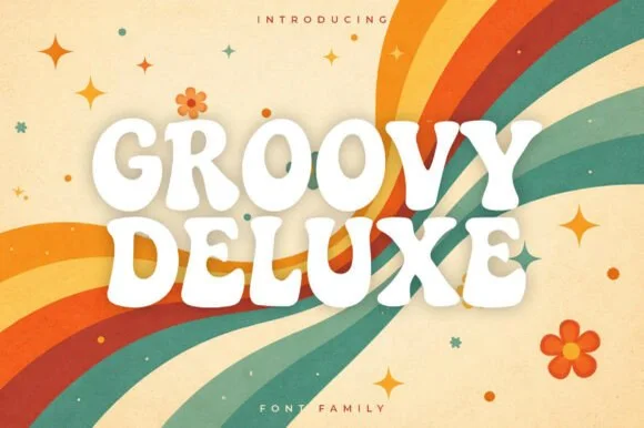
Soft groovy 1970s poster display family
Groovy Deluxe is a clean, upbeat 1970s retro display font family with softly pinched waists, plump rounded feet, and clear open counters.
Ideas for this font
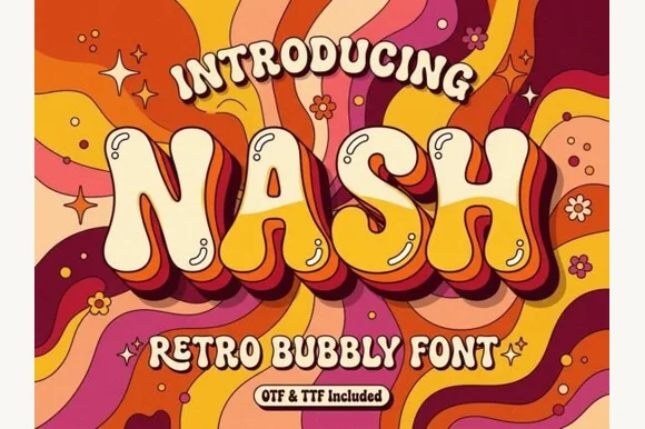
Groovy 1970s psychedelic lava-lamp bubble display (OTF & TTF)
Nash is a cheerful 1970s psychedelic bubble display font swelling bottom-heavy groovy curves for retro shirts, posters, and mugs (OTF & TTF).
Ideas for this font
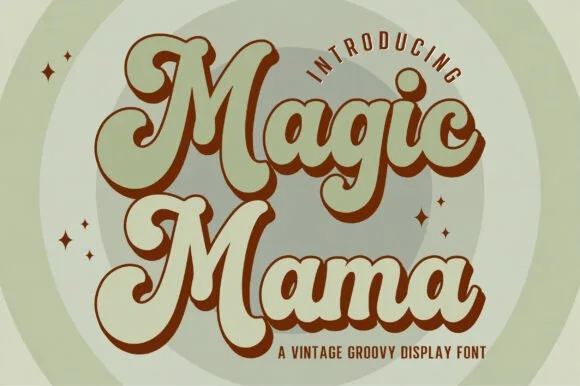
Vintage groovy display with offset shadow
Magic Mama is a vintage groovy display in pale green with a heavy brown offset: fat rounded letters that lean and bulge, a solid step of depth to the lower left, and a scatter of four-point sparkles around two concentric circles.
Ideas for this font
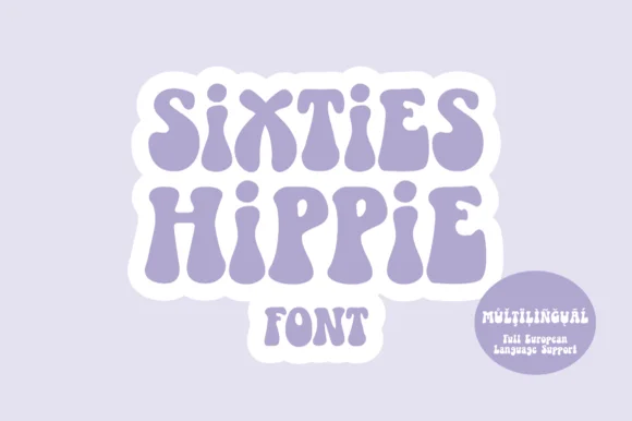
Heavy 1960s flower-power & Fillmore poster display
Sixties Hippie is a warm, bottom-heavy 1960s flower-power display font with pinched waists, plump teardrop feet, and full European multilingual support.
Ideas for this font
Allow optional Google Analytics to measure visits and catalogue actions. Your search words and notes are not included. Privacy & storage