 #1 · Best Overall
Disclosure: MakerFileHub may earn a commission from qualifying purchases via paid links on this page. How our links work.
Inflated balloon forms & glossy sticker lettering
30 Best Bubble & Puffy 3D Fonts
Bubble lettering comes from graffiti throw-ups, and the good versions keep that soft, inflated logic: convex outlines, tiny contact points between letters, and highlights drawn as part of the glyph. Bubble Gloss and Gum Drop Pop lean glossy, Mochi Soda and Sunday Bubble go soft and pillowy, and Chunky Plump and Kids 3D Outline Shadow supply the extruded versions.
Quick verdict
Bubble Gloss is the strongest glossy bubble for stickers, Mochi Soda handles the ultra-soft look, and Chunky Plump covers the extruded 3D case. Sunday Bubble works for a warm everyday bubble sans.
Quick answer
Top 3 bubble & puffy 3D lettering picks right now.
Short on time? Start with our three highest-rated bubble & puffy 3D lettering standouts before scrolling the full breakdown.
#1 · Best Overall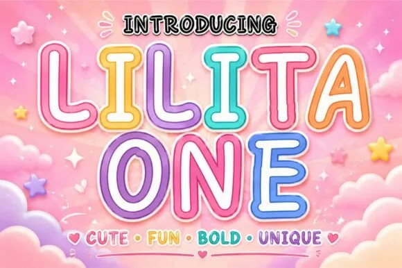 #2 · Runner-Up Pick
 #3 · Editor's Choice
How we tested & selected these 30 fonts
We kept 30 of 238 candidates with genuinely convex outlines and open counters. Judged on how an offset border follows the silhouette, how the shapes hold below 1.5 inches, and whether highlights are drawn rather than applied as a gradient.
Side-by-side summary
Top 5 bubble & puffy 3D lettering picks at a glance.
Compare specimens, OpenType/PUA traits and primary project roles side by side.
| Rank & Font | Style & File Specs | Best Project Fit | Store Listing |
|---|---|---|---|
| DisplayLanguage support | Pool-party sublimation tumbler & waterproof sticker pack | Get fontPaid link | |
| DisplayCandy-coated | Cotton-candy party banner, sweet-shop jar & kids' tumbler | Get fontPaid link | |
| DisplayStackable | Two-color layered HTV birthday tee & cake-topper badge | Get fontPaid link | |
| DisplayPUA encoded · File formats | Die-cut laptop sticker, planner cover & iced-latte cup | Get fontPaid link | |
| DisplayChubby | Boba-tea cup seal, lip-gloss tube & kawaii sticker pack | Get fontPaid link |
Display & Decorative Headlines
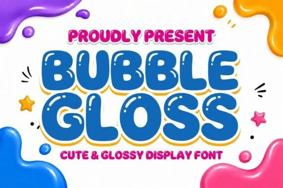
30 fonts#1 · Best OverallBubble Gloss
Bubble Gloss is a chunky cartoon bubble display typeface with built-in interior specular highlight cutouts that create an instant shiny 3D look.
Bubble Gloss is an inflated three-dimensional cartoon bubble display: fat rounded letters with a bright highlight running along the top of each stem, a deep inner shade at the bottom and a hard keyline around the whole shape. The highlight and the shade are the design and they merge into a flat fill when the face is reduced. It needs roughly 30 mm for the highlight and the keyline to read, and it is best as a three-colour flat print on coated stock, or two inks where the shade takes a darker tone of the fill.
Recommended project & layout
Pool-party sublimation tumbler & waterproof sticker pack — Fill stacked headlines in bright cyan, hot pink, or lime over a thick white sticker contour for Print-Then-Cut decals.
Before you cut or print
Prefer Print-Then-Cut, sublimation, or DTF over tiny cut vinyl—each letter contains small interior shine dots that require extra weeding.
Best paired with
Get fontPaid link
#2 · Runner-Up PickLilita One
Lilita One (by creativelabstd) is a plump, rounded display typeface shown with playful double candy-cane border styling and soft tubular terminals.
Lilita One is a rounded retro-candy display with both an outline and an inline cut: fat lozenge-shaped letters, a soft drop shadow, a thin white inner line and a glossy top highlight drawn into the stroke. The three layers share metrics, so they stack into one candy word, and the inner line closes first at small sizes. It needs roughly 30 mm for the inner line and the gloss to read, and it is best in two bright inks on white, or one ink plus bare-paper highlights on coloured card.
Recommended project & layout
Cotton-candy party banner, sweet-shop jar & kids' tumbler — Add a crisp white inner offset and pastel outer contour in Canva or Cricut Print-Then-Cut over cloud backgrounds.
Before you cut or print
Solid rounded letter cores cut fast and cleanly on HTV, permanent vinyl, and cardstock at 0.65 in+.
Best paired with
Get fontPaid link
#3 · Editor's ChoiceBubble Joy
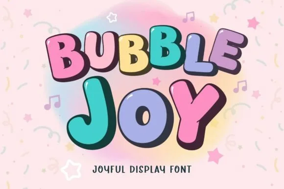
Bubble Joy is a two-style bouncy bubble family (Regular & Outline) engineered so solid fills and cartoon borders stack in exact registration.
Bubble Joy is a stackable two-style cartoon bubble duo in a regular and an outline cut: fat rounded letters drawn so a second line can stack tight beneath the first, with a thick keyline in the regular and a hollow face where only the outline prints in the second cut. The pair builds a two-colour stack without a separate shadow shape, which is how a children's headline is usually assembled by hand. The outline cut closes its counters first and needs more size than the regular, while the regular's keyline doubles the word's footprint on any panel. The regular needs roughly 28 mm and the outline 32 mm for their detail to read.
Recommended project & layout
Two-color layered HTV birthday tee & cake-topper badge — Duplicate your text box in the exact same coordinates: set the back/top border in Bubble Joy Outline and fill in Bubble Joy Regular.
Before you cut or print
For two-layer HTV, cut at 1.25 inches+ tall so the dark outline layer weeds cleanly without stretching out of alignment.
Best paired with
Get fontPaid link
 #4 · Top Maker Utility
Bubble Mood
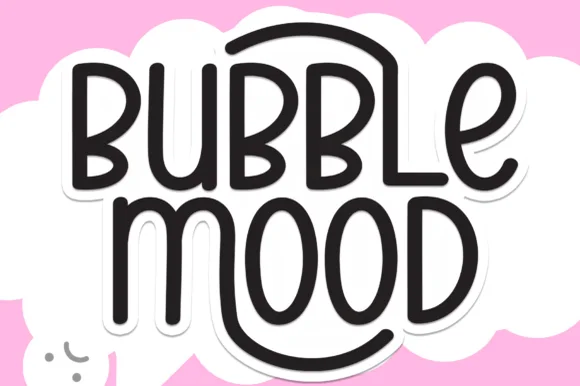
Bubble Mood is a tall, medium-weight rounded marker display font where curved outer stems wrap playfully around neighboring vowels.
Bubble Mood is a tall rounded monoline marker display with nesting arches: narrow upright letters drawn with an even round-tipped stroke, where each word sits under a shallow arch that nests inside the next line's arch. The arch grows the word vertically and the monoline keeps it honest at small sizes. It needs roughly 22 mm for the arch and the rounded end to read, and it is best in one bright ink on white, or a single dark colour on a pale board.
Recommended project & layout
Die-cut laptop sticker, planner cover & iced-latte cup — Stack two short words centered and add a 0.12 in white offset contour in Cricut Design Space for an instant die-cut sticker silhouette.
Before you cut or print
Clean medium-weight strokes and wide open 'O' and 'D' counters make adhesive vinyl weeding quick even at 0.75 in height.
Best paired with
Get fontPaid link
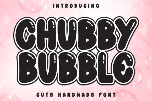 #5 · Standout Silhouette
Chubby Bubble
Chubby Bubble is a fat, rounded handmade bubble display font wrapped in a parallel outline ring and accented with interior shine marks.
Chubby Bubble is a sticker-outlined marshmallow display: fat pillow letters with a thick uniform outline, a small pair of shine slits on each form and a soft squeeze where two letters meet. The outline doubles the word's footprint and the shine slits are the finest element, closing first when the face shrinks. It needs roughly 30 mm for the slits and the outline to read, and it is best in two flat inks on white vinyl, or one bright ink plus a knocked-out outline on coloured card where the shape stays crisp.
Recommended project & layout
Boba-tea cup seal, lip-gloss tube & kawaii sticker pack — Stack 2 chubby uppercase words tight (0.88 leading) for maximum sticker-slap impact on thermal Munbyn/Rollo labels.
Before you cut or print
Shines on thermal label printers, Print-Then-Cut stickers, and DTF; avoid tiny blade-cut vinyl due to the thin outline and shine slits.
Best paired with
Get fontPaid link
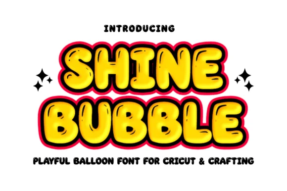 #6
Shine Bubble
Shine Bubble is a bright, balloon-round uppercase display font featuring thick cartoon outlines and glossy corner highlights.
Shine Bubble is a glossy comic-balloon display built for craft machines: fat rounded letters with a hard white shine highlight, a thick balloon outline and a cut-friendly silhouette that weeds cleanly from vinyl. The shine is the design and it fills when the face is reversed or cut small, and the outline is what makes the shape survive weeding. It needs roughly 26 mm for the shine and the outline to read, and it is best as a one-colour vinyl cut, or two flat inks where the shine is a knockout.
Recommended project & layout
Balloon-garland party sign, lemonade cup & goodie sticker — Layer bright yellow, cyan, or pink fills behind the dark comic outline+shine glyph for instant 2-color Print-Then-Cut stickers.
Before you cut or print
Use Print-Then-Cut or DTF for small multi-color stickers; on cut HTV, scale above 1.75 in or Contour out the small shine slits.
Best paired with
Get fontPaid link
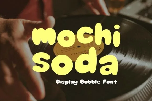 #7
Mochi Soda
Mochi Soda is a super-plump, marshmallow-soft rounded bubble font with squishy organic lowercase and plump circular i-dots.
Mochi Soda is an ultra-soft pillowy lowercase display built like a Japanese snack mascot: fully rounded letters with almost no straight edges, tight counters and a squash that makes each form look pressed. The soft forms close their counters at small sizes and the lowercase-only set limits how a word can start. It needs roughly 28 mm for the pillowy edge and the counter to read, and it is best in two soft inks on white, or one ink plus a paper highlight on a pale ground.
Recommended project & layout
Mochi/boba cup sleeve, plushie tag & lo-fi playlist cover — Set all-lowercase 2-word titles in buttercream, matcha green, or strawberry pink at tight 0.90 line spacing.
Before you cut or print
Pure single-layer solid shapes weed in seconds on puff HTV and cup vinyl; watch the tiny counters inside 'o/a' below 1 in.
Best paired with
Get fontPaid link
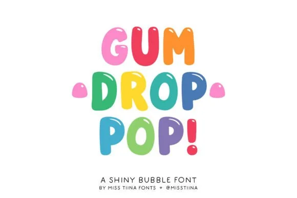 #8
Gum Drop Pop
Gum Drop Pop is a tall, bouncy candy-drop bubble font accented with tiny white shine highlights on every colorful character.
Gum Drop Pop is a glossy jellybean bubble display: fat oval letters, a highlight swoosh drawn inside the upper stroke and a soft second outline that gives the sweet a glassy coat. The highlight is bare paper rather than a lighter ink, so it disappears on tinted stock, and the fat ovals close their counters early. It needs roughly 30 mm for the highlight and the outline to read, and it is best in two bright inks on white, or one ink plus the knocked-out swoosh on coloured card.
Recommended project & layout
Candy-land birthday banner, treat-bag topper & sticker — Color each letter in alternating gumdrop hues (hot pink, tangerine, lime, sky blue, grape) stacked in 3 centered rows.
Before you cut or print
Ideal for Print-Then-Cut stickers and sublimation; if cutting solid HTV, Contour/fill the tiny shine dots first.
Best paired with
Get fontPaid link
 #9
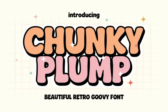
Chunky Plump
Chunky Plump is a bubbly retro-groovy display font wrapped in bold black comic outlines and extruded 3D drop shadows!
Chunky Plump is an inflated retro-groovy display with a groovy waist pinch, heavy black comic outlines and an extruded 3D drop shadow baked into the glyph, so a word reads as a screen-printed poster sticker rather than a flat letter. The extrusion always falls to one side, which fixes the light direction and means the word cannot be flipped without looking wrong. It needs roughly 32 mm for the extrusion to read as depth, and it is best in peach or pink with a black shadow on a pale grid ground.
Recommended project & layout
Retro sticker-shop logo, iced-coffee wrap & graphic tee — Stack 2 tight uppercase words at 68–130 pt so black 3D shadows lock into one cohesive retro badge.
Before you cut or print
Shines on Print-Then-Cut vinyl stickers, DTF tees, and sublimation wraps—or cut solid single-layer shapes on 0.8 in+ HTV!
Best paired with
Get fontPaid link
 #10
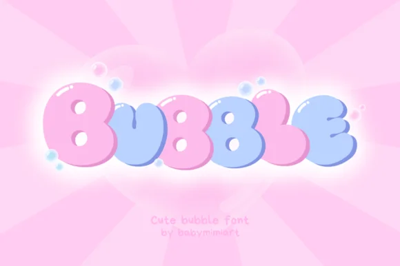
Bubble
Bubble (by Babymimiart) is an ultra-plump, pillow-inflated balloon font with tiny dot counters built for pastel cotton-candy baby and kawaii designs.
An ultra-plump inflatable display shown in pink to periwinkle gradients over glowing hearts: round cushion capitals crowd together so the word reads as a cluster of balloons rather than as a row of letters. The overlaps are the construction, which is why the face works as a single short word and fails in a long line, and the soft gradients give each letter its volume. Because the shapes are solid and the highlights are broad, the size floor is low, but the overlaps close first at small sizes. The hearts behind are staging. Uses are party, baby, kawaii and celebration work where a single joyful word carries the design.
Recommended project & layout
Gender-reveal banner ('PINK OR BLUE'), baby shower & onesie — Set 1 short word huge (72–140 pt) with tight -4 tracking so puffy edges kiss like a balloon arch.
Before you cut or print
Outer pillow curves cut cleanly on cardstock and puff HTV (weld if overlapping!); tiny pinhole 'B' counters favor 1.25 in+ scale.
Best paired with
Get fontPaid link
 #11
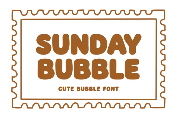
Sunday Bubble
Sunday Bubble is a warm, ultra-plump rounded bubble display font with soft cozy strokes and super-fast Cricut weeding.
A warm chubby bubble sans shown inside a scalloped postage-stamp border on crisp white: thick pillowy uppercase letters with tiny dot and slit counters, so the word reads as a friendly retro sign rather than as a rounded geometric. The small counters are the signature, and they are also what sets the size floor, since they close before anything else. The chubby weight is even, which is why the face holds on a box seal and cuts without welding. The stamp border and the caramel ground are staging. Uses are bakery and cafe packaging, stationery stamps, kids' apparel and party stickers where warmth is the point.
Recommended project & layout
Cookie-bakery box seal, iced-latte cup & stationery stamp — Stack 2 uppercase words centered at 56–105 pt inside a wavy postage-stamp border.
Before you cut or print
Ultra-smooth outer silhouettes weed in 5 seconds on Cricut Oracal 651 and puff HTV—watch tiny pinhole counters below 0.9 in!
Best paired with
Get fontPaid link
 #12
Bouncy Block Deluxe
Bouncy Block Deluxe is a thick, solid-filled bubble display font with pillowy rounded terminals, playful tilt, and tiny counter pinholes.
Bouncy Block Deluxe is a heavy rounded chunky bubble display: fat even-width letters with fully rounded corners, tight counters that almost close and a baseline that lifts a few letters so the word looks stacked and bouncing. It is a signage face, so it wants size and a single flat colour rather than fine detail. The counters are the finest element and they plug as soon as the face is reduced or cut in vinyl. It needs roughly 30 mm for the counter and the corner radius to read, and it is best as one flat ink on a light ground.
Recommended project & layout
Back-to-school tote, water-bottle sticker & kids' tee — Stack 2 or 3 short punchy words ('STAY COOL', 'DREAM BIG') at tight 0.88 line-height inside a contoured die-cut sticker shape.
Before you cut or print
When weeding small decals under 1 inch, use a fine pin pen solely to pop out the tiny teardrop counters inside 'B', 'o', 'a', and 'e'.
Best paired with
Get fontPaid link
 #13
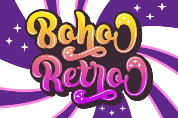
Boho Retro
Boho Retro is a plump, heavy-looped 1970s groovy display script with curled swash caps and pillowy connected lowercase bowls.
Boho Retro is a swirled nineteen-seventies psychedelic bubble script-display: fat rounded letters that swell at the waist, joins drawn as spirals and terminals that curl back into the letter like smoke. It is a poster face, so it wants size, two flat inks and a pale ground rather than a busy photograph. The spirals are the finest element and they fill into solid blobs as soon as the face is reduced. It needs roughly 44 mm for the spiral and the swell to read, and it is best two warm flat inks on a light stock.
Recommended project & layout
Retro festival ringer tee & iced-coffee glass wrap — Stack a two-word phrase at a slight upward 6-degree angle and add a contoured offset shadow layer in Cricut or Illustrator if you want the sticker look.
Before you cut or print
Weld connected lowercase letters before cutting vinyl, and check the tight interior spiral holes inside 'B', 'o', and 'e' when weeding.
Best paired with
Get fontPaid link
 #14
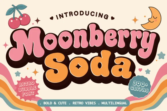
Moonberry Soda
Moonberry Soda is a plump retro bubble display in which the round bowls hide heart-shaped counters, the silhouettes stay thick and soft and the alternates add playful variants, so a short word reads as a kawaii sticker.
The B closes two round bowls with a heart cut inside one, the o keeps a small heart counter, the S swells through a soft spine and the lowercase m sits low under round shoulders, all at a bubble weight with thick sticker-ready outlines. The heart counters are the character: they sit inside the letter rather than beside it, which is why the sample sets a two-word phrase with air around it. Because the hearts are small, the face wants 34 pt before they read and the alternates should be checked for the shapes a project prefers. The pastel ground and the small caption are presentation; the dark bubble letters are the face.
Recommended project & layout
Boba cup decal, kawaii sticker shop logo or party tee — Layer a deep brown drop-shadow offset behind pastel pink and orange fills.
Before you cut or print
Keep cut height above 1.2 inches on vinyl so the tiny heart counters weed cleanly.
Best paired with
Get fontPaid link
 #15
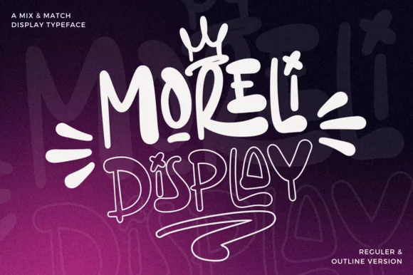
Moreli
Moreli is a playful mix-and-match street-bubble display typeface shipped in both solid Regular and matching hollow Outline versions.
Moreli is a street-art bubble and outline graffiti display duo: the fill cut is a fat rounded bubble with a wide flare and a slight lean, while the outline cut traces the same shapes as a hollow keyline for a second colour behind or in front. The pair is designed to be layered, so the outline only makes sense when it is registered against the fill. The keyline is the finest element and it closes first when the face is reduced. The fill needs roughly 36 mm and the outline 44 mm for their detail to read.
Recommended project & layout
Streetwear drop tee, skate sticker & podcast cover — Stack the solid Regular style on line one at 110% scale above the Outline style on line two, tilting the whole lockup 5 degrees.
Before you cut or print
Use the solid Regular cut for vinyl decals; reserve the fine double-wall Outline version for screen printing, DTF, or large posters.
Best paired with
Get fontPaid link
 #16
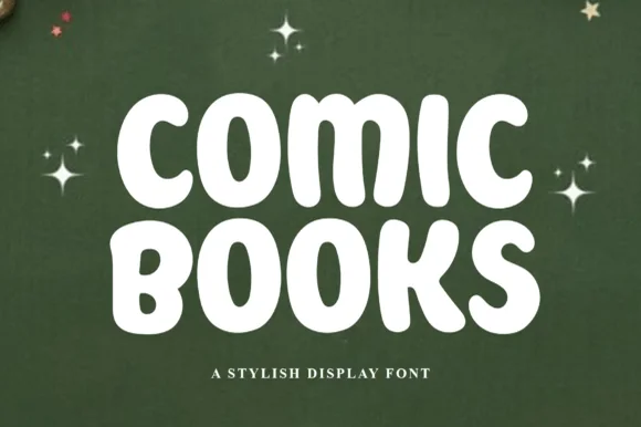
Comic Books
Comic Books is a plump, marshmallow-soft all-caps display font with gently irregular hand-inked contours and wide open bowls.
Comic Books is a soft chubby hand-lettered comic block display: rounded squared letters with a slightly wobbly baseline, an uneven pen edge and a small inner highlight on the left of each stem that reads as ink sitting on paper. The wobble is the design and it disappears when the face is reversed or printed very small. It needs roughly 26 mm for the wobble and the highlight to read, and it is best in two flat inks on white, or one ink plus paper where the highlight prints as a knockout.
Recommended project & layout
Reading-log binder cover, comic-club tee & kid bookmark — Stack two short words centered at 0.92 line-height and tuck small star or speech-bubble accents around the corners.
Before you cut or print
Zero sharp corners and wide circular 'O' holes make this an easy beginner cut on HTV, permanent vinyl, and cardstock.
Best paired with
Get fontPaid link
 #17
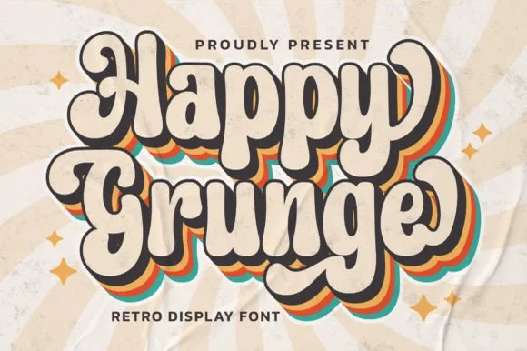
Happy Grunge
Happy Grunge is a clean, upbeat 1970s groovy bubble display font—smooth and rounded rather than distressed—with teardrop bowls and dancing stems.
Happy Grunge is a bouncy nineteen-seventies groovy soft-bubble display: fat rounded letters with a warm wobble across the baseline, a soft outline that separates the bubbles from a busy ground and a small heart or star tucked into one counter. The wobble grows the word vertically and the tucked shape closes first. It needs roughly 30 mm for the tucked shape and the outline to read, and it is best in two warm inks on cream, or one ink plus paper where the outline reads as a soft edge.
Recommended project & layout
Retro sunshine tote, festival sticker & kids' graphic tee — Duplicate 3 offset background layers in mustard, burnt orange, and teal behind cream foreground type for the classic 70s stack.
Before you cut or print
Solid vector edges weed smoothly down to 0.75 in; just pop out the small enclosed counters inside 'a', 'p', 'g', and 'e'.
Best paired with
Get fontPaid link
 #18
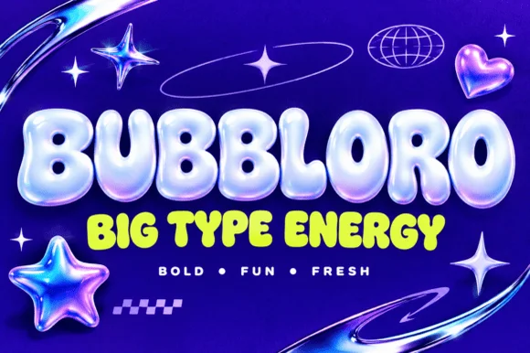
Bubbloro
Bubbloro delivers thick inflated balloon-style display letters with compact counters, and the smaller subline on the cover confirms the same solid puffy silhouette without any chrome bevel.
The strokes swell outward, the corners round fully, the counters shrink to small openings and the letters sit tight against one another. The inflated body is the character: the word reads as a blown-up object rather than a drawn line, which is why the sample pairs a hero word with a smaller subline in the same construction. Because the counters are small, keep 32 pt before they close, and note the advertised 3D finish is a treatment applied later rather than a built-in effect.
Recommended project & layout
Soda/snack label, kids' YouTube banner or party sign — Use solid neon or pastel fills on dark backgrounds or apply layer styles in Photoshop/Canva.
Before you cut or print
Base OTF/TTF provides solid vector shapes (3D chrome gloss on cover is a raster layer effect).
Best paired with
Get fontPaid link
 #19
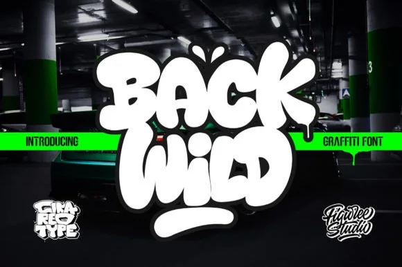
Back Wild
Back Wild delivers puffy throw-up street bubble graffiti, where the white letters inflate into overlapping blobs with a dark outline and a soft glow, a drip runs from the final letter and a thick rounded underline bar sits below on a dark garage photograph.
The letters stay fat and rounded, they overlap rather than sit apart, the outline carries the shape and one drip pulls the eye down. That overlap is the character: the word reads as a painted throw-up rather than a font setting, which is why the sample shows a two-word stack on a dark ground. The green banner and the small studio marks belong to the cover. Check whether the outline and the glow are included styles, keep 44 pt so the outlines stay separate and print on a matte surface where the soft edge does not smear.
Recommended project & layout
Die-cut skate sticker, youth hoodie or party poster — Pair bright fill colours with a heavy black outer contour and underline swash.
Before you cut or print
Smooth bold contours cut great on layered vinyl and print-then-cut stickers.
Best paired with
Get fontPaid link
 #20
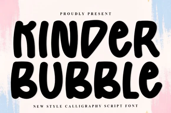
Kinder Bubble
Kinder Bubble is a bold, solid-black hand-drawn block display font with soft organic edges and playful mixed-case letterforms.
Kinder Bubble is a heavy hand-cut playroom block display: fat squared letters with visible scissor-cut edges, slightly mismatched heights and blunt corners, drawn to look as if cut from coloured card and pinned to a playroom wall. The cut edges are the design and they silt when the face is reduced. It needs roughly 26 mm for the cut edge and the height mismatch to read, and it is best as a one-colour vinyl or paper cut on a light ground, or one ink print where the cut edge reads as a shadow.
Recommended project & layout
Daycare cubby nameplates, teacher shirts & backpack tags — Center a child's name or grade level in 1.5–2.5 in solid letters, pairing classroom room numbers in the same bold face.
Before you cut or print
Weeds cleanly on both permanent vinyl and puff HTV; just watch the compact double counters inside 'B' below 0.8 inches.
Best paired with
Get fontPaid link
 #21
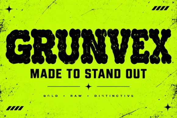
Grunvex
Grunvex is an ultra-heavy, puffy street-block display font combining rounded graffiti-slab silhouettes with subtle worn-ink texture.
Grunvex is an ultra-heavy puffy street-block display with rounded graffiti-slab silhouettes, tightly touching capitals, tiny slit counters and a subtle worn-ink bite on the edges, so a word reads as a painted block panel rather than a tag. The slit counters are very small, which means the face needs size to stay legible, and the touching letters make the word behave as one mass. It needs roughly 34 mm for the slits to read, and it is best in jet black on acid yellow or in one flat ink on a dark ground.
Recommended project & layout
Rave/punk flyer, streetwear chest bar & YouTube thumbnail — Set 1 uppercase hero word at 72–130 pt with tight -5 tracking above solid condensed subheaders ('MADE TO STAND OUT').
Before you cut or print
Best for screen print, DTF hoodies, and posters; if cutting large 2 in+ vinyl, Contour out the sparse internal specks.
Best paired with
Get fontPaid link
 #22
Kale
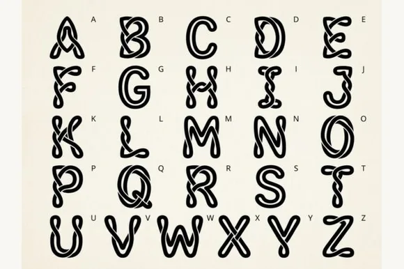
Kale is a bouncy, wavy-contoured cartoon bubble display font with glossy interior shine highlights across all 26 capitals.
Kale is a wiggly liquid-jelly cartoon bubble alphabet: each letter is a rounded blob that wobbles along its length, with a soft inner highlight, a thin outer outline and joins that stretch between neighbouring characters. The wobble grows the word in both directions, and the outline closes first when the face is small. It needs roughly 30 mm for the wobble and the outline to read, and it is best in two bright translucent-looking inks on white, or one ink plus a knocked-out highlight on coloured card.
Recommended project & layout
Pool-party invite, slime-kit label & popsicle stand sign — Set short uppercase words at 48–84 pt in bright aqua, lime, or watermelon pink over crisp white.
Before you cut or print
Interior shine cutouts make Print-Then-Cut, sublimation, and DTF far easier than blade-weeding tiny vinyl highlight slivers.
Best paired with
Get fontPaid link
 #23
Macy
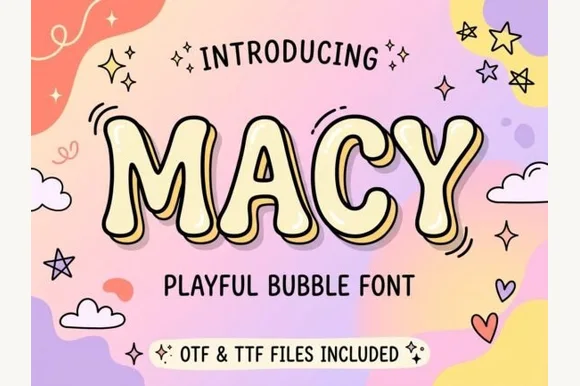
Macy is a cheerful, rounded comic-bubble display font accented by interior shine curves (note: playful bubble styling, not Art Deco).
Macy is a plump cartoon bubble display with comic highlight strokes: fat rounded letters, a thick balloon keyline and a pair of short highlight slashes on each stem that read as a glossy print. The highlights are the design and they merge with the fill when the face shrinks, and the keyline doubles the footprint. It needs roughly 30 mm for the highlight and the keyline to read, and it is best in two flat inks on white, or one ink plus paper where the highlights read as knockouts.
Recommended project & layout
Kids' pastel birthday banner, sticker sheet & party favor — Fill letters in pastel butter-yellow, lilac, or sky blue with a dark outline and white sticker border.
Before you cut or print
Ideal for Print-Then-Cut stickers, DTF shirts, and sublimation; if cutting vinyl, either weld/fill the thin shine slits or scale above 2 in.
Best paired with
Get fontPaid link
 #24
Graffiti Giggle
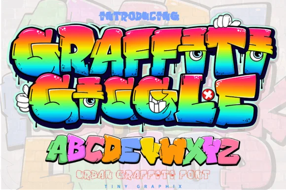
Graffiti Giggle is a playful cartoon street-graffiti font featuring chunky overlapping bubble letters and cheeky character-eye details.
Graffiti Giggle is a cartoon character-eye bubble graffiti display: fat interlocking throw-up letters with a hard keyline, cartoon eyes set inside one or two counters that look out at the reader, and a small drip running off the baseline. The eyes are the design and they turn into two dots as soon as the face shrinks. It needs roughly 32 mm for the eye and the keyline to read, and it is best as a two-colour flat print on coated stock, or one vinyl colour where the eyes are redrawn as knockouts.
Recommended project & layout
Kids' art-party banner, custom skate tee & goodie bag — Color individual letters in alternating lime, cyan, yellow, and magenta inside Canva or Illustrator before Print-Then-Cut.
Before you cut or print
Use Print-Then-Cut or DTF transfers when preserving fine cartoon eye details; on cut vinyl, scale letters above 2 inches.
Best paired with
Get fontPaid link
 #25
Baby Blanket
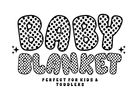
Baby Blanket draws fat round capitals and fills them with a dense grid of black dots that carry a white centre, so the letters look like printed fabric with a quilted edge.
BABY over BLANKET fills the card in thick bubble letters with soft, wobbling outlines, and every letter is packed edge to edge with round dots, each dot holding a small white dot inside it. The outer keyline is heavy and slightly uneven, and the dots that fall on the edge are cut by it, which is what makes the surface read as printed cloth rather than as a pattern laid behind the type. Four drawn sparkles sit at the sides of the second row, and a small caps line at the foot repeats the intent in a quieter hand. The letters are wide and short, with tiny counters, so a word fills a line fast. As a display face it works best at party scale; at small sizes the dot grid collapses into a grey field, and the outline that gives the shapes their charm becomes the only thing left visible.
Recommended project & layout
A baby album title panel — Centre BABY on a white album cover with a plain name-and-date panel below and no extra dotted background.
Before you cut or print
Check the separation of spots, outline and B counters at cover size.
Best paired with
Get fontPaid link
 #26
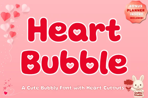
Heart Bubble
Heart Bubble is a cheerful rounded bubble display font where enclosed letter counters and i-dots are shaped as crisp upright hearts.
Heart Bubble is a plump kawaii bubble display with heart-shaped counters: very fat rounded letters, a thick balloon keyline and a heart cut into the bowl of the round letters and the counters of the capitals. The heart counters are the design and they close into dots as soon as the face is reduced. It needs roughly 28 mm for the heart counter and the keyline to read, and it is best in two soft inks on white, or one ink plus paper where the hearts print as knockouts.
Recommended project & layout
Kids' Valentine shirt, classroom sticker & treat topper — Set 1-to-2-word greetings in bright berry red or hot pink wrapped in a 0.1 in white offset sticker contour.
Before you cut or print
Chunky outer walls weed easily on HTV and glossy vinyl; use a sharp weeding pin to lift the cute heart-shaped counter pieces cleanly.
Best paired with
Get fontPaid link
 #27
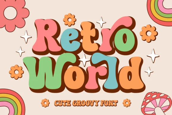
Retro World
Retro World is a curvy, bottom-heavy 1970s groovy display typeface with curled swash ears, teardrop lobes, and sunny flower-child bounce.
Retro World is a plump nineteen-seventies psychedelic bubble display: fat rounded letters built from overlapping flower petals, a wobbling baseline and a soft outline that separates the bubbles from the ground. The petals close the counters early and the outline is the finest element. It needs roughly 32 mm for the petal edge and the outline to read, and it is best in two warm inks on cream, or one burnt orange on white where the petal edges stay open.
Recommended project & layout
Groovy summer-camp tee, iced-coffee glass wrap & tote — Color individual letters in alternating muted retro tones (terracotta, sage, mustard, dusty pink) backed by a unified dark brown shadow.
Before you cut or print
Smooth, generous vector curves weed fast and cleanly on permanent cup vinyl and HTV down to 0.75 inches.
Best paired with
Get fontPaid link
 #28
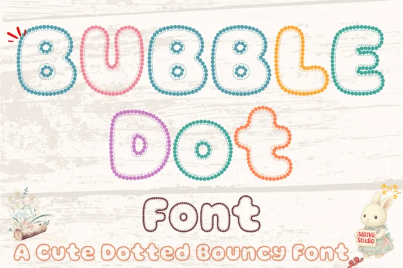
Bubble Dot
Bubble Dot traces plump, bouncy cartoon bubble letters entirely out of tiny pearl-bead rings with cozy hollow centers (OTF & TTF)!
Bubble Dot is a bouncy bubble display whose letters are drawn entirely as chains of tiny pearl beads forming hollow outlines, so a word reads as beaded jewellery rather than as filled type. The chain must stay continuous for the letter to exist, which means the face needs size for individual beads to read and it cannot be used where a bead ring would close. It needs roughly 32 mm for the beads to resolve, and it is best in pastel bead colours on white or in one metallic on a soft ground.
Recommended project & layout
Easter nursery print, coloring-page name & bracelet card — Stack 2 bouncy words at 64–125 pt, coloring each letter's bead chain in soft teal, yellow, coral, and lavender.
Before you cut or print
Tiny individual bead rings are made for printables, Print-Then-Cut stickers, sublimation, and DTF—do NOT weed on vinyl!
Best paired with
Get fontPaid link
 #29
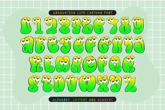
Graduation Cute Cartoon
Graduation Cute Cartoon is a full-color goofy monster-blob cartoon font (not a slab serif) topping bubbly lime-yellow letters and numbers with googly eyes.
Graduation Cute Cartoon is a full-colour bubble alphabet in which each letter is a googly-eyed monster: a fat rounded body with a coloured fill, two white eyes with offset pupils and a small mouth line, all drawn as separate colour layers. The eyes are the character, so they need size to read, and the colour build means a one-ink print loses the whole idea. It needs roughly 34 mm for the eyes and mouth to read, and it is best in four flat colours on white card, or a single ink on white where the eyes are left as paper circles.
Recommended project & layout
Preschool 'Little Monster' graduate certificate & folder — Set kids' names or numbers (0–9) big at 60–110 pt on white Print-Then-Cut sticker paper.
Before you cut or print
Full-color gradients and tiny cartoon pupils require Print-Then-Cut, sublimation, or color printing—not single-color vinyl.
Best paired with
Get fontPaid link
 #30
Patriotic America
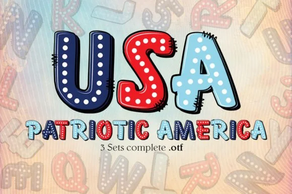
Patriotic America is a playful 3-set pop-art OTF collection featuring chunky comic-stitched bubble letters decorated with stars and red-white-and-blue fills!
Patriotic America ships as three OTF sets of pop-art comic bubbles: a solid colour build, a stitched outline build and a decorated build with stars, so the family is designed to be layered rather than set once. The bubbles are chunky with black comic outlines and stitched dashes, which means the outline version needs the solid behind it or the stitches float, and the layered sandwich has to be registered precisely. It needs roughly 30 mm for the stitching to read, and it is at its best in red, navy and cream on white.
Recommended project & layout
4th of July kids' sticker, sublimation popsicle holder & tee — Set 'USA' huge (110 pt) above 'PATRIOTIC' (48 pt) on white or kraft-pastel sublimation blanks.
Before you cut or print
NOTE: OpenType-SVG color fonts render in full color inside Photoshop, Illustrator, and Procreate (export PNG for Cricut Print-Then-Cut!)—not for single-layer vinyl cutting.
Best paired with
Get fontPaid link
Practical buyer checklist
Frequently asked questions.
Key cutting, printing and pairing answers before choosing a bubble & puffy 3D lettering typeface.
Why do bubble fonts fall apart when cut?
Because the letters touch but are not joined. Weld the word before cutting so the contact points merge into one outline. Without welding, each letter becomes a separate piece that shifts on the mat.
Can puffy 3D fonts be made to look inflated in print?
Yes, with a drawn highlight and a soft shadow rather than a bevel effect. Fonts that include the highlight in the glyph print consistently, while gradient bevels applied later look glossy on screen and flat on paper.
What is the smallest size for bubble lettering?
About 0.5 inch for bold bubble faces, and 1 inch for outlined ones where the inner ring needs to stay open. Below that the counters close and the letters turn into blobs.
Do bubble fonts work for vinyl on a tumbler?
Yes, and they are among the easiest shapes to apply because the silhouette is smooth. Warp to the circumference first, then weld, and keep the whole word above 3 inches so the bubbles stay distinct.
Keep exploring
Related collections & guides.
Explore adjacent maker roundups or check our practical pre-production checklists.
01 / Type Styles
Cute bubble & kawaii
30 curated fonts · Previews & pairings
02 / Cricut & Craft
Sublimation, sticker & Print-Then-Cut
29 curated fonts · Previews & pairings
03 / Type Styles
Retro 70s & groovy
31 curated fonts · Previews & pairings

04 / Type Styles
Graffiti, throw-up & street tag
18 curated fonts · Previews & pairings
Guides: Invitation font checklist · Vinyl & cutting checklist · How to pair script & sans fonts