Neutral Sans Workhorse

Hells Bells + Hermano
Lets Hells Bells own the focal silhouette while handling secondary copy, sizing and subheads cleanly.
Inspect Hermano specimenDisclosure: MakerFileHub may earn a commission from qualifying purchases via paid links on this page. How our links work.
Exuberant 1970s bell-bottom & swash-flame poster display
Hells Bells is a flamboyant 1970s poster display typeface with sweeping bell-bottom curves, flame-like left swashes, and heavy disco swagger.
Paid link
Get this fontProject & layout blueprintsAt-a-glance maker compatibility
Sturdy stroke walls and open counters weed cleanly on adhesive vinyl, HTV apparel film, and cut cardstock.
Visual anatomy & craft review
Hells Bells is an exuberant nineteen-seventies bell-bottom display with swash flames: heavy rounded strokes that flare into wide trouser legs at the baseline, flame-shaped swashes curling off the caps and a warm irregular rhythm that reads as a concert poster. The flares widen a word considerably and the flame tips are the finest element. It needs roughly 34 mm for the flame tip and the flare to read, and it is best in two warm inks on cream, or one ink plus paper where the flames read as knockouts on a tinted ground.
Far-out · Bell-bottom · Flamboyant
Two-font hierarchy recipes
Tested contrast partners — pairing Hells Bells with grounded secondary typography.
Hells Bells + Hermano
Lets Hells Bells own the focal silhouette while handling secondary copy, sizing and subheads cleanly.
Inspect Hermano specimen
Hells Bells + Grandeur – Elegant Classic Serif
Grounds bold display lettering with classic typographic authority on posters, badges and apparel.
Inspect Grandeur – Elegant Classic Serif specimenPractical applications
Concrete hierarchy, scale and production guidance tailored to Hells Bells’s stroke geometry.
A bell-bottom display turns a seventies music feature into its own concert poster. The flares hold at 72 pt on a coated cover, and two warm inks keep the flame tips crisp against a tinted band.
Hierarchy & layout recipe
Cover 210 x 297 mm, title 72 pt with 12 mm flare clearance, cover lines 10/14 pt over two columns of 82 mm, 18 mm margins and a 12 mm head. Opener 56 pt. Pull quote 40 pt.
Pre-production check
At 40 pt on the pull quote the flame tips fill and the quote reads as a solid warm block. Keep the face at 52 pt and above, and proof one spread at 1:1.
A bell-bottom display reads as a printed sleeve rather than a modern logo. The flares hold at 60 mm on a sleeve, and two warm inks print the sleeve and the cards in one order.
Hierarchy & layout recipe
Sleeve print 300 x 300 mm, word 70 mm with 12 mm flare clearance, 20 mm margins. Card 85 x 55 mm, word 14 mm, 5 mm margins. Bag print 200 x 250 mm, word 50 mm, 15 mm margins.
Pre-production check
On an 85 x 55 mm card the flares merge with the next letter and the name reads as one warm ribbon. Keep the card word at 24 mm, and check one card before the run.
A bell-bottom display reads as a hand-drawn festival poster rather than a modern flyer, which is what a retro weekend wants at the gate. The flares hold at 150 mm on a poster, and two warm inks print the poster and the tote from one separation.
Hierarchy & layout recipe
Poster A2, word 150 mm with 15 mm flare clearance, details 44 mm, 20 mm margins. Stage banner 3000 x 800 mm, word 260 mm, 60 mm safe edge. Tote print 300 x 300 mm, word 70 mm, 25 mm margins.
Pre-production check
Screen printed on a tote at 70 mm the flame tips bridge and fill after the first wash. Use a 2 mm stencil bridge on the tips, and wash one sample before the order.
Technical & licence verification
Confirm included OTF/TTF/WOFF formats, full glyph tables and licence coverage on the live store page before batch production.
Closest visual alternatives
Matched across letterform anatomy, stroke behaviour and craft applications.
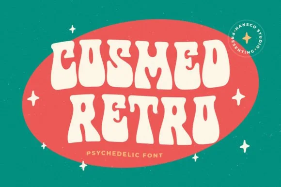
Wavy psychedelic blob-lettered retro display
Cosmed Retro is a thick, wavy psychedelic display typeface with liquid bottom swells and tiny keyhole counters built for bold 60s/70s badges.
Ideas for this font
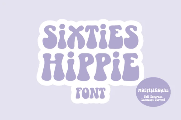
Heavy 1960s flower-power & Fillmore poster display
Sixties Hippie is a warm, bottom-heavy 1960s flower-power display font with pinched waists, plump teardrop feet, and full European multilingual support.
Ideas for this font
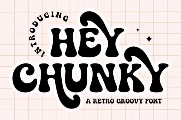
Swash-tailed 1970s psychedelic & groovy serif display
Hey Chunky is an expressive 1970s groovy display font kicking long, flamboyant retro swash tails off 'H', 'Y', 'C', and 'K'!
Ideas for this font
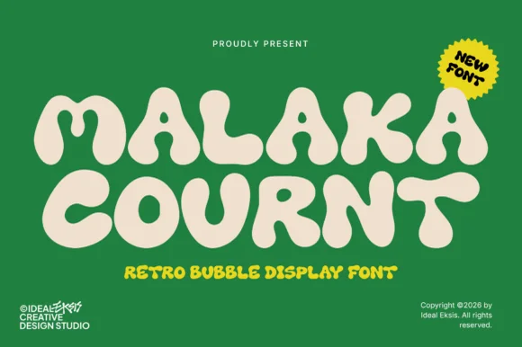
Ultra-heavy groovy pillow-bubble retro display
Malaka Cournt is an ultra-bold retro bubble display font sculpting wide, squishy 1970s letterforms with compressed teardrop counters.
Ideas for this font
Same independent foundry
Allow optional Google Analytics to measure visits and catalogue actions. Your search words and notes are not included. Privacy & storage