Neutral Sans Workhorse

Dancing Christmas + Montreal
Lets Dancing Christmas own the focal silhouette while handling secondary copy, sizing and subheads cleanly.
Inspect Montreal specimenDisclosure: MakerFileHub may earn a commission from qualifying purchases via paid links on this page. How our links work.
Narrow festive letters with large curls
Dancing Christmas shows narrow high-contrast letters with oversized spiral terminals, red on the upper word and green on the lower, where the D curls inward at both ends and the C, s and final extensions sweep across the vertical stems next to them.
Paid link
Get this fontProject & layout blueprintsAt-a-glance maker compatibility
Sturdy stroke walls and open counters weed cleanly on adhesive vinyl, HTV apparel film, and cut cardstock.
Visual anatomy & craft review
The stems stay tall and narrow, the contrast swings wide, the hairlines thin out and the terminals spiral large. That overlap is the character: the sweeping terminals cross neighbouring letters, so the sample only works with the letters tightly set. Pine branches and berries in the corners are separate artwork. Keep 40 pt for the hairlines, leave 18 mm above and 20 mm below for the crossings, and check the s and C against your own wording before committing to a tight set.
Narrow festive letters with large curls
Two-font hierarchy recipes
Tested contrast partners — pairing Dancing Christmas with grounded secondary typography.
Dancing Christmas + Montreal
Lets Dancing Christmas own the focal silhouette while handling secondary copy, sizing and subheads cleanly.
Inspect Montreal specimen
Dancing Christmas + Gorga
Grounds bold display lettering with classic typographic authority on posters, badges and apparel.
Inspect Gorga specimenPractical applications
Concrete hierarchy, scale and production guidance tailored to Dancing Christmas’s stroke geometry.
The narrow high-contrast letters carry a seasonal card with elegance rather than novelty, and the spirals supply the decoration.
Hierarchy & layout recipe
Print a 120 by 180 mm card: set the greeting at 38 pt across two rows with 14 mm between baselines, keep 18 mm of clear ground beneath for the lower sweeps, and keep 16 mm of margin.
Pre-production check
Hairlines at 30 pt fade on textured card; check the proof and keep the greeting at 34 pt or above on a smooth stock.
The formal letterforms suit a printed menu, and the tight setting lets the spiral terminals knit the two words together.
Hierarchy & layout recipe
Print an A5 menu: set the heading at 34 pt on one row, keep 16 mm of clear ground beneath before the courses at 10 pt, and keep 14 mm of margin so the curls stay inside.
Pre-production check
Tight setting needs the spirals to clear the neighbouring stem; check the printed row at final size.
The contrast and the spirals give a winter sign formality, which works where a plain serif would look borrowed from an office.
Hierarchy & layout recipe
Print a 400 by 600 mm board: set the greeting at 70 mm across two rows, keep 34 mm of clear ground beneath for the sweeps, and keep 30 mm of border so the curls do not meet the frame.
Pre-production check
Large-format hairline reproduction thins the contrast; check the printer's minimum stroke weight first, since thin lines drop out.
Technical & licence verification
Confirm included OTF/TTF/WOFF formats, full glyph tables and licence coverage on the live store page before batch production.
Closest visual alternatives
Matched across letterform anatomy, stroke behaviour and craft applications.
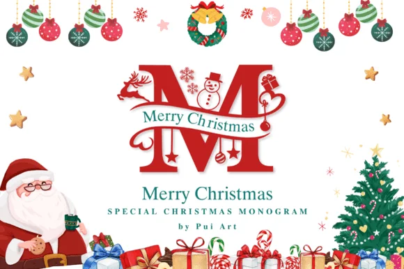
Ornate Christmas monogram with inset figures
Merry Christmas Monogram is a red ornamental initial in which a deer, a snowman and a pair of skates are drawn inside the letterforms: a heavy didone-style M with fine hairline accents, a green banner of serif capitals crossing it, and a page full of baubles, a wreath, a Santa and a tree.
Ideas for this font
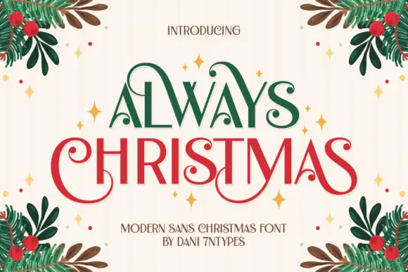
Tall capitals with curled terminals
Always Christmas combines tall mostly upright letters with curled ends on selected capitals, and large loops on the A, C and S give the restrained strokes a decorative edge across a two-row red-and-green composition.
Ideas for this font
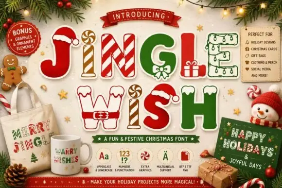
Christmas capitals dressed as festive objects
Jingle Wish shows chunky capitals decorated with candy stripes, hats, gifts and winter-clothing details: some characters arrive as outlines while others are solid filled shapes, so one word mixes two finishes.
Ideas for this font
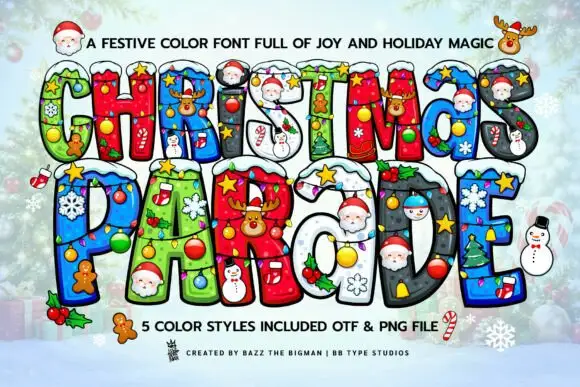
Snow-topped Christmas blocks filled with bright miniature ornaments
Christmas Parade sets fat layered capitals in five bright holiday styles, each letter filled with a pattern and topped with snow, baubles, a Santa face or a gingerbread man.
Ideas for this font
Same independent foundry
Allow optional Google Analytics to measure visits and catalogue actions. Your search words and notes are not included. Privacy & storage



