Neutral Sans Workhorse

Christmas Beautiful + Modern Limited
Lets Christmas Beautiful own the focal silhouette while handling secondary copy, sizing and subheads cleanly.
Inspect Modern Limited specimenDisclosure: MakerFileHub may earn a commission from qualifying purchases via paid links on this page. How our links work.
Playful upright letters with long swashes
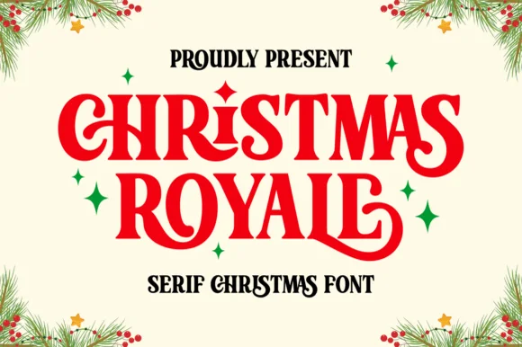
Christmas Beautiful mixes rounded upright lettering with curling terminals, where large C and B initials turn into spirals, long strokes sweep beneath neighbouring letters and the most elaborate flourish reaches below the lower row on a pale ground framed by fir branches and stars.
Paid link
Get this fontProject & layout blueprintsAt-a-glance maker compatibility
Sturdy stroke walls and open counters weed cleanly on adhesive vinyl, HTV apparel film, and cut cardstock.
Visual anatomy & craft review
The bodies stay rounded and heavy, the initials curl large, the connecting strokes sweep sideways and one flourish drops well under the second row. That drop is the character: the sample reads as hand-arranged rather than set, which is why the two rows feel stacked and slightly staggered. The fir branches, the stars and the corner badge are separate decoration. Keep 40 pt so the curls stay open, plan 25 mm beneath the lower row for the flourish and keep supporting copy well outside the sweep.
Playful upright letters with long swashes
Two-font hierarchy recipes
Tested contrast partners — pairing Christmas Beautiful with grounded secondary typography.
Christmas Beautiful + Modern Limited
Lets Christmas Beautiful own the focal silhouette while handling secondary copy, sizing and subheads cleanly.
Inspect Modern Limited specimen
Christmas Beautiful + Rosemode
Grounds bold display lettering with classic typographic authority on posters, badges and apparel.
Inspect Rosemode specimenPractical applications
Concrete hierarchy, scale and production guidance tailored to Christmas Beautiful’s stroke geometry.
The playful curls give a seasonal card warmth, and the stacked rows leave room for a short message beneath the flourish.
Hierarchy & layout recipe
Print a 120 by 180 mm card: set the greeting at 40 pt across two rows with 16 mm between baselines, keep 26 mm of clear ground beneath for the flourish, and keep 16 mm of margin.
Pre-production check
The flourish competes with packed copy; check the card and keep the message at least 26 mm away.
The rounded lettering sets a festive menu heading, and the curls give the sheet a hand-finished look without any border at all.
Hierarchy & layout recipe
Print an A5 menu: set the heading at 34 pt on one row, keep 20 mm of clear ground beneath before the courses at 10 pt, and keep 14 mm of margin at each side.
Pre-production check
The sweep reaches under the first course line; check the layout and raise the courses 8 mm.
The seasonal weight works as a December shop label, where the flourishes replace printed ornament on a small hanging tag.
Hierarchy & layout recipe
Print a 45 by 70 mm tag: set the shop name at 16 pt on one row, keep 10 mm of clear ground beneath for the terminal, and keep 6 mm to the punch hole so no curl is cut.
Pre-production check
The large initial may not fit a short name; check the artwork with your own wording first.
Technical & licence verification
Confirm included OTF/TTF/WOFF formats, full glyph tables and licence coverage on the live store page before batch production.
Closest visual alternatives
Matched across letterform anatomy, stroke behaviour and craft applications.
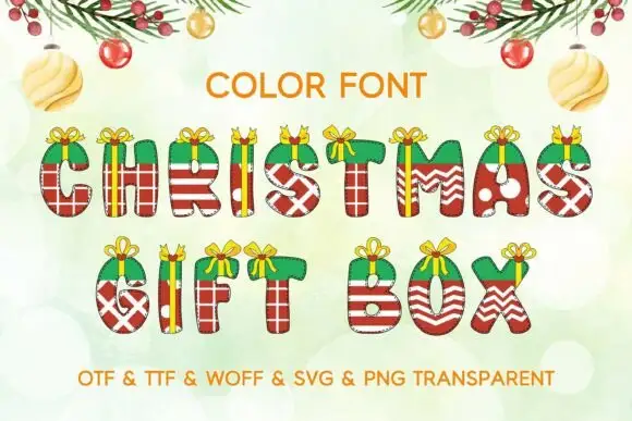
Compact rounded capitals wrapped in red-green parcel patterns and gold-like ribbons
Christmas Gift Box draws every capital as a present: a box in red or green with a ribbon wrap, a striped or dotted paper pattern, and a golden bow with curled tails sitting on the top edge.
Ideas for this font
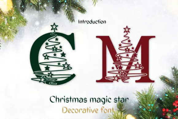
Serif C and M crossed by star-studded spiral tree outlines
Christmas Magic Star draws a serif monogram initial and winds a spiral of small stars around it, so the letter looks like a tree decorated with a garland and a star on top.
Ideas for this font
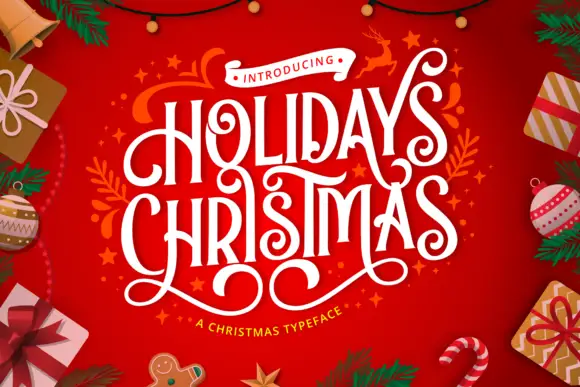
Condensed festive capitals with curled terminals and looping under-extensions
Holidays Christmas is a condensed festive display in which the capitals stay tall and narrow, the terminals curl, the strokes carry high contrast and long lower loops overlap neighbouring letters, so a greeting reads as ribbon lettering.
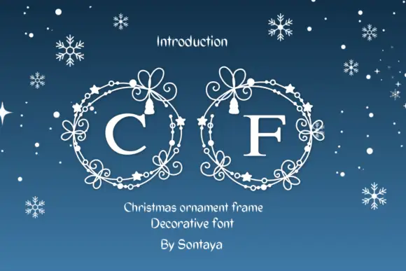
Serif initials inside fine circular ornament frames made from bows, stars and bead-like marks
Christmas Ornament Frame draws an oval frame from curling ornaments, dot-beads and small stars, ties a bow at the top, and leaves a serif initial in the middle.
Ideas for this font
Same independent foundry
Allow optional Google Analytics to measure visits and catalogue actions. Your search words and notes are not included. Privacy & storage