Editorial Serif Anchor

Christmas Farmhouse + Gorga
Anchors Christmas Farmhouse's fluid strokes with crisp Roman proportions on wedding suites, headers and packaging.
Inspect Gorga specimenDisclosure: MakerFileHub may earn a commission from qualifying purchases via paid links on this page. How our links work.
Dancing-baseline farmhouse cursive
Christmas Farmhouse is an upright handwritten cursive in which the baseline dances, the ascenders rise tall and the brush-pen weight stays sturdy, so a porch sign reads across a yard without the formality of a connected script.
Paid link
Get this fontProject & layout blueprintsAt-a-glance maker compatibility
Weld or Unite overlapping script joins into one continuous vector path before sending to the blade.
Visual anatomy & craft review
The C and h lift tall ascenders, the f and h repeat that height through the second word, the baseline shifts up and down by design and the brush-pen weight keeps a consistent thickset stroke with light joins. The dancing baseline is the character: it makes a painted sign feel hand-lettered rather than printed, which is why the sample suits a rustic board. Because the letters bounce, keep 18 mm between rows from 30 pt and check that the tallest ascender stays inside the panel. The farmhouse props are presentation; the cursive line is the face.
Joyful · Upright · Handwritten
Two-font hierarchy recipes
Tested contrast partners — pairing Christmas Farmhouse with grounded secondary typography.
Christmas Farmhouse + Gorga
Anchors Christmas Farmhouse's fluid strokes with crisp Roman proportions on wedding suites, headers and packaging.
Inspect Gorga specimen
Christmas Farmhouse + Helina
Keeps small-scale dates, URLs, nutrition facts and care instructions crisp and legible below script titles.
Inspect Helina specimenPractical applications
Concrete hierarchy, scale and production guidance tailored to Christmas Farmhouse’s stroke geometry.
The dancing baseline suits a painted porch sign, and the sturdy stroke holds a three-word greeting at 60 mm on a board in two colours. The brush weight also holds up on a painted board outdoors.
Hierarchy & layout recipe
Paint a 700 by 300 mm board: set the greeting at 60 mm on two rows, keep 25 mm between the rows for the bouncing baseline, and keep 30 mm of border so the tallest ascender stays inside the frame.
Pre-production check
A dancing baseline painted too close to a border clips an ascender; check the mounted board and add 8 mm of margin.
The upright cursive suits a small tag, and the even stroke stays clear at 18 pt on a 40 mm kraft tag with a punched hole. The bounce is subtle enough to keep a short word readable.
Hierarchy & layout recipe
Print a 40 by 70 mm kraft tag: set the word at 18 pt, punch a 4 mm hole 9 mm from the top edge, and keep 6 mm between that hole and the tallest ascender. Tie the tag on rather than stapling it.
Pre-production check
A hole punched under a tall ascender leaves a thin bridge; check the die and shift the hole 4 mm lower. A 5 mm washer spreads the load.
The hand-lettered line suits a box label, and the brush weight stays solid at 22 pt on a 90 mm label in one flat ink. The dancing baseline keeps a printed label from feeling corporate.
Hierarchy & layout recipe
Print a 90 by 50 mm label: set the shop name at 22 pt, set the phrase at 11 pt in a small caps beneath with 8 mm of clear ground, and keep 8 mm of border at each end. Keep the second phrase short.
Pre-production check
A bouncing baseline printed as a straight row loses the hand feel; check the proof and keep the original offsets in the artwork.
Technical & licence verification
Confirm included OTF/TTF/WOFF formats, full glyph tables and licence coverage on the live store page before batch production.
Closest visual alternatives
Matched across letterform anatomy, stroke behaviour and craft applications.
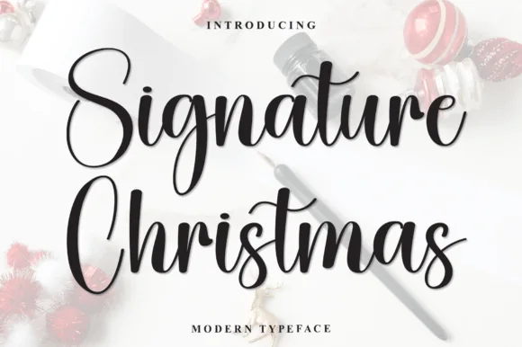
Bouncy upright holiday brush calligraphy script
Signature Christmas is a lively, medium-weight modern calligraphy script with tall oval capitals ('S', 'C') and dancing lowercase bounce.
Ideas for this font
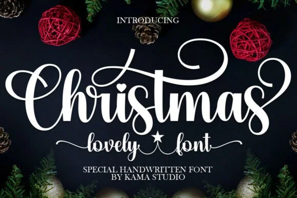
Bold festive brush calligraphy with heart & star accents
Christmas (by Kama Studio) is a thick, joyful holiday calligraphy script featuring sweeping spiral swashes, a heart i-dot, and star word-connectors.
Ideas for this font
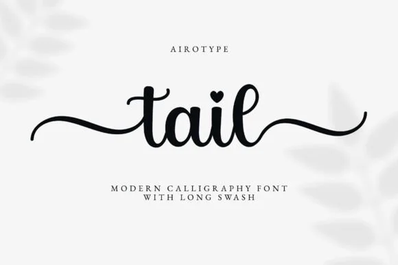
Long wavy-tail craft calligraphy
Tail is a clean medium-weight calligraphy script with built-in beginning and ending wavy swashes and heart-dotted i glyphs, so a short personalised line reads as smooth writing with a flourish at each end.
Ideas for this font
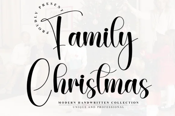
Tall narrow bouncy holiday calligraphy script
Family Christmas is a tall, narrow modern calligraphy script with high-arching 'F' and 'C' capitals and rhythmic bouncing lowercase loops.
Ideas for this font
Same independent foundry
Allow optional Google Analytics to measure visits and catalogue actions. Your search words and notes are not included. Privacy & storage