Modern Grotesque Body

More Christmas + One More
Creates crisp high-hierarchy contrast beneath More Christmas headlines across menus, websites and labels.
Inspect One More specimenDisclosure: MakerFileHub may earn a commission from qualifying purchases via paid links on this page. How our links work.
Lavish interlocking swash-ligature retro display serif
More Christmas is a showstopping modern-retro display serif weaving lavish, ribbon-smooth swash curls and custom ligatures across stacked titles!
Paid link
Get this fontProject & layout blueprintsAt-a-glance maker compatibility
Sturdy stroke walls and open counters weed cleanly on adhesive vinyl, HTV apparel film, and cut cardstock.
Visual anatomy & craft review
More Christmas is a lavish retro display serif in which the swashes of adjacent letters interlock, so the exit stroke of one glyph passes through the entry of the next and the word reads as one ornamented band. The interlocking means the letters cannot be respaced or tracked apart without breaking the joins, and the swashes extend above and below the line. It needs roughly 36 mm for the interlock to read, and it is best in one metallic or deep ink on cream, with foil only at large sizes.
Swash-interlock · 70s-editorial · Holiday-luxe
Two-font hierarchy recipes
Tested contrast partners — pairing More Christmas with grounded secondary typography.
More Christmas + One More
Creates crisp high-hierarchy contrast beneath More Christmas headlines across menus, websites and labels.
Inspect One More specimen
More Christmas + Thick Black
Adds a warm human signature touch for 1-to-3-word callouts without competing against structured serif capitals.
Inspect Thick Black specimenPractical applications
Concrete hierarchy, scale and production guidance tailored to More Christmas’s stroke geometry.
An interlocking swash serif reads as a vintage printed greeting rather than a modern card, which is what a shop wants in December. The joins give the greeting one continuous ornamented line at 26 mm, and one deep ink on cream keeps the hairlines from breaking on uncoated card.
Hierarchy & layout recipe
Card 105 x 148 mm, greeting 26 mm with 10 mm swash clearance, message 8/11 pt, 12 mm margins. Tag band 140 x 40 mm, word 14 mm, 6 mm margins. Window decal 400 x 180 mm, word 80 mm, 20 mm edge clearance.
Pre-production check
Tracked out to fit the tag band the interlocking swashes detach and the word reads as a row of stray hooks. Keep the joins intact and shorten the greeting instead, and print one tag before the batch.
A retro swash serif reads as a heritage confectionery label rather than a supermarket brand, which is what a small maker wants on a box sleeve. The interlock gives the name one ornamented band at 30 mm, and one ink plus a metallic rule prints the sleeve and the ribbon label from a single artwork.
Hierarchy & layout recipe
Box sleeve 220 x 80 mm, word 30 mm with 10 mm swash clearance, 10 mm margins. Ribbon label 60 x 40 mm, word 12 mm, 4 mm die margin. Card 85 x 55 mm, word 14 mm, 5 mm margins.
Pre-production check
Foil on the 60 x 40 mm ribbon label bridges the interlock gap and the name prints as a solid gold bar. Keep foil to the sleeve at 30 mm and above, and press one label in flat ink before the run.
A lavish swash serif suits a formal winter dinner because the interlock reads as engraved ornament at menu size. The heavy serifs hold a dark ink on cream at 22 mm, and the same artwork prints the card, the menu and the table cards as one suite without rescaling the joins.
Hierarchy & layout recipe
Card 105 x 148 mm, word 22 mm with 8 mm swash clearance, note 8/11 pt, 12 mm margins. Menu 120 x 210 mm, header 18 mm, courses 9/12 pt. Table card 90 x 50 mm, name 10 mm, 4 mm margins.
Pre-production check
A 90 x 50 mm table card at 10 mm lets the interlock close into a solid knot and the guest name becomes unreadable at the table. Print table cards in the plain companion or at 14 mm, and proof one card before the set.
Technical & licence verification
Confirm included OTF/TTF/WOFF formats, full glyph tables and licence coverage on the live store page before batch production.
Closest visual alternatives
Matched across letterform anatomy, stroke behaviour and craft applications.
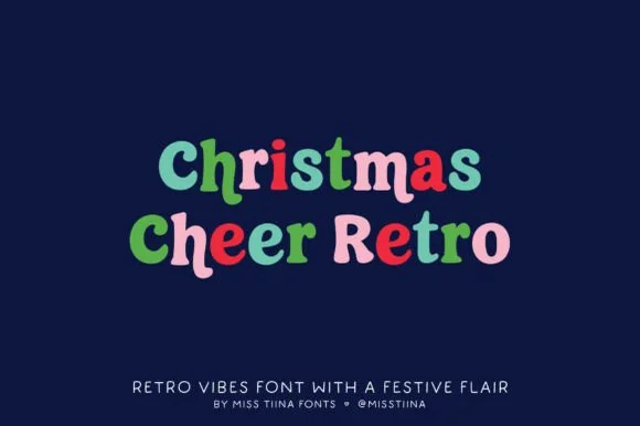
Cozy 1970s retro-groovy mixed-case holiday & everyday serif
Christmas Cheer Retro is a charming, chubby retro serif by Miss Tiina with soft rounded brackets and playful mixed-case bounce (zero holiday clipart attached!).
Ideas for this font
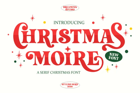
Bold retro teardrop-swashed holiday display serif
Christmas Moire is actually an exuberant, bold retro display serif (NOT a handwritten script!) curling plump teardrop swashes onto 'C', 'S', 'M', and 'R'!
Ideas for this font
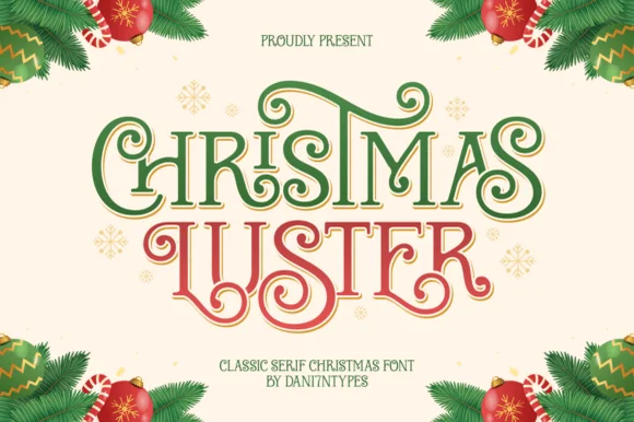
Ornamental ribbon-swashed vintage Christmas display serif
Christmas Luster is actually a lush, swash-curled classic display serif (NOT a connected script!) weaving storybook loops through red-and-green capitals!
Ideas for this font
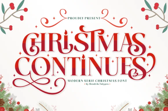
Ornamental holiday display serif with candle-flame i & spiral curls
Christmas Continues is a whimsical holiday display serif (not a cursive script) featuring curled spiral hooks, ligatures, and a candle-flame 'I'.
Ideas for this font
Same independent foundry
Allow optional Google Analytics to measure visits and catalogue actions. Your search words and notes are not included. Privacy & storage