 #1 · Best Overall
Disclosure: MakerFileHub may earn a commission from qualifying purchases via paid links on this page. How our links work.
Snow-capped puffs, Nordic knits & frost detail
18 Best Winter Fonts for Snow & Cold Crafts
Winter lettering is snow, wool and frost, and each behaves differently. Snowy and Bubble Christmas fuse a snow cap to the letter, Cozy fills heavy capitals with Nordic knit bands, and Frostbite Christmas and Cold Snowfall add the groovy and textured registers. Winter and Winter Embroidery keep the fine script side for ornaments and tags.
Quick verdict
Cozy is the most distinctive winter display for a cosy brand, Snowy is the strongest snow-capped puff for signs, and Winter Embroidery covers the script role. Frostbite Christmas adds a groovy alternative for younger markets.
Quick answer
Top 3 winter picks right now.
Short on time? Start with our three highest-rated winter standouts before scrolling the full breakdown.
#1 · Best Overall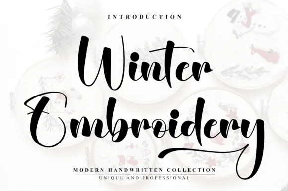 #2 · Runner-Up Pick
 #3 · Editor's Choice
How we tested & selected these 18 fonts
We kept 23 of 161 candidates that read as winter rather than strictly Christmas. Judged on whether snow caps and knit bands are fused, legibility at 2 inch ornament scale, and how the face holds in a two-colour palette.
Side-by-side summary
Top 5 winter picks at a glance.
Compare specimens, OpenType/PUA traits and primary project roles side by side.
| Rank & Font | Style & File Specs | Best Project Fit | Store Listing |
|---|---|---|---|
| ScriptPUA encoded · Ligatures | A winter concert programme cover | Get fontPaid link | |
| ScriptPUA encoded · Ligatures · Alternates & swashes | Holiday mug decal, gift sack & ornament lettering | Get fontPaid link | |
| ScriptPine-and-berry | Cricut Pen holiday card envelope, gift tag & ribbon | Get fontPaid link | |
| ScriptTextured slanted seasonal script | A Christmas market heading | Get fontPaid link | |
| ScriptPUA encoded · Alternates & swashes | Cottage-bakery cake box, sourdough bag & apron HTV | Get fontPaid link |
Scripts & Calligraphy
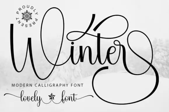
7 fonts#1 · Best OverallWinter
Winter surrounds its small joined middle with a tall W loop, a high t sweep and a very large lower terminal, where the final stroke returns in a wide loop beneath and beside the word and fills almost half of the square field around it.
The letters stay connected and medium weight, the initial loop rises high, the t sweeps wide and the closing stroke falls into a vast loop that wraps under the word. That terminal is the character: the silhouette is nearly square rather than a narrow strip, which is why the sample cannot be cropped into a banner. Snow imagery around the field is context. Keep 30 pt for the hairlines, plan a square or very wide area for the word and check the loop against your trim before committing.
Recommended project & layout
A winter concert programme cover — Give the title most of a square cover and set performers and venue on a plain inside page. Leave the lower terminal clear of the cover edge.
Before you cut or print
Try the real words before reserving a loop; the preview’s terminal may depend on a specific alternate.
Best paired with
Get fontPaid link
#2 · Runner-Up PickWinter Embroidery
Winter Embroidery is a bouncy modern calligraphy brush script—despite its name, it features smooth solid ink strokes rather than stitch textures.
Winter Embroidery is a thick-thin bouncy modern brush script: a high-contrast stroke with a swollen thick and a hairline-thin, letters that rise and fall along the baseline and joins that loop back into the word. It is the look of a machine-embroidered name, so it suits a patch or a knit more than a leaflet. The hairlines are the finest element and they break first, on thread and in print. It needs roughly 34 mm for the thick-thin contrast to read, and it is best one colour on a soft ground where the hairline holds.
Recommended project & layout
Holiday mug decal, gift sack & ornament lettering — Stack a two-word winter phrase with tight leading so the upper capital sits neatly above the wider lowercase second word.
Before you cut or print
Weld all cursive joins before vinyl cutting and keep x-height above 0.65 in so the thin upward connectors do not lift during weeding.
Best paired with
Get fontPaid link
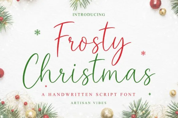
#3 · Editor's ChoiceFrosty Christmas
Frosty Christmas (by Artisan Vibes) is a light, upright fountain-pen signature script with tall 'F/C/t/h' loops and calm modern elegance.
Frosty Christmas is a hand-drawn Christmas display in which each letter wears a dusting of snow: the stems carry uneven caps of white, small icicles hang from the crossbars and the counters fill with drifts. The snow is drawn into the glyph rather than layered on, so a two-colour print needs the white to be bare paper, not an ink. It needs roughly 30 mm for the icicles and the drift to read, and it is best as one deep ink on white or pale blue, where the snow stays as paper.
Recommended project & layout
Cricut Pen holiday card envelope, gift tag & ribbon — Color row 1 cranberry red and row 2 forest green at 60–120 pt above wide-tracked serif micro-caps.
Before you cut or print
Draws crisply with 0.4 metallic Cricut Pens & Foil Quill; if blade-cutting vinyl, Weld joins and scale above 1.4 inches.
Best paired with
Get fontPaid link
 #4 · Top Maker Utility
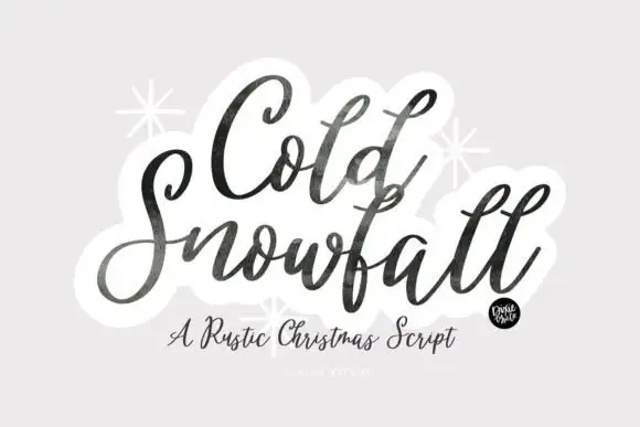
Cold Snowfall
Cold Snowfall is a slanted thick-thin seasonal script whose dark strokes look worn at the edges, whose tittles are drawn as snowflakes and whose tall f and l loops crowd the centre line.
The C begins with a wide curled entry hook and the S opens into a shallow bowl, while the tall f and l loops in the second word crowd the centre of the line and leave only a narrow gap between them. Weight shifts noticeably inside single strokes, which is what gives the lettering a brushed rather than a drawn feel, and the stroke edges carry a fine speckled texture instead of a clean contour. Snowflake marks sit in place of dots, and the small round badge after the last letter is part of the cover composition rather than an ornament you can type. A lighter sub-line names the style in the same family and confirms that the seasonal intent comes from the ornaments, not the letterforms.
Recommended project & layout
A Christmas market heading — Stack the title above plain opening times and address.
Before you cut or print
Check the central tall loops before tightening line spacing.
Best paired with
Get fontPaid link
 #5 · Standout Silhouette
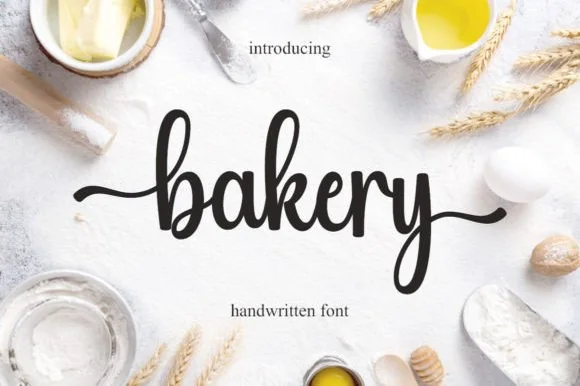
Bakery
Bakery is a warm, bouncy handwritten brush script with tall looped ascenders ('b', 'k') and smooth horizontal beginning and ending tails.
Bakery is a bouncy medium-weight farmhouse brush script with side tails: a loaded stroke with visible dry edges, joined letters, a rising baseline and long tails that flick off the first and last letters. The tails need side clearance and are the first thing trimmed, and the brush edge is the finest element. It needs roughly 24 mm for the tail and the brush edge to read, and it is best in one warm ink on kraft and cream, or a single dark colour on a pale board where the brush edge prints as texture.
Recommended project & layout
Cottage-bakery cake box, sourdough bag & apron HTV — Set a lowercase focal word ('bakery', 'homemade', 'cookies') at 4–8 inches wide with the entry and exit tails turned on.
Before you cut or print
Medium brush stroke weight is one of the easiest script styles to cut and weed on Cricut HTV and adhesive vinyl—remember to weld.
Best paired with
Get fontPaid link
 #6
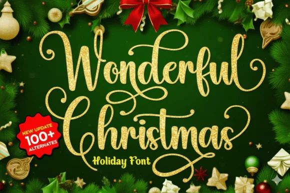
Wonderful Christmas
Wonderful Christmas builds tall looping calligraphy flourishes with spiral loops that crown the capitals and descenders across a two-line specimen, pairing fine hairlines with medium calligraphic downstrokes.
The downstrokes hold a medium weight, the hairlines thin away, the capitals open spiral crowns and the extra characters are encoded beyond a hundred alternates. The crowned capital is the character: the word begins with a drawn flourish that sets a formal tone, which is why the sample sets two lines for foil cards. Because the spirals are hairlines, keep 30 pt as the floor on coated stock and give the loops 20 mm above the line. The spiral crowns are hairlines: they snap in foil and silt below about 30 pt, so the crowned capitals belong on a coated card with 20 mm above the loop rather than on a curved tag.
Recommended project & layout
Foil-stamped family photo card overlay — Place the script over a quiet dark or cream area of the photo and keep family names in small caps.
Before you cut or print
Delicate hairline loops shine in print, digital cards and foil transfer; avoid cutting tiny decals below 2.5 inches.
Best paired with
Get fontPaid link
 #7
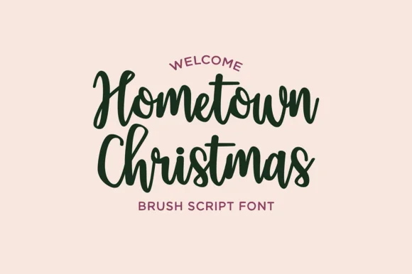
Hometown Christmas
Hometown Christmas is a warm, upright medium-bold brush script with tidy compact loops and welcoming small-town holiday charm.
Hometown Christmas is a cosy upright brush-marker script: connected letters with a soft loaded stroke, an almost vertical axis and small blunt flicks at the terminals rather than long tails. The upright stance keeps a word compact so it fits a card, and the brush edge is the texture that carries at large sizes. It needs roughly 24 mm for the brush edge and the flick to read, and it is best in one deep ink on cream and kraft, or white paint on a dark board where the brush edge prints as ridges.
Recommended project & layout
Holiday porch leaner, cookie-exchange card & family mug — Arch a tiny sans 'WELCOME' on top, stack 2 pine-green Hometown Christmas lines at 54–90 pt, and anchor in berry-red sans.
Before you cut or print
Sturdy brush thickness cuts and weeds cleanly on HTV, wood stencils, and mug vinyl down to 0.75 in—weld joins first!
Best paired with
Get fontPaid link
Display & Decorative Headlines
9 fonts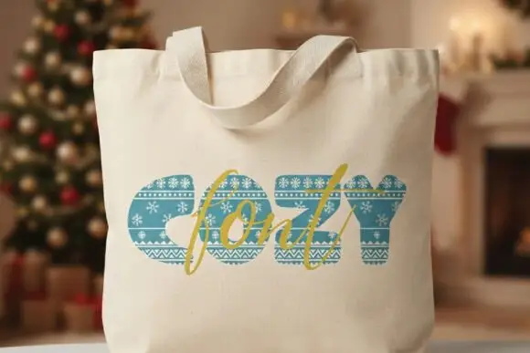 #8
Cozy
Cozy appears on a cream tote mockup as thick blue-green capitals containing horizontal decorative bands. White snowflakes, tiny repeated motifs and zigzags cross the strokes like a knitted winter pattern, and a gold script word overlaps the block title as a second, clearly different lettering layer.
The bodies stay heavy, the bands run horizontally through the strokes, the motifs repeat at a small scale and a script layer overlaps the block. That knit fill is the character: the word reads as woven fabric rather than printed type, which is why the sample sets it on a tote with a script overlay. The tote scene suggests an application rather than tested fabric output, so check the band scale at your size, keep the supporting text plain and allow 36 pt before the narrow bands close.
Recommended project & layout
A winter reading nook sign — Place the heading on cream with a plain dark teal book-list panel beneath a large blank gap.
Before you cut or print
Check the fine bands at sign size and whether the overlapping script is actually included.
Best paired with
Get fontPaid link
 #9
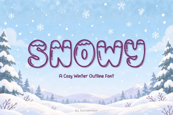
Snowy
Snowy is a cozy, puffy winter outline font draping soft, rounded snowcap drifts across the top of hollow marshmallow capitals!
Snowy is a puffy winter outline alphabet with hollow marshmallow letters and scalloped snowcap drifts sitting across the top of each character, covering upper and lower case. The hollow construction means the letter is defined by its outline, which reads as a sticker at 25 mm and as a soft shape at 150 mm, and the snowcaps add height that the layout must reserve. It needs roughly 25 mm for the scalloped drift to read as snow, and it is at its best in ice-blue outline on a pale ground or white on a deep blue panel.
Recommended project & layout
'LET IT SNOW' coloring sheet, winter mug & snow-day shirt — Center 1 uppercase word huge (80–160 pt) in plum or navy outline filled with icy blue + white snowcaps.
Before you cut or print
Awesome for Cricut Pen coloring cards, Print-Then-Cut stickers, sublimation tumblers, and 1.5 in+ layered HTV!
Best paired with
Get fontPaid link
 #10
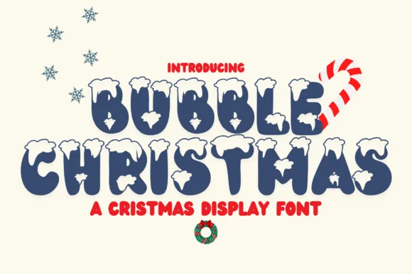
Bubble Christmas
Bubble Christmas crowns plump navy-blue cartoon bubble letters with fluffy white snowdrifts along every upper curve!
Bubble Christmas is a puffy winter bubble display with hollow rounded letters carrying scalloped snowcaps across their tops, so a word reads as a sticker of snow-covered balloons. The hollow construction makes the letter an outline, and the caps add height above the cap line that the layout must reserve. It needs roughly 26 mm for the scalloped drift to read as snow rather than as a wobble, and it is best in ice-blue outline on white or in white on a deep blue panel.
Recommended project & layout
'Let It Snow' family mug, holiday shirt & classroom banner — Stack 2 uppercase words at 64–120 pt in navy, evergreen, or crimson so the white snow caps pop.
Before you cut or print
Thin outlines around the snow caps favor sublimation mugs, DTF sweatshirts, and Print-Then-Cut stickers over small vinyl weeding!
Best paired with
Get fontPaid link
 #11
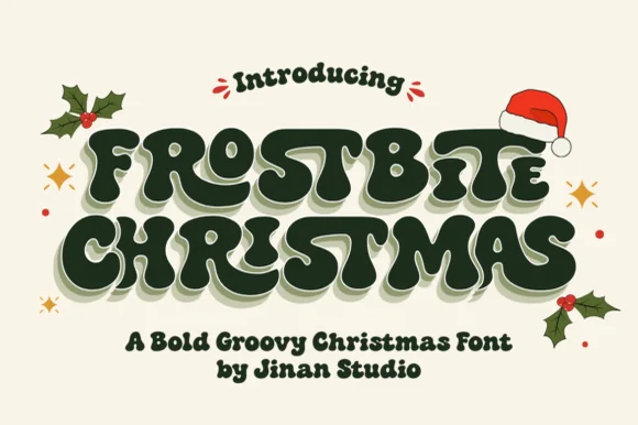
Frostbite Christmas
Frostbite Christmas drapes creamy white snowdrifts across heavy 1970s groovy bubble capitals for nostalgic retro holiday merch!
Frostbite Christmas is a snow-dusted nineteen-seventies groovy bubble display: fat rounded letters with a soft outline, a groovy baseline that rises and falls across the word, and a dusting of snow drawn as small white caps on the upper edge. The snow needs bare paper to read, and the groovy baseline grows the word vertically. It needs roughly 32 mm for the snow cap and the outline to read, and it is best in one deep ink on bright white, or a two-colour build on pale blue where the snow stays paper.
Recommended project & layout
'STAY FROSTY' / groovy holiday sweatshirt, mug & tote — Stack 2 groovy uppercase lines tight (64–120 pt) in evergreen, cranberry, or cocoa on cream fleece.
Before you cut or print
Two-tone snow-cap details shine on DTF sweatshirts, sublimated camp mugs, and Print-Then-Cut stickers!
Best paired with
Get fontPaid link
 #12
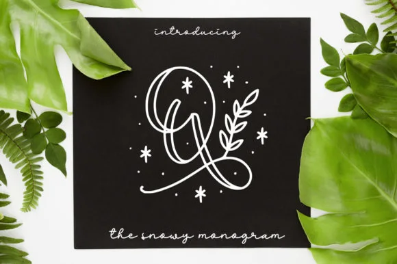
Quinn Monogram
Quinn Monogram wraps looped monoline script initials with hand-drawn botanical sprigs, berries, and twinkling winter stars.
Quinn Monogram is a decorative mark rather than a text face: continuous looped monoline script initials are wrapped in hand-drawn botanical sprigs, berries and small winter stars, so the result reads as a snowy monogram card rather than lettering with decoration. The sprigs surround the initial, which means the mark needs size for the leaves to read as leaves. It needs roughly 34 mm across for the botanicals to hold, and it is best in white on a dark card or in one ink on kraft.
Recommended project & layout
Foil-Quill holiday card, engraved slate coaster & gift tag — Center 1 botanical initial at 2.5–4 inches tall above a relaxed monoline script family name.
Before you cut or print
Delicate hairline loops + floating star dots are built for Foil Quill, pen plotting, laser engraving, and print—not blade-cut vinyl.
Best paired with
Get fontPaid link
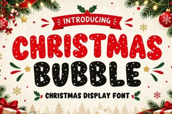 #13
Christmas Bubble
Christmas Bubble is a cheerful holiday bubble display font dusting chunky rounded capitals inside with falling snow-dot speckles!
Christmas Bubble is a festive bubble display whose plump rounded capitals are speckled inside with falling snow dots and carry comic shine arcs, so a word reads as a snow-globe sticker rather than as flat lettering. The speckle is interior and random, which means the face needs size for the dots to read as snow rather than as print dirt, and the rounded forms cut easily. It needs roughly 28 mm for the snowfall to resolve, and it is best in crimson and evergreen on white or in white on deep green.
Recommended project & layout
Christmas pajama-party invite, cocoa mug & cookie sticker — Color row one holly red and row two dark evergreen at 64–120 pt under a curved red ribbon banner.
Before you cut or print
Dozens of tiny snow-dot cutouts inside every letter mean sublimation, DTF, Print-Then-Cut, and flat print are the right tools—never weed vinyl!
Best paired with
Get fontPaid link
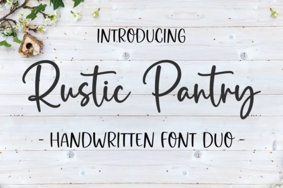 #14
Rustic Pantry
Rustic Pantry is a coordinated farmhouse font duo pairing a lively bouncy cursive script with a tall, narrow hand-drawn uppercase sans.
Rustic Pantry is a duo of a bouncy farmhouse brush script and a tall skinny marker sans: the script runs a loaded stroke with small flicks, a rising baseline and joined letters, while the sans is narrow with blunt marker ends for prices and lists. The two voices share one palette, so a jar label can carry a name and a list in the same hand. The script's bounce grows the word vertically and the marker sans stacks a long line in a narrow label. The script needs roughly 22 mm and the sans 18 mm for their detail to read.
Recommended project & layout
Glass pantry canister decal, spice-jar set & kitchen sign — Center the script word at 2–3.5 inches wide above a 0.5-inch tracked skinny sans descriptor line.
Before you cut or print
Weld all touching cursive connectors before cutting Oracal 651 permanent jar vinyl; medium stroke weight weeds cleanly.
Best paired with
Get fontPaid link
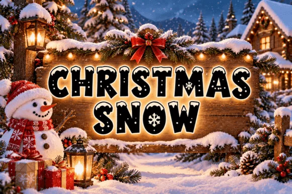 #15
Christmas Snow
Christmas Snow is a rounded capital alphabet in which the counters are punched with small snow dots, the strokes stay fat and a heavy outline wraps the word, so a greeting reads as lettering cut into a wooden sign and lit from behind.
The C curls a fat crescent, the H sets two stems with a snow dot in the bar, the R opens a wide bowl, the I drops a small dot and the S holds a soft spine, all at a festive weight with rounded corners, a contour drawn around the outside and dots cut inside the counters. The punched dots are the character: they replace plain counters, which is why the sample sets two stacked words in white on a dark board. Because the dots are small, the face needs 34 pt before they stay open, and it prints best in one light colour. The snowy forest, the wooden sign, the lantern, the snowman and the fairy lights are presentation; the white dotted words are the face.
Recommended project & layout
Winter cocoa mug, holiday pajama print or classroom door sign — Print/press on light or mid-tone backgrounds or add a white offset border on dark blanks.
Before you cut or print
Tiny snowfall dots and interior flakes favour sublimation, DTF and Print-Then-Cut over small vinyl.
Best paired with
Get fontPaid link
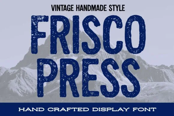 #16
Frisco Press
Frisco Press is a tall, heavy rounded sans-display font (not a slab serif) textured with authentic letterpress speckles and hand-carved warmth.
Frisco Press is a distressed woodblock-stamp condensed sans: narrow squared letters, a rough stamped contour with chipped edges, small ink voids inside the stems and a slightly uneven baseline that mimics hand-set type. The distress is drawn into the glyph rather than applied as a texture, so a one-colour print keeps the chips. It needs roughly 30 mm for the stamp chips to read as texture rather than dirt, and it is best in a single dense ink on kraft and newsprint, or black on a pale board.
Recommended project & layout
Mountain brewery can, ski-lodge sweatshirt & roast-coffee bag — Stack 2 all-caps words centered at 64–110 pt between solid horizontal banner strips.
Before you cut or print
Fine interior press-speckle dots are built for print, DTF, sublimation, and screen print—Contour specks solid if cutting vinyl.
Best paired with
Get fontPaid link
Serifs & Slab Serifs
2 fonts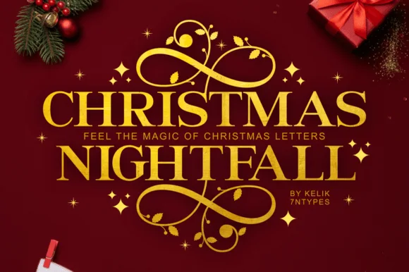 #17
Christmas Nightfall
Christmas Nightfall is a classic, high-contrast ornamental holiday serif crowned with elaborate top-and-bottom gold scrollwork flourishes.
Christmas Nightfall is an opulent holiday display serif with symmetrical filigree swashes: heavy bracketed stems, high thin-thick contrast and a pair of mirrored flourishes that curl off both sides of the word like an engraved frame. The filigree is the design and it closes into a blot as soon as the face is reduced, and the symmetry fixes the block's width. It needs roughly 34 mm for the filigree and the hairline to read, and it is best in one fine gold on a deep ground, or a dense ink on cream with a spot varnish.
Recommended project & layout
Foil holiday gala invite, Christmas Eve menu & velvet box — Insert a narrow tracked sans subline ('FEEL THE MAGIC' or family year) cleanly between the two stacked serif rows.
Before you cut or print
Delicate spiral tendrils and tiny star accents shine in gold foil stamping, print, and sublimation rather than small cut vinyl.
Best paired with
Get fontPaid link
 #18
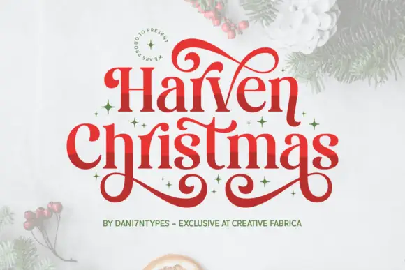
Harven Christmas
Harven Christmas is an upright high-contrast serif whose long swashes curl above the first line, below the second and across the space between the two words.
Hairlines are very fine against thick stems, with sharp bracketed serifs and a tall narrow waist, so the face reads as a classic roman until the swashes arrive. Those swashes start at the first and last letters and travel in wide arcs, crossing the space between words, which means the lockup needs deliberate vertical room rather than default leading. Two lines are used in the sample: the upper line sets one word in mixed case with its swash rising, the lower line lets a descender curl below the baseline. The pale photograph behind the specimen is context only. At small sizes the hairlines thin out much faster than the swashes do.
Recommended project & layout
A festive invitation — Reserve clear space above and below the heading.
Before you cut or print
Confirm how the visible alternates are entered.
Best paired with
Get fontPaid link
Practical buyer checklist
Frequently asked questions.
Key cutting, printing and pairing answers before choosing a winter typeface.
Can snow-capped fonts be cut from vinyl for ornaments?
At 1.5 inches or more, yes. The cap is fused to the stroke, so it cuts as one piece. Frost speckle and separate snowflakes will not survive weeding, so keep those for printed designs.
Which winter fonts work for a cosy small business brand?
The knit and rounded displays, in a two-colour palette. Avoid explicit Christmas words if the brand trades through January, and keep the snow detail light so it reads as winter rather than as a holiday campaign.
What is the best size for a wood slice ornament?
Lettering at 0.75 to 1 inch on a 3 inch slice, with the design kept inside a 2 inch circle. Below that the counter closes and the word turns into a decorative blob.
Do winter fonts include accented characters for European markets?
Seldom. Most craft fonts cover basic Latin only, so check before setting a phrase in French or German, since a missing accent forces a fallback face mid-word.
Keep exploring
Related collections & guides.
Explore adjacent maker roundups or check our practical pre-production checklists.
01 / Holidays & Seasons
Christmas
38 curated fonts · Previews & pairings
02 / Branding & Print
Soy candles, apothecary & skincare
29 curated fonts · Previews & pairings

03 / Cricut & Craft
Modern farmhouse & wood signs
27 curated fonts · Previews & pairings



04 / Type Styles
Luxury & modern serif
34 curated fonts · Previews & pairings
Guides: Invitation font checklist · Vinyl & cutting checklist · How to pair script & sans fonts