Neutral Sans Workhorse

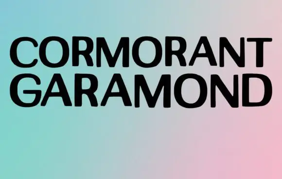
Winter Wish + Monure
Lets Winter Wish own the focal silhouette while handling secondary copy, sizing and subheads cleanly.
Inspect Monure specimenDisclosure: MakerFileHub may earn a commission from qualifying purchases via paid links on this page. How our links work.
Narrow winter lettering with long inward curls
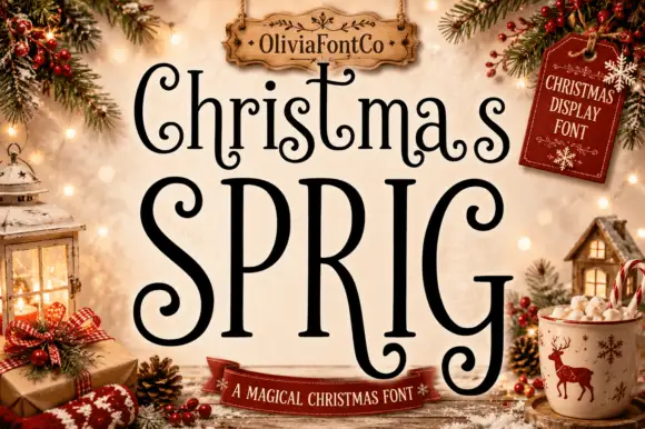
Winter Wish shows a very large narrow W beside lighter rounded forms, where the s coils inward at its foot and the final h closes on a low curled extension rather than a straight stem.
Paid link
Get this fontProject & layout blueprintsAt-a-glance maker compatibility
Sturdy stroke walls and open counters weed cleanly on adhesive vinyl, HTV apparel film, and cut cardstock.
Visual anatomy & craft review
The first letter grows beyond the rest, the bodies stay narrow, the coils turn inward and the last stroke reaches below the line. That single oversized initial is the character: the lockup interlocks a short seasonal phrase without a second typeface, which is why the sample sits inside a pale title panel among Christmas objects. The panel and props are artwork, and the arrangement demonstrates one fitted lockup rather than automatic shaping, so set your own phrase and keep 30 pt before the curls close.
Narrow · Inward curls · Festive
Two-font hierarchy recipes
Tested contrast partners — pairing Winter Wish with grounded secondary typography.
Winter Wish + Monure
Lets Winter Wish own the focal silhouette while handling secondary copy, sizing and subheads cleanly.
Inspect Monure specimen
Winter Wish + Kernova
Grounds bold display lettering with classic typographic authority on posters, badges and apparel.
Inspect Kernova specimenPractical applications
Concrete hierarchy, scale and production guidance tailored to Winter Wish’s stroke geometry.
The narrow lettering with one oversized initial suits a holiday card, and the interlock holds a two-word greeting at 30 pt on an A6 sheet.
Hierarchy & layout recipe
Print an A6 card: set the greeting at 30 pt so the large initial sits beside the lighter forms with 4 mm of tight but clear spacing, keep 16 mm of clear ground beneath for the inward curls, and keep 14 mm of margin all round.
Pre-production check
The inward coil merges with the following letter under 26 pt; check the card and hold the greeting at 28 pt or above.
The festive caps suit a small gift label, and the narrow bodies fit a short phrase at 22 pt on a 55 mm panel, where the oversized initial still holds its scale.
Hierarchy & layout recipe
Print a 55 by 40 mm label: set the phrase at 22 pt with the oversized initial on the same row, keep 8 mm of clear ground beneath for the final curl, and keep 5 mm of border so the low extension is not cut.
Pre-production check
A low curl crossing the border looks damaged; check the artwork and keep 6 mm of clear panel below the line.
The interlocking lettering reads across a counter, and the heavy initial holds a two-word sign at 50 pt on a printed board.
Hierarchy & layout recipe
Print a 500 by 250 mm board: set the sign at 50 pt with the initials kept at their drawn relationship, keep 24 mm of clear ground beneath for the curls, and set the opening hours at 14 pt in a plain caps on a band beneath.
Pre-production check
A fitted lockup scaled unevenly loses the interlock; check the board and scale both words together.
Technical & licence verification
Confirm included OTF/TTF/WOFF formats, full glyph tables and licence coverage on the live store page before batch production.
Closest visual alternatives
Matched across letterform anatomy, stroke behaviour and craft applications.
Pine tree illustrated display
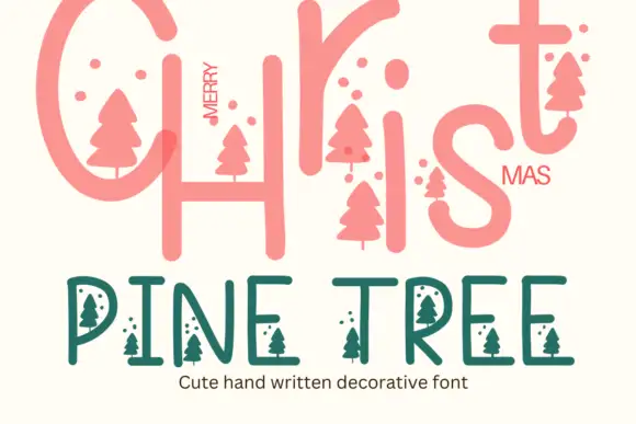
Pine Tree is a seasonal decorative face in coral and green on cream: a large rounded script-style Christmas line at the top, and a lighter capitals line beneath in which small pine-tree silhouettes hang from the letters and small dots float between them, with a caption under that.
Ideas for this font
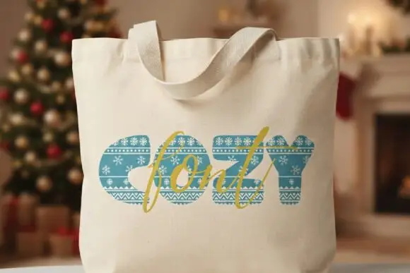
Heavy blue-green capitals filled with pale Nordic-knit-like horizontal bands
Cozy appears on a cream tote mockup as thick blue-green capitals containing horizontal decorative bands. White snowflakes, tiny repeated motifs and zigzags cross the strokes like a knitted winter pattern, and a gold script word overlaps the block title as a second, clearly different lettering layer.
Ideas for this font
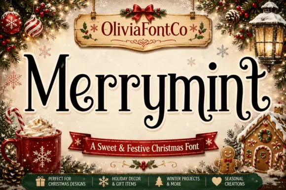
Festive serif with curled terminals
Merrymint is a festive serif in near-black on cream: a moderate-contrast serif with ball terminals that curl into hooks, a wide x-height, generous spacing and a slight bounce, framed by a Christmas still life with a banner naming it a sweet and festive face.
Ideas for this font
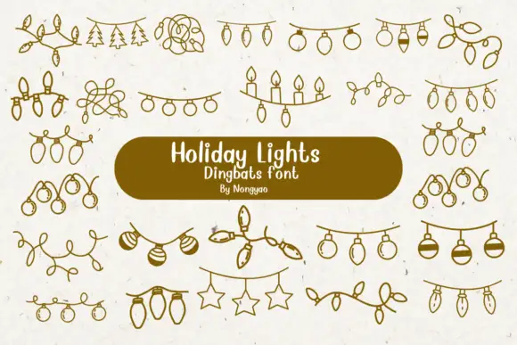
Loose line-art dingbats of hanging lights, baubles and tangled strings
Holiday Lights is a dingbat font that draws Christmas light garlands in one even line: bulb strings, loops of wire, rows of candles, hanging stars and sprigs of pine, all ready to be dropped between two pieces of type.
Ideas for this font
Same independent foundry
Allow optional Google Analytics to measure visits and catalogue actions. Your search words and notes are not included. Privacy & storage