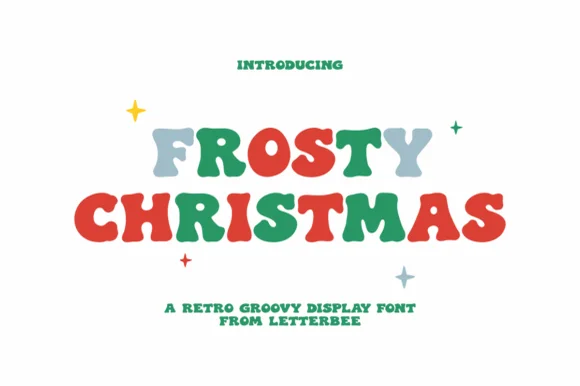
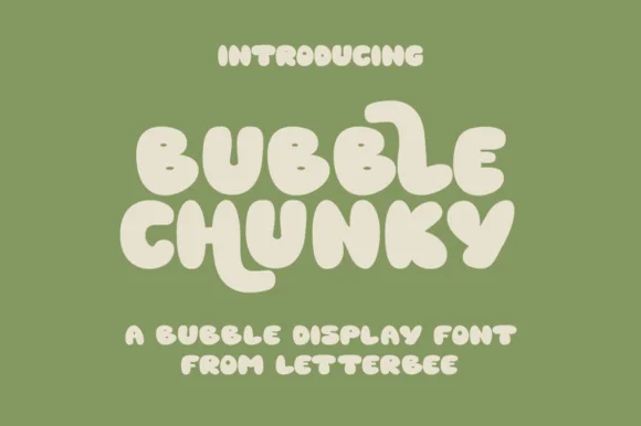
Neutral Sans Workhorse

Bubble Cream + Godthem
Lets Bubble Cream own the focal silhouette while handling secondary copy, sizing and subheads cleanly.
Inspect Godthem specimenDisclosure: MakerFileHub may earn a commission from qualifying purchases via paid links on this page. How our links work.
Soft groovy ice-cream-scoop & pastel bubble display
Bubble Cream is a sweet, organic rounded display font featuring playful stretched U/R tails and pillowy ice-cream-scoop curves.
Paid link
Get this fontProject & layout blueprintsAt-a-glance maker compatibility
Sturdy stroke walls and open counters weed cleanly on adhesive vinyl, HTV apparel film, and cut cardstock.
Visual anatomy & craft review
Bubble Cream is a soft groovy ice-cream display: scoop-shaped letters with a rounded top, a thin outline, pastel fills and a small drip or swirl at the base of some characters. The scoops close their counters early and the swirls are the finest element, and the pastel palette means a one-ink print loses the idea. It needs roughly 30 mm for the swirl and the outline to read, and it is best in three pastels on white, or one ink plus bare paper for the swirl on coloured card.
Ice-cream-soft · Pastel-groovy · Sweet
Two-font hierarchy recipes
Tested contrast partners — pairing Bubble Cream with grounded secondary typography.
Bubble Cream + Godthem
Lets Bubble Cream own the focal silhouette while handling secondary copy, sizing and subheads cleanly.
Inspect Godthem specimen
Bubble Cream + Cervelique
Grounds bold display lettering with classic typographic authority on posters, badges and apparel.
Inspect Cervelique specimenPractical applications
Concrete hierarchy, scale and production guidance tailored to Bubble Cream’s stroke geometry.
An ice-cream scoop display announces a summer birthday in the lettering, so the invite needs no illustration. The swirls read at 36 mm, and three pastels print the invite and the wraps as one set.
Hierarchy & layout recipe
Invite A6, word 36 mm with 8 mm swirl clearance, details 8/11 pt, 12 mm margins. Topper 130 x 110 mm, word 44 mm with a 6 mm stick slot and 12 mm clear. Cup wrap 200 x 90 mm, word 20 mm, 12 mm from the rim.
Pre-production check
A cup wrap printed across the taper doubles the swirl at the seam and the word reads as a row of scoops. Keep the word inside the flat 60 mm centre band, and wrap one cup before the party.
A scoop display reads as the product turned into lettering, which is what a gelato shop wants above its counter. The scoops hold at 30 mm on a tub, and three pastels print the labels and the board in one order.
Hierarchy & layout recipe
Tub label 90 x 60 mm, word 22 mm with 6 mm swirl clearance, 5 mm die margin. Menu board 600 x 900 mm, header 80 mm, items 26 mm, 30 mm margins. Card 85 x 55 mm, word 14 mm, 5 mm margins.
Pre-production check
A 90 x 60 mm tub label at 22 mm closes the scoop counters and the name reads as a pastel blob in the freezer. Raise the label word to 30 mm, and check one tub under freezer light before the batch.
A soft scoop display reads as a hand-painted kiosk poster rather than a modern advert, which is what a beach kiosk wants on its hatch. The swirl holds at 110 mm, and three pastels print the poster and the drink cards in one pass.
Hierarchy & layout recipe
Poster A2, word 110 mm with 12 mm swirl clearance, details 34 mm, 20 mm margins. Drink card 105 x 148 mm, header 30 mm, items 10 mm. Towel tag 60 x 90 mm, word 14 mm with a 4 mm hole and 8 mm clear.
Pre-production check
On a 60 x 90 mm towel tag at 14 mm the swirl merges with the outline and the word reads as a dab. Raise tags to 20 mm, and print one tag on the loop card before the batch.
Technical & licence verification
Confirm included OTF/TTF/WOFF formats, full glyph tables and licence coverage on the live store page before batch production.
Closest visual alternatives
Matched across letterform anatomy, stroke behaviour and craft applications.
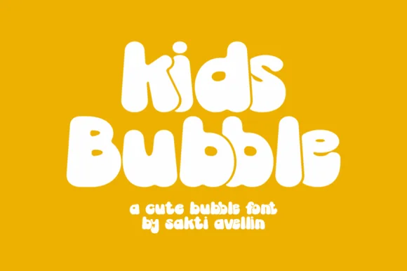
Groovy 70s marshmallow lowercase & mixed-case bubble font
Kids Bubble is a buoyant, ultra-heavy mixed-case bubble font packing 1970s marshmallow warmth into chubby lowercase letters.
Ideas for this font
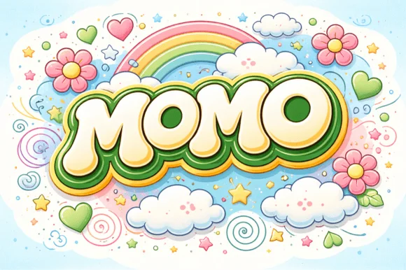
Groovy 60s/70s rainbow-flower-power plump bubble font
Momo is a plush, groovy retro bubble display font built for multi-ringed 1970s rainbow outlines, daisy illustrations, and puff-print apparel.
Ideas for this font
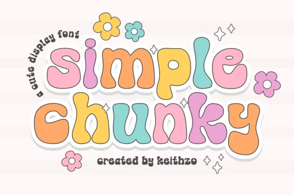
Chunky multicolour sticker display
Simple Chunky is a chunky rounded display in pastel multicolour with a white contour and a soft offset shadow: fat lowercase letters, a bouncing baseline, daisy and sparkle ornaments, and a curved note in a light script at the left, so the plate reads as a sticker sheet.
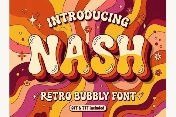
Groovy 1970s psychedelic lava-lamp bubble display (OTF & TTF)
Nash is a cheerful 1970s psychedelic bubble display font swelling bottom-heavy groovy curves for retro shirts, posters, and mugs (OTF & TTF).
Ideas for this font
Same independent foundry
Allow optional Google Analytics to measure visits and catalogue actions. Your search words and notes are not included. Privacy & storage