High-Contrast Display Serif

Itsmehello Regular + Gorga
Pairs sculptural editorial warmth with Itsmehello Regular's clean modern geometry.
Inspect Gorga specimenDisclosure: MakerFileHub may earn a commission from qualifying purchases via paid links on this page. How our links work.
Chunky bubble & looping script duo
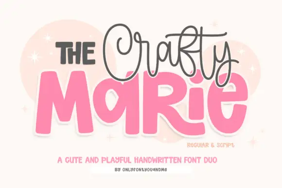
Itsmehello Regular pairs a fat rounded seventies display face with a smooth monoline script, where the wide white caps sit as a background block with a soft outline and the connected cursive threads across their lower half in a flat pink.
Paid link
Get this fontProject & layout blueprintsAt-a-glance maker compatibility
Weld or Unite overlapping script joins into one continuous vector path before sending to the blade.
Visual anatomy & craft review
The display row stays wide and inflated, the script stays one thin weight, the script crosses the caps rather than sitting below them, and the outline lifts the block off the pale ground. That crossing is the character, because the two voices occupy the same space and the eye reads one shape rather than two rows. The pink planet and the sparkles are cover artwork. Keep 46 pt for the caps, keep 22 pt for the script, and check that the script colour holds enough contrast over the pale caps.
Playful · Paired · Retro-pop
Two-font hierarchy recipes
Tested contrast partners — pairing Itsmehello Regular with grounded secondary typography.
Itsmehello Regular + Gorga
Pairs sculptural editorial warmth with Itsmehello Regular's clean modern geometry.
Inspect Gorga specimen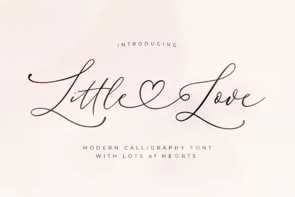
Itsmehello Regular + Little Love
Introduces organic movement on pull-quotes, signatures and gift tags.
Inspect Little Love specimenPractical applications
Concrete hierarchy, scale and production guidance tailored to Itsmehello Regular’s stroke geometry.
The bubble caps set a period card and the script crossing them keeps the greeting in one compact block instead of two rows.
Hierarchy & layout recipe
Print a 120 by 170 mm card: set the greeting in the caps at 44 pt, run the name in the script at 22 pt across the lower third, keep 20 mm of clear ground beneath, and keep 15 mm of margin.
Pre-production check
The script over pale caps loses contrast; check the card and darken the script to a solid tone.
The wide caps give a cup or bottle a period mark and the monoline script supplies the second line without a second pairing.
Hierarchy & layout recipe
Print a 60 by 60 mm cup label: set the shop name in the caps at 24 pt, set the strapline in the script at 12 pt across the caps, keep 6 mm of clear ground, and keep 5 mm to the die edge.
Pre-production check
The outline thickens the block by 2 mm per side; check the artwork against the die line first.
The inflated caps carry a summer poster and the script fills the join between the rows, so a short title looks full without extra copy.
Hierarchy & layout recipe
Print an A2 poster: set the title in the caps at 100 pt on one row, run the date line in the script at 30 pt across it, keep 28 mm of clear ground beneath, and keep 24 mm of border.
Pre-production check
Overlapping rows at poster size need the outline to stay distinct; check a scaled proof first.
Technical & licence verification
Confirm included OTF/TTF/WOFF formats, full glyph tables and licence coverage on the live store page before batch production.
Closest visual alternatives
Matched across letterform anatomy, stroke behaviour and craft applications.
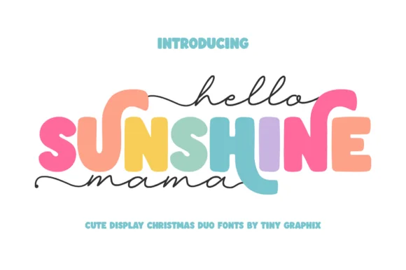
Chunky rounded caps in mixed colours with a fine monoline script above and below
Hello Sunshine Mama pairs chunky rounded caps that can each take a different colour with a fine monoline script that runs above and below the caps in long flat strokes.
Ideas for this font
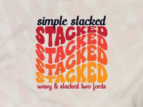
Wavy repeated display letters stacked in three offset rows
Simple Stacked is a wavy display in which rounded capitals repeat down three offset rows, each row bending and stretching the letters differently, so a short word reads as a rainbow of stacked script rather than a plain line.
Ideas for this font
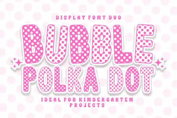
Rounded bubble capitals in two polka-dot colourways with a soft edge
Bubble Polka Dot is a duo of rounded bubble capitals supplied in two dotted colourways, one pale letters on a pink dot field and one pink letters on a pale field, so a poster can alternate letters for contrast.
Ideas for this font
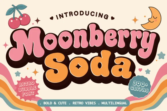
Plump retro bubble with heart-shaped interior counters
Moonberry Soda is a plump retro bubble display in which the round bowls hide heart-shaped counters, the silhouettes stay thick and soft and the alternates add playful variants, so a short word reads as a kawaii sticker.
Ideas for this font
Same independent foundry
Allow optional Google Analytics to measure visits and catalogue actions. Your search words and notes are not included. Privacy & storage