Neutral Sans Workhorse

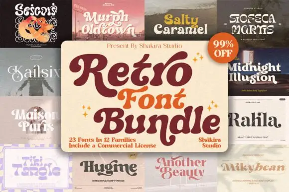
Tiki Tangle + Monure
Lets Tiki Tangle own the focal silhouette while handling secondary copy, sizing and subheads cleanly.
Inspect Monure specimenDisclosure: MakerFileHub may earn a commission from qualifying purchases via paid links on this page. How our links work.
Wavy retro surf display with flared groovy curves
Tiki Tangle is a wavy retro display in which the letters bounce along a loose line, the curves flare at the terminals and the counters stay open, so a short phrase reads as a nineteen-sixties surf poster without any distress.
Paid link
Get this fontProject & layout blueprintsAt-a-glance maker compatibility
Sturdy stroke walls and open counters weed cleanly on adhesive vinyl, HTV apparel film, and cut cardstock.
Visual anatomy & craft review
The T flares a wide top, the k splays two curved arms, the i dots small and round and the g drops a soft tail, all at a medium weight with smooth solid outlines and a bounce that shifts each letter a few points up or down. The clean vector edge is the character: there is no texture in the fill, which is why the sample sets a two-word phrase in one flat colour. Because the letters bounce, a long line needs deliberate leading from 30 pt, and the face cuts cleanly from three quarters of an inch of cap height. The wave illustration, the sun and the small caption are presentation; the groovy lettering is the face.
Groovy · Surf · Breezy
Two-font hierarchy recipes
Tested contrast partners — pairing Tiki Tangle with grounded secondary typography.
Tiki Tangle + Monure
Lets Tiki Tangle own the focal silhouette while handling secondary copy, sizing and subheads cleanly.
Inspect Monure specimen
Tiki Tangle + Raffined
Grounds bold display lettering with classic typographic authority on posters, badges and apparel.
Inspect Raffined specimenPractical applications
Concrete hierarchy, scale and production guidance tailored to Tiki Tangle’s stroke geometry.
The surf bounce suits a summer counter sign, and the solid curves stay crisp at 60 mm on an A3 board in two flat colours.
Hierarchy & layout recipe
Print an A3 sign: set the shop phrase at 60 mm, keep 22 mm between lines so the bounce does not collide, and set the menu in a 14 pt sans in the lower third.
Pre-production check
A bouncing baseline set on tight leading tangles its ascenders; check the sign and open the gap by 6 mm.
The groovy weight suits a hangtag, and the flared curves stay clear at 20 pt on a 50 mm kraft tag tied to a garment with string.
Hierarchy & layout recipe
Print a 50 by 80 mm tag: set the range name at 20 pt, punch a 4 mm hole 9 mm from the top edge, and keep 8 mm between that hole and the tallest flare.
Pre-production check
A flared terminal near a punched hole weakens the card; check the die and shift the hole 4 mm clear.
The retro curves suit a die-cut sticker, and the solid fill stays whole at 30 mm on a shaped die with a plain pale ground.
Hierarchy & layout recipe
Print a 55 mm shaped sticker: set the word at 30 mm, keep 4 mm of clear vinyl around the outermost curve, and print in one flat colour on white stock.
Pre-production check
A die cut that hugs a flared terminal leaves a fragile rim; check the sheet and keep 4 mm of clearance.
Technical & licence verification
Confirm included OTF/TTF/WOFF formats, full glyph tables and licence coverage on the live store page before batch production.
Closest visual alternatives
Matched across letterform anatomy, stroke behaviour and craft applications.
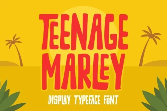
Tall hand-cut tropical tiki & surf poster display
Teenage Marley is a tall, upbeat hand-cut display typeface with dancing tropical stems, tapered brush curves, and breezy island poster rhythm.
Ideas for this font
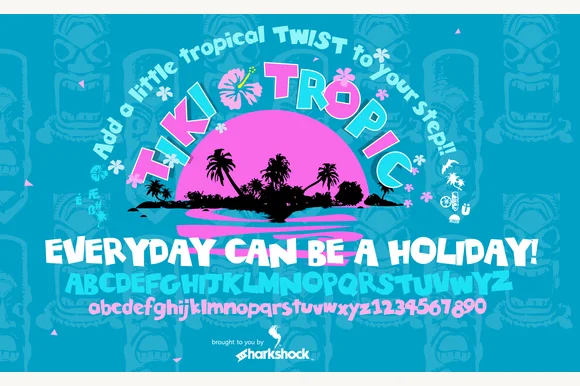
Classic Polynesian carved-wood & surf-shack display (Full charset)
Tiki Tropic (by Sharkshock) is a full-featured tropical wood-carved display font covering A–Z, playful lowercase, and 0–9 numerals.
Ideas for this font
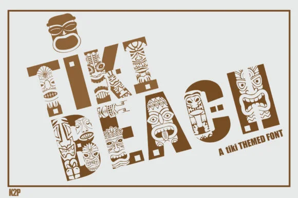
Polynesian carved-totem & tiki mask decorative display
Tiki Beach is an illustrated tropical display font whose chunky block capitals are filled with carved tiki faces, palm-frond chevrons, and tribal motifs.
Ideas for this font
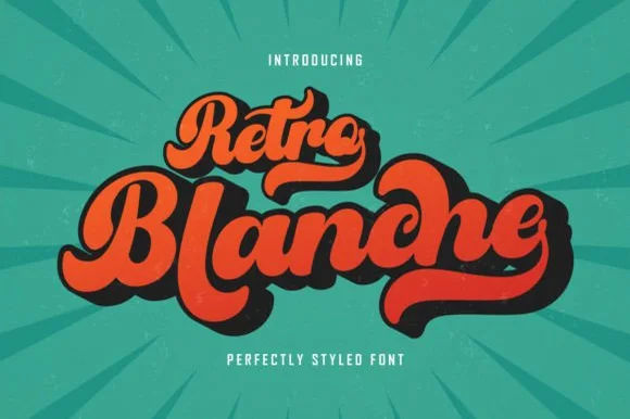
Retro fat script with extrusion
Retro Blanche is a fat retro script in orange on a teal sunburst: heavy connected strokes, a strong slope, small loops and a solid dark extrusion behind every letter, so the pair reads as a painted sign from a mid-century diner.
Same independent foundry
Allow optional Google Analytics to measure visits and catalogue actions. Your search words and notes are not included. Privacy & storage