Modern Grotesque Body

Dream to Berich Font + Kohilo
Creates crisp high-hierarchy contrast beneath Dream to Berich Font headlines across menus, websites and labels.
Inspect Kohilo specimenDisclosure: MakerFileHub may earn a commission from qualifying purchases via paid links on this page. How our links work.
Heavy soft retro lettering with large interwoven loops
Dream to Berich shows orange mixed-case letters with thick rounded strokes and tight curved counters, where the large D and B capitals curl inward and a long loop fills the gap between the two title rows on a pale cover that advertises a two-style and an italic version in the corners.
Paid link
Get this fontProject & layout blueprintsAt-a-glance maker compatibility
Sturdy stroke walls and open counters weed cleanly on adhesive vinyl, HTV apparel film, and cut cardstock.
Visual anatomy & craft review
The strokes stay thick, the counters squeeze tight, the capitals roll inward and one loop bridges the rows. That bridge is the character: the stack reads as a single ornament rather than two lines, which is why the sample keeps three words close together. The corner notes promise two styles and an italic without showing them. Keep 40 pt so the tight counters stay open, check whether the loop is a letter or an added flourish and confirm the italic file before planning a paired setting.
Heavy soft retro lettering with large interwoven loops
Two-font hierarchy recipes
Tested contrast partners — pairing Dream to Berich Font with grounded secondary typography.
Dream to Berich Font + Kohilo
Creates crisp high-hierarchy contrast beneath Dream to Berich Font headlines across menus, websites and labels.
Inspect Kohilo specimen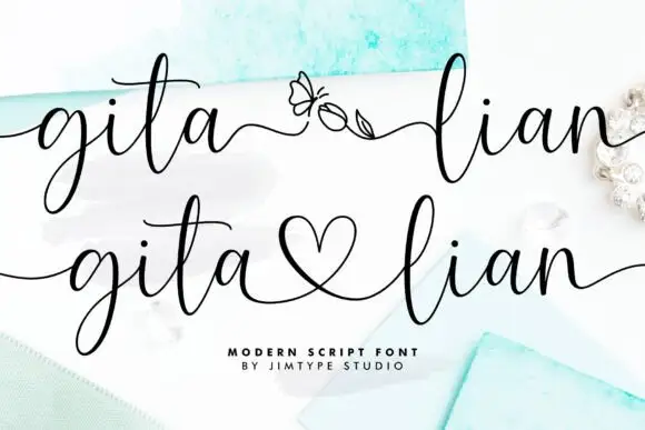
Dream to Berich Font + Gita Lian
Adds a warm human signature touch for 1-to-3-word callouts without competing against structured serif capitals.
Inspect Gita Lian specimenPractical applications
Concrete hierarchy, scale and production guidance tailored to Dream to Berich Font’s stroke geometry.
The rounded serif gives a box a warm period feel, and the thick strokes hold a short bakery name at 24 pt on a small label.
Hierarchy & layout recipe
Print a 60 by 90 mm box label: set the bakery name at 24 pt on one row, keep 10 mm of clear ground beneath before the weight at 7 pt, and keep 6 mm to the die edge for the inward curls.
Pre-production check
Tight counters fill in under 20 pt; check the plate proof and hold the name at 22 pt or above.
The chunky serif carries a themed greeting, and the inward curls give the card movement without needing a photograph behind it.
Hierarchy & layout recipe
Print a 105 by 148 mm card: set the greeting at 34 pt across two rows with 12 mm between baselines, keep 18 mm of clear ground beneath, and keep 15 mm of margin at each side.
Pre-production check
The bridging loop needs its own space; check the card and keep the details line 20 mm away.
The bold rounded forms read across a counter, and the thick strokes hold their shape when a short name is painted large.
Hierarchy & layout recipe
Paint a 600 by 300 mm board: set the stall name at 56 mm across two rows, keep 24 mm of clear ground beneath before the prices at 16 pt, and keep 26 mm of border all round.
Pre-production check
The advertised italic is not shown; check your files before pairing two styles on the board.
Technical & licence verification
Confirm included OTF/TTF/WOFF formats, full glyph tables and licence coverage on the live store page before batch production.
Closest visual alternatives
Matched across letterform anatomy, stroke behaviour and craft applications.
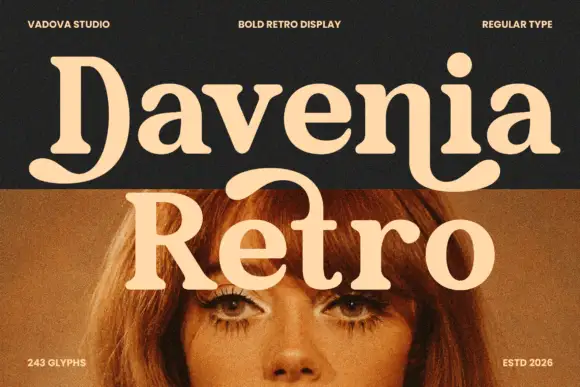
Heavy soft serif lettering with a broad D tail and hooked n ending
Davenia Retro sets a bold serif with high-waisted bowls, a round shoulder and a D that opens into a swash, so a two-word title looks like a printed poster from the early seventies.
Ideas for this font
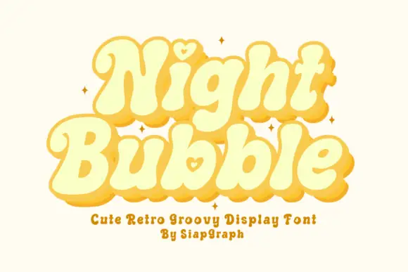
Soft retro bubble letters with hearts
Night Bubble is a soft retro display face in butter yellow: fat rounded letterforms, an offset pink shadow, and a small heart tucked into the counters of the N and the b.
Ideas for this font
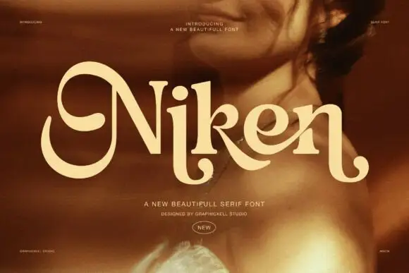
Rounded serif with rolled initials
Niken is a rounded serif in cream over a warm portrait: mixed case with an oversized rolled N, soft curved endings, thick stems and open bowls, set as one word with two small lines above and two beneath, the second in a script.
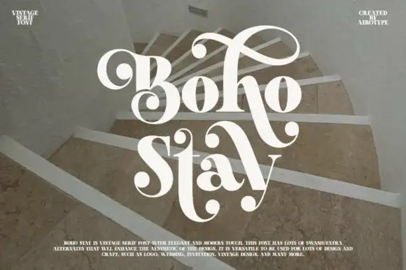
Heavy soft serifs with large ball-ended looping swashes
Boho Stay is a heavy soft serif in which the letters carry strong thick-thin contrast, the counters stay tight and large curled swashes with ball ends frame the capital, rise over the first row and sweep between the two title lines.
Ideas for this font
Same independent foundry
Allow optional Google Analytics to measure visits and catalogue actions. Your search words and notes are not included. Privacy & storage