Editorial Serif Anchor

Krandish + Things
Anchors Krandish's fluid strokes with crisp Roman proportions on wedding suites, headers and packaging.
Inspect Things specimenDisclosure: MakerFileHub may earn a commission from qualifying purchases via paid links on this page. How our links work.
Chunky 1970s swash-tail retro brush script
Krandish is a heavy, cream-smooth 1970s retro script featuring dramatic looping swash capitals and thick figure-eight underline tails.
Paid link
Get this fontProject & layout blueprintsAt-a-glance maker compatibility
Cut solid base, outline, and shadow layers in separate vinyl colors and align on registration marks.
Visual anatomy & craft review
Krandish is a chunky nineteen-seventies retro brush script with swash tails: a very heavy loaded stroke, a firm slant and tails that extend straight off the first and last letters before curling up at the tip. The tails widen the word and are the first thing trimmed, and the heavy weight closes the counters early. It needs roughly 30 mm for the tail and the heavy stroke to read, and it is best in two warm inks on cream, or one burnt orange on white where the tails still read as drawn lines.
Groovy · Bold · Nostalgic
Two-font hierarchy recipes
Tested contrast partners — pairing Krandish with grounded secondary typography.
Krandish + Things
Anchors Krandish's fluid strokes with crisp Roman proportions on wedding suites, headers and packaging.
Inspect Things specimen
Krandish + Borsen
Keeps small-scale dates, URLs, nutrition facts and care instructions crisp and legible below script titles.
Inspect Borsen specimenPractical applications
Concrete hierarchy, scale and production guidance tailored to Krandish’s stroke geometry.
A heavy seventies script reads as a hand-drawn festival bill rather than a modern flyer. The tails hold at 150 mm on a poster, and two warm inks print the poster and the tote from one separation.
Hierarchy & layout recipe
Poster A2, word 150 mm with 15 mm tail clearance, details 44 mm, 20 mm margins. Stage banner 3000 x 800 mm, word 260 mm, 60 mm safe edge. Tote print 300 x 300 mm, word 70 mm, 25 mm margins.
Pre-production check
Screen printed on a tote at 70 mm the tails bridge into the word after a wash. Keep 3 mm between the tail and the word, and wash one sample before the order.
A seventies brush script reads as a printed sleeve rather than a modern logo. The tails hold at 60 mm on a sleeve, and two warm inks print the sleeve and the cards in one order.
Hierarchy & layout recipe
Sleeve print 300 x 300 mm, word 70 mm with 12 mm tail clearance, 20 mm margins. Card 85 x 55 mm, word 20 mm, 5 mm margins. Bag print 200 x 250 mm, word 50 mm, 15 mm margins.
Pre-production check
On an 85 x 55 mm card the tail runs into the next word and the name reads as one ribbon. Keep the card word at 28 mm, and check one card before the run.
A chunky retro script announces a themed birthday through the lettering alone. The tails hold at 44 mm on a topper, and two warm inks print the invite and the banner as one set.
Hierarchy & layout recipe
Invite A6, word 44 mm with 12 mm tail clearance, details 8/11 pt, 12 mm margins. Topper 130 x 110 mm, word 48 mm with a 6 mm stick slot and 12 mm clear. Banner 1500 x 400 mm, word 150 mm, 30 mm safe edge.
Pre-production check
A 130 mm topper cut through a tail tip leaves a 1 mm sliver that snaps on the stick. Cut toppers with a 2 mm bridge, and test one before the party.
Technical & licence verification
Confirm included OTF/TTF/WOFF formats, full glyph tables and licence coverage on the live store page before batch production.
Closest visual alternatives
Matched across letterform anatomy, stroke behaviour and craft applications.
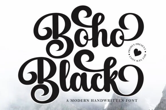
Ultra-bold 70s coiled-swash retro calligraphy script
Boho Black is an ultra-bold, plush retro script wrapping thick brush downstrokes in dramatic 1970s spiral curls and bouncy loops.
Ideas for this font
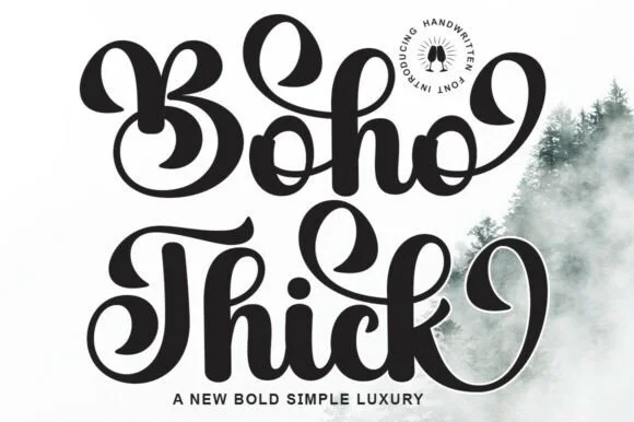
Chunky retro-groovy swashed brush script
Boho Thick is a bold, curvy retro calligraphy script (not a geometric display) packing heavy teardrop swashes and thick vinyl-friendly strokes!
Ideas for this font
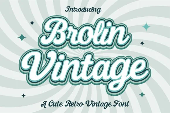
Creamy 1970s soda-fountain & ice-cream parlor script
Brolin Vintage is actually a lush, plump 1970s retro script (NOT a rigid block display!) built for multi-ringed pastel outlines and diner-parlor logos!
Ideas for this font
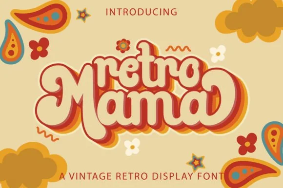
Groovy 1970s connected marshmallow script with swash loops
Retro Mama is a plump, connected 1970s marshmallow script featuring bulbous heart-cleft M arches and sweeping wrap-around swash loops.
Ideas for this font
Same independent foundry
Allow optional Google Analytics to measure visits and catalogue actions. Your search words and notes are not included. Privacy & storage