Neutral Sans Workhorse

Letterpress + Montreal
Lets Letterpress own the focal silhouette while handling secondary copy, sizing and subheads cleanly.
Inspect Montreal specimenDisclosure: MakerFileHub may earn a commission from qualifying purchases via paid links on this page. How our links work.
Heavy woodblock-grunge condensed poster grotesk
Letterpress is a tall, heavy condensed sans-display font stamped with authentic wood-type ink voids, chipped edges, and poster-press grit.
Paid link
Get this fontProject & layout blueprintsAt-a-glance maker compatibility
Fine grain and micro-texture excel in 300 DPI print, sublimation, and screen print rather than small vinyl weeding.
Visual anatomy & craft review
Letterpress is a heavy woodblock-grunge condensed grotesk: very narrow letters, an extremely heavy stem, small counters and a printed texture of chipped edges, ink squash and lighter patches inside the stroke. The condensation plus the weight means the counters are the first thing to close, and the texture is drawn so it survives one-colour printing. It needs roughly 32 mm for the counters and the chipped edge to read, and it is best in one dense black on newsprint and uncoated board.
Gritty · Press-worn · Punchy
Two-font hierarchy recipes
Tested contrast partners — pairing Letterpress with grounded secondary typography.
Letterpress + Montreal
Lets Letterpress own the focal silhouette while handling secondary copy, sizing and subheads cleanly.
Inspect Montreal specimen
Letterpress + Alerigue
Grounds bold display lettering with classic typographic authority on posters, badges and apparel.
Inspect Alerigue specimenPractical applications
Concrete hierarchy, scale and production guidance tailored to Letterpress’s stroke geometry.
A woodblock-grunge grotesk reads as a printed poster from a letterpress shop, which gives an investigative feature the weight of a headline that had to be set by hand. The narrow stems stack a long title at 72 pt, and the printed texture holds in one black ink on uncoated stock.
Hierarchy & layout recipe
Opener 210 x 297 mm, title 72 pt with 6 mm chipped-edge clearance, standfirst 11/15 pt, body 9/13 pt in three columns, 18 mm margins. Quote slab 210 x 80 mm, word 50 pt. Cover band 210 x 60 mm, word 40 pt.
Pre-production check
At 50 pt on the quote slab the counters of the A and R close and the slab reads as a black bar with white specks. Keep the face at 60 pt and above, and proof one spread at 1:1 before the run.
A condensed woodblock grotesk reads as a painted shutter rather than a modern shop logo, which is what a repair shop wants on its front and its paperwork. The heavy stems hold at 60 mm on a roller shutter, and one ink covers the tag, the card and the shutter without a second pass.
Hierarchy & layout recipe
Shutter sign 2000 x 600 mm, word 200 mm with 20 mm edge clearance. Work-order tag 100 x 60 mm, word 16 mm, 5 mm margins. Card 85 x 55 mm, word 14 mm, 5 mm margins.
Pre-production check
On a 100 x 60 mm work-order tag at 16 mm the chipped texture turns to noise and the shop name reads as a stain. Use the clean companion on tags and keep the grunge for the shutter, then check one tag on the actual card.
A woodblock grotesk reads as an apple-press poster printed a hundred years ago, which is exactly what an autumn cider brand wants above its crates. The narrow heavy stems hold at 120 mm, and one black on a warm uncoated sheet prints the poster, the label and the crate stamp in a single order.
Hierarchy & layout recipe
Poster A2, word 120 mm with 12 mm chipped-edge clearance, details 34 mm, 20 mm margins. Cider label 80 x 60 mm, word 16 mm, 5 mm margins. Crate stamp 300 x 150 mm, word 70 mm, 20 mm margins.
Pre-production check
On a wet-pressed label stock the chipped edge fills and the label prints as a solid condensed black with no texture at all. Print labels on a dry uncoated sheet or accept the flat look, and check one label on the bottle.
Technical & licence verification
Confirm included OTF/TTF/WOFF formats, full glyph tables and licence coverage on the live store page before batch production.
Closest visual alternatives
Matched across letterform anatomy, stroke behaviour and craft applications.
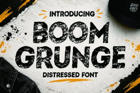
Heavy sponge-stamped & spray-speckled urban display sans
Boom Grunge is a wide, chunky urban sans-display font heavily textured inside and out with coarse asphalt and sponge-stamp grit.
Ideas for this font
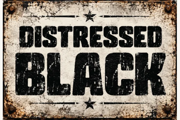
Heavy asphalt-cracked industrial grunge block sans
Distressed Black is an ultra-heavy industrial block sans (NOT delicate handwriting!) blasted with authentic scratched-paint & rusted-sign distressing!
Ideas for this font
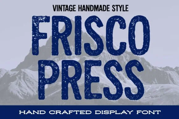
Distressed woodblock-stamp condensed vintage sans display
Frisco Press is a tall, heavy rounded sans-display font (not a slab serif) textured with authentic letterpress speckles and hand-carved warmth.
Ideas for this font
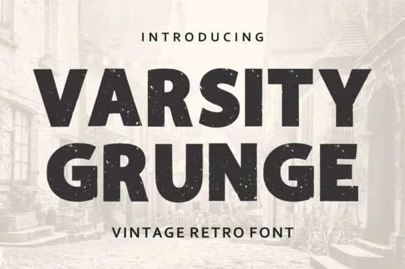
Weathered vintage athletic block sans
Varsity Grunge is a bold, stamp-weathered athletic block sans built for vintage gym tees, tailgate coolers, and throwback sweatshirts.
Ideas for this font
Same independent foundry
Allow optional Google Analytics to measure visits and catalogue actions. Your search words and notes are not included. Privacy & storage