Neutral Sans Workhorse

Klashmode + Furion
Lets Klashmode own the focal silhouette while handling secondary copy, sizing and subheads cleanly.
Inspect Furion specimenDisclosure: MakerFileHub may earn a commission from qualifying purchases via paid links on this page. How our links work.
Chaotic punk-street & ransom-tilted grunge display (OTF)
Klashmode is a raw, rebellious street-grunge display font mixing chunky tilted uppercase and lowercase blocks with rough ink-stamp edges.
Paid link
Get this fontProject & layout blueprintsAt-a-glance maker compatibility
Fine grain and micro-texture excel in 300 DPI print, sublimation, and screen print rather than small vinyl weeding.
Visual anatomy & craft review
Klashmode is a chaotic punk display that mixes chunky tilted uppercase and lowercase blocks with rough ink-stamp edges, so a word looks assembled from cut-outs rather than set on a baseline. Tilt is baked into each glyph, which means the face already carries the ransom-note instability and only needs a short phrase to work. Ink-stamp roughness sits on the edges, so it survives a low-resolution print, and it needs roughly 18 mm for the tilt to read as intentional rather than as a mistake. It is a sticker, flyer and zine face.
Street-rebel · Tilted · Raw
Two-font hierarchy recipes
Tested contrast partners — pairing Klashmode with grounded secondary typography.
Klashmode + Furion
Lets Klashmode own the focal silhouette while handling secondary copy, sizing and subheads cleanly.
Inspect Furion specimen
Klashmode + Svara
Grounds bold display lettering with classic typographic authority on posters, badges and apparel.
Inspect Svara specimenPractical applications
Concrete hierarchy, scale and production guidance tailored to Klashmode’s stroke geometry.
Cut-and-tilted blocks read as a pasted poster, which is the register of a skate or punk label. Rough stamp edges keep the graphic visible on a small sticker die.
Hierarchy & layout recipe
Chest print 240 x 120 mm, word 55 mm, 40 mm from the collar. Sticker 70 x 45 mm die-cut, word 14 mm, 2 mm die margin. Zine header 148 x 40 mm, word 20 mm.
Pre-production check
A die-cut sticker around tilted blocks leaves awkward narrow shoulders that peel first. Use a rounded rectangle die rather than a contour cut, and keep 3 mm between any glyph corner and the die.
Tilted mixed-case blocks give a playlist cover the look of a hand-made sleeve, and roughness survives a low-bitrate thumbnail. The instability means one short word is enough.
Hierarchy & layout recipe
Cover 3000 x 3000 px, word 900 px wide, 300 px margins. Flyer A5, word 80 mm, date block 10/13 pt. Insert 300 x 300 mm printed both sides, word 90 mm.
Pre-production check
Playlist covers are shown at 60 px in some apps, where tilted glyphs read as misalignment. Check one render at 60 px, and straighten the layout rather than the type if it looks broken.
Ransom tilt carries menace without gore, which suits a party for adults who want attitude rather than decoration. Rough edges hold on a photocopied flyer.
Hierarchy & layout recipe
Flyer A5 on 120 gsm, word 90 mm, lineup 10/13 pt, 12 mm margins. Poster A2, word 300 mm, details 22/28 pt. Zine 148 x 210 mm, header 30 mm, body 8.5/12 pt.
Pre-production check
Photocopied flyers on cheap stock fill the stamped edges and the word becomes a solid slab. Print one test copy on the actual machine, and use the rougher alternate only if the copy still shows edges.
Technical & licence verification
Confirm included OTF/TTF/WOFF formats, full glyph tables and licence coverage on the live store page before batch production.
Closest visual alternatives
Matched across letterform anatomy, stroke behaviour and craft applications.
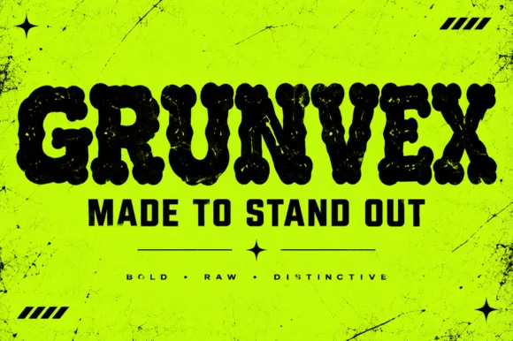
Rounded puffy street-grunge block display (OTF)
Grunvex is an ultra-heavy, puffy street-block display font combining rounded graffiti-slab silhouettes with subtle worn-ink texture.
Ideas for this font
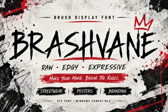
Raw jagged street-brush uppercase display (OTF)
Brashvane is an edgy, fast-painted uppercase street-brush font with sharp dry-bristle kicks and punk-poster attitude (OTF).
Ideas for this font
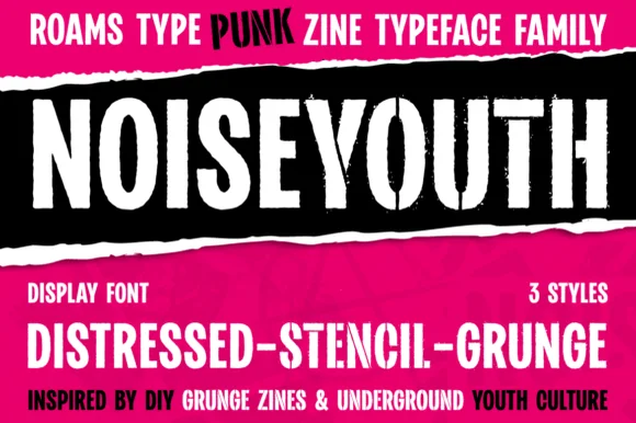
Punk zine display in three distressed styles
Noise Youth is a punk zine typeface family in white and black on magenta: tall condensed capitals shown in distressed, stencil and grunge styles, with ink bands and a caption line about DIY zines.
Ideas for this font
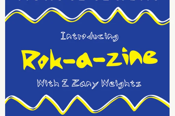
Zany hand-drawn display with multiple weights
Rok-a-Zine is a zany hand-drawn display in yellow with a black outline on blue: irregular caps with zigzag arms and slanted strokes, letters that tilt at different angles, and a wavy ribbon border that frames the page top and bottom.
Ideas for this font
Same independent foundry
Allow optional Google Analytics to measure visits and catalogue actions. Your search words and notes are not included. Privacy & storage



