Neutral Sans Workhorse

Jack Skull + Memoir Slang
Lets Jack Skull own the focal silhouette while handling secondary copy, sizing and subheads cleanly.
Inspect Memoir Slang specimenDisclosure: MakerFileHub may earn a commission from qualifying purchases via paid links on this page. How our links work.
Rough mixed-case strokes with pointed serif-like tips and an extended k leg
Jack Skull is a pirate display face: irregular letterforms with jagged edges, spiked serifs and uneven stroke weights, drawn to look cut into a parchment map.
Paid link
Get this fontProject & layout blueprintsAt-a-glance maker compatibility
Sturdy stroke walls and open counters weed cleanly on adhesive vinyl, HTV apparel film, and cut cardstock.
Visual anatomy & craft review
Jack Skull sits across the middle of an aged parchment card in a dark brown, and the letters look hand-cut: the strokes thicken and thin without a pattern, the serifs break into spikes, and the K and the S carry small notches that read as knife marks. A skull and crossed swords sit at the top centre, small drawn islands and ships decorate the corners, and a spaced caption under the word names the style. The captions and the ornaments are drawn at the same brown as the type, so the card reads as one printed sheet rather than a word on a background. The face is a display cut for pirate parties, rum labels and treasure-hunt invitations, and it holds at a large size where the rough edges are visible; set small, the notches close and the word turns into a plain condensed serif.
Rough mixed-case strokes with pointed serif-like tips and an extended k leg
Two-font hierarchy recipes
Tested contrast partners — pairing Jack Skull with grounded secondary typography.
Jack Skull + Memoir Slang
Lets Jack Skull own the focal silhouette while handling secondary copy, sizing and subheads cleanly.
Inspect Memoir Slang specimen
Jack Skull + Kernova
Grounds bold display lettering with classic typographic authority on posters, badges and apparel.
Inspect Kernova specimenPractical applications
Concrete hierarchy, scale and production guidance tailored to Jack Skull’s stroke geometry.
The rough cut sets the theme in one word, and the notched edges give a small card enough texture to look printed rather than typed.
Hierarchy & layout recipe
Print a 105 by 148 mm card: set the greeting at 44 pt across two rows, keep 16 mm of clear ground beneath before the details at 8.5 pt, and hold 13 mm of margin so no spike is cut at the edge.
Pre-production check
The notches close below 22 pt; print one card at the finished size and check the rough edges before the batch.
The lettering suits the product without a drawn pirate on the bottle, and the irregular strokes read as hand-lettered at label size.
Hierarchy & layout recipe
Print a 65 by 100 mm label: set the rum name at 24 pt on one row, keep 8 mm of clear ground beneath before the strength at 5 pt, and hold 6 mm from the lowest spike to the die line.
Pre-production check
Fine notches fill in on coated label stock; print one label on the actual material and check the cuts first.
The theme is legible at thumbnail size, and the rough letterforms give a paperback cover a hand-made character that a clean serif would not.
Hierarchy & layout recipe
Print a 130 by 200 mm cover: set the title at 52 pt across two rows, keep 22 mm of clear ground beneath before the author at 11 pt, and hold 15 mm from the widest letter to the trim.
Pre-production check
Rough edges print as dirt at small trim; print one cover at the final size and inspect the letter outlines before the run.
Technical & licence verification
Confirm included OTF/TTF/WOFF formats, full glyph tables and licence coverage on the live store page before batch production.
Closest visual alternatives
Matched across letterform anatomy, stroke behaviour and craft applications.
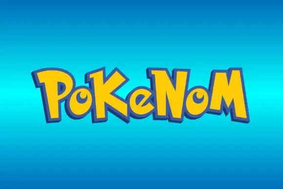
Bouncing pointed display
Pokenom is a bouncing irregular display shown in yellow on a blue gradient: mixed case with pointed capitals, curled small bowls, uneven stroke widths and letters that rise and fall, with a heavy blue outline and a soft shadow around the whole word.
Ideas for this font
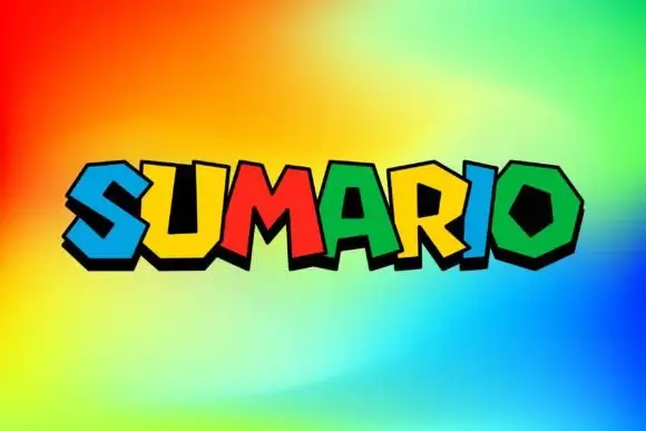
Polygonal heavy display
Sumario is a heavy angular display on a bright gradient: capitals built from polygonal shapes with counters cut as hexagons and trapezoids, each letter in a different saturated colour with a bold black offset edge, set as one word and nothing else on the sheet.
Ideas for this font
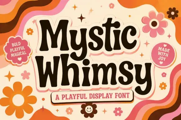
Soft flared retro mixed case
Mystic Whimsy is a playful display face in dark brown on cream: soft rounded letters with flared stems, a mixed case set, a heavy weight and a slight lean, presented on a seventies ground of wavy stripes and daisies.
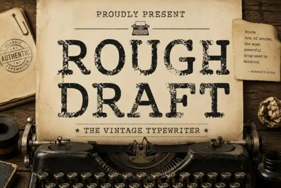
Distressed typewriter slab
Rough Draft is a distressed typewriter slab in black on aged typing paper: light uniform strokes, blunt slab serifs, a fixed advance with ragged breaks, and a coarse wear that eats the outlines, set as two stacked lines inside a typewriter with a stamp at the left and a small typed quote card at the right.
Ideas for this font
Same independent foundry
Allow optional Google Analytics to measure visits and catalogue actions. Your search words and notes are not included. Privacy & storage