Modern Grotesque Body

Jersey Distressed + Cultivo
Creates crisp high-hierarchy contrast beneath Jersey Distressed headlines across menus, websites and labels.
Inspect Cultivo specimenDisclosure: MakerFileHub may earn a commission from qualifying purchases via paid links on this page. How our links work.
Distressed varsity slab capitals with an outline and a heavy fill
Jersey Distressed is a varsity slab capital alphabet with a heavy fill, a separate outline and a speckled wear texture, so one word reads as a shirt print that has been washed a hundred times.
Paid link
Get this fontProject & layout blueprintsAt-a-glance maker compatibility
Fine grain and micro-texture excel in 300 DPI print, sublimation, and screen print rather than small vinyl weeding.
Visual anatomy & craft review
The J carries a full hook, the E holds three even arms and the Y forks high, all at a heavy even weight with square unbracketed slabs. Both the fill and the outline are supplied separately in the sample, which is how a two-colour athletic print is built: the outline traps the fill and the texture sits inside the fill so the edge stays clean. That construction is what makes the face usable at 60 mm on a garment without the letterforms collapsing into noise. Numbers and a full alphabet are shown on the sheet, which is the practical part for team work. Counters are wide enough to survive a screen print. The dark ground, the white fill, the black outline and the small credits are presentation; the typeface is the word.
Varsity · Distressed · Outlined
Two-font hierarchy recipes
Tested contrast partners — pairing Jersey Distressed with grounded secondary typography.
Jersey Distressed + Cultivo
Creates crisp high-hierarchy contrast beneath Jersey Distressed headlines across menus, websites and labels.
Inspect Cultivo specimen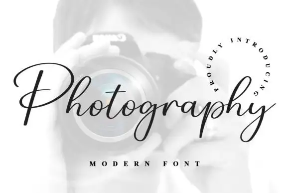
Jersey Distressed + Photography Font
Adds a warm human signature touch for 1-to-3-word callouts without competing against structured serif capitals.
Inspect Photography Font specimenPractical applications
Concrete hierarchy, scale and production guidance tailored to Jersey Distressed’s stroke geometry.
The two-colour construction reproduces an athletic print, and the wear texture survives a plastisol screen at 70 mm where a clean slab would look new.
Hierarchy & layout recipe
Screen a 300 mm back print: lay the outline at 70 mm in one screen, register the textured fill inside it, and stay 40 mm below the hood seam so the print does not distort when the garment is worn.
Pre-production check
A textured fill registered inside an outline shows mis-registration at the edge; check a pull on the actual fleece and add 1 mm of trap on the outline.
The distressed slabs give a metal plate a worn collegiate character, and the separate outline lets a small plate carry two colours at 30 mm.
Hierarchy & layout recipe
Print a 200 by 80 mm plate: set the club name at 30 mm, keep the founding year in a 10 mm slab beneath, and leave 12 mm of border so the outline is not cut by the mounting holes.
Pre-production check
Metal printing holds a texture harshly; check a sample plate and reduce the wear on the smallest word before the run.
The worn slabs read on a small hang tag at 12 pt, and the outline carries the two-colour look without a second print pass at retail size.
Hierarchy & layout recipe
Print a 45 by 65 mm hang tag: set the brand at 12 pt, set the size in a 6 pt caps sans beneath, and keep 5 mm of margin so the outline survives the die cut and the punched hole.
Pre-production check
A distressed outline at 12 pt breaks into dots; check the printed tag and use the clean cut of the same letterforms below 10 pt.
Technical & licence verification
Confirm included OTF/TTF/WOFF formats, full glyph tables and licence coverage on the live store page before batch production.
Closest visual alternatives
Matched across letterform anatomy, stroke behaviour and craft applications.
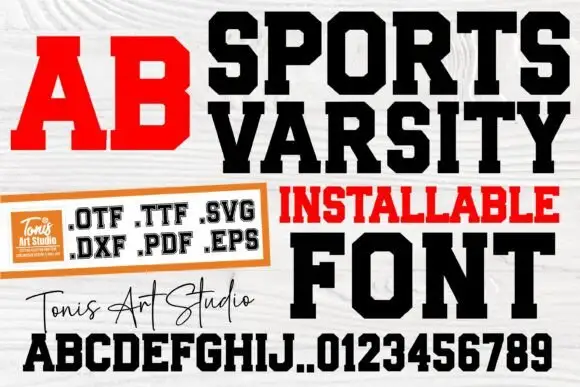
Condensed varsity slab with heavy blocks
Sports Varsity is a varsity slab in black and red on white wood: heavy condensed capitals with flat serifs, shown as a headline, a red two-letter block, a full alphabet with digits, and a handwritten studio signature.
Ideas for this font
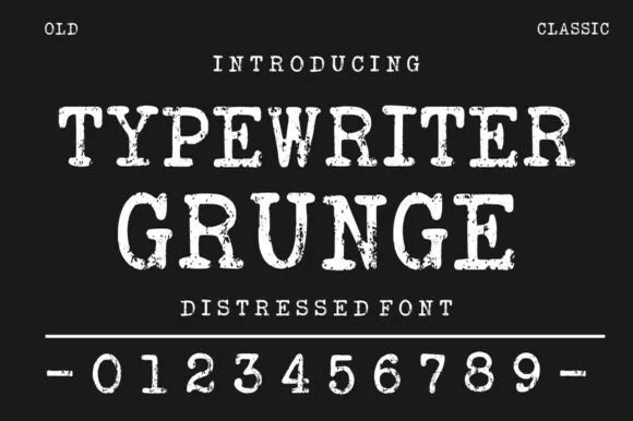
Distressed typewriter face with stamped edges
Typewriter Grunge is a distressed serif in white on near black: wide capitals with slab serifs and worn, ink-stamped edges, shown with a full row of digits and two small tracked labels at the corners.
Ideas for this font
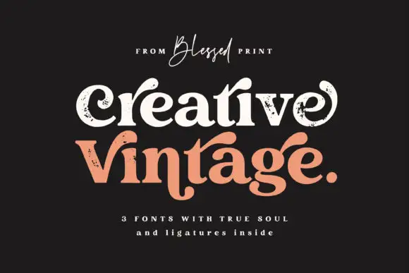
Distressed curled vintage serif
Creative Vintage is a high-contrast serif in which the terminals curl into swash shapes, the C turns inward, the t finishes in a broad low hook and scattered distressed marks break the fill, so a title reads as a worn printed label.
Ideas for this font
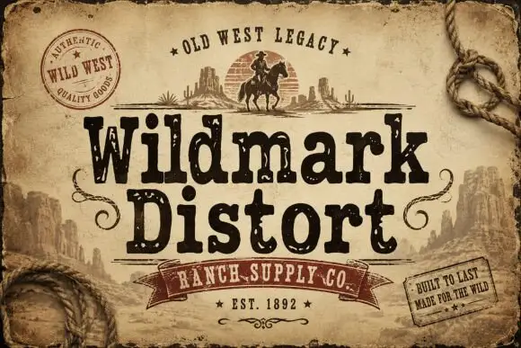
Distressed western display
Wildmark Distort is a distressed western display in black and cream on aged paper: a rounded slab with an uneven, worn outline, a swollen waist and a slight tilt, framed by a rope, a round seal, a ribbon and two small cards with period copy.
Same independent foundry
Allow optional Google Analytics to measure visits and catalogue actions. Your search words and notes are not included. Privacy & storage