Modern Grotesque Body

Retro Grunge + Bargain Condensed
Creates crisp high-hierarchy contrast beneath Retro Grunge headlines across menus, websites and labels.
Inspect Bargain Condensed specimenDisclosure: MakerFileHub may earn a commission from qualifying purchases via paid links on this page. How our links work.
Tall worn slabs with vertical scrape texture
Retro Grunge shows tall closely spaced slab capitals with rounded bowls and deep vertical scratches, where the E and R keep heavy stems even as the surface breaks and a red-brown offset edge sits behind the black letters on aged paper.
Paid link
Get this fontProject & layout blueprintsAt-a-glance maker compatibility
Fine grain and micro-texture excel in 300 DPI print, sublimation, and screen print rather than small vinyl weeding.
Visual anatomy & craft review
The stems stay tall, the fit runs close, the scratches cut vertically and the offset edge repeats the whole row behind it. That scrape is the character: the word looks printed on a worn press rather than deliberately shredded, which is why the cover keeps the letters pale on aged stock. The letter texture already supplies most of the visual activity, so skip extra distressed art in the layout, keep 34 pt and check the offset edge against the trim.
Tall slabs · Scraped · Offset edge
Two-font hierarchy recipes
Tested contrast partners — pairing Retro Grunge with grounded secondary typography.
Retro Grunge + Bargain Condensed
Creates crisp high-hierarchy contrast beneath Retro Grunge headlines across menus, websites and labels.
Inspect Bargain Condensed specimen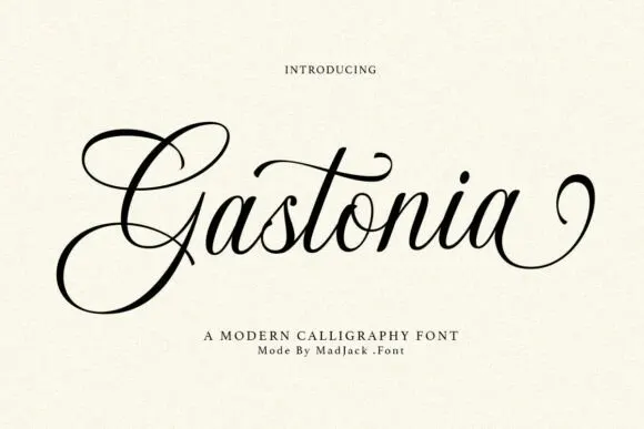
Retro Grunge + Gastonia Script
Adds a warm human signature touch for 1-to-3-word callouts without competing against structured serif capitals.
Inspect Gastonia Script specimenPractical applications
Concrete hierarchy, scale and production guidance tailored to Retro Grunge’s stroke geometry.
The worn slabs give a shop sign character, and the heavy stems read at 56 mm on a painted panel, where the scratches stay as texture rather than damage.
Hierarchy & layout recipe
Paint a 500 by 250 mm panel: set the name at 56 mm on one row, keep the scratches inside the stencil, and keep 22 mm of border so the offset edge stays whole.
Pre-production check
Scrapes painted at 30 mm look like a bad coat; check the mask and hold the name at 50 mm or above.
The tall slabs set a music heading, and the close fit holds a two-word title at 46 pt on a page, where the vertical wear gives the row movement.
Hierarchy & layout recipe
Print a 210 mm page: set the heading at 46 pt on one row, keep 18 mm beneath before the standfirst at 10 pt, and keep the block on flat colour so the texture reads.
Pre-production check
A distressed face over a textured paper doubles the noise; check the proof and use smooth stock.
The worn slabs suit a bottle label, and the heavy forms hold a two-word name at 24 pt on a 55 mm panel, where the offset edge adds depth.
Hierarchy & layout recipe
Print a 55 by 45 mm label: set the brand at 24 pt on one row, keep 8 mm of clear ground around the offset edge, and set the volume at 6 pt in small caps.
Pre-production check
The offset edge cut by the border looks like misregistration; check the artwork and keep 6 mm of panel.
Technical & licence verification
Confirm included OTF/TTF/WOFF formats, full glyph tables and licence coverage on the live store page before batch production.
Closest visual alternatives
Matched across letterform anatomy, stroke behaviour and craft applications.
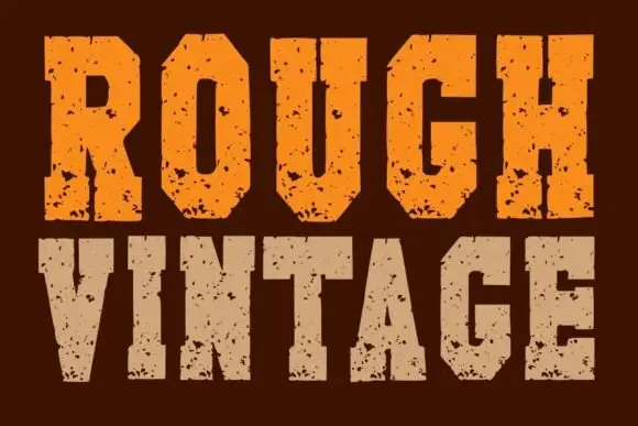
Chamfered pitted vintage slab
Rough Vintage is a tall heavy slab shown in orange and sand on a dark brown ground: chamfered slabs with scattered pits, chipped fill and blunt terminals, set in two lines with no ornament and no copy on the sheet.
Ideas for this font
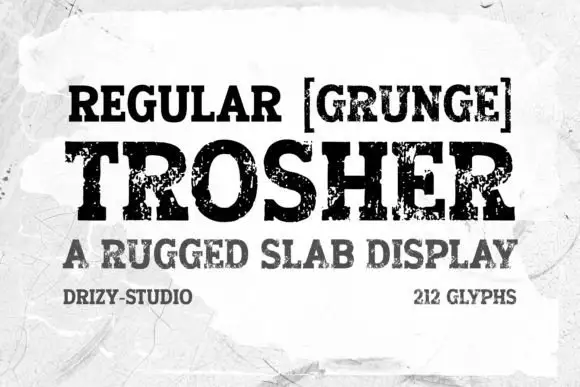
Rugged eroded slab display
Trosher is a rugged slab display in black on a mottled white ground: broad bracketed slabs with clean and heavily eroded fills, mixed case with tall ascenders and a full-width setting, with a bracketed note above, a plain line beneath and two small notes at the foot.
Ideas for this font
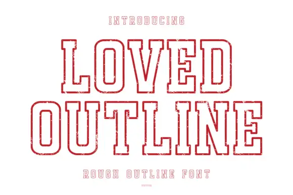
Rough outline collegiate display
Loved Outline is a rough collegiate outline in red on white: heavy caps drawn as a double contour with no fill, worn edges, block serifs and a small inner echo, with tracked caps above and below and a fine credit line at the foot.
Ideas for this font
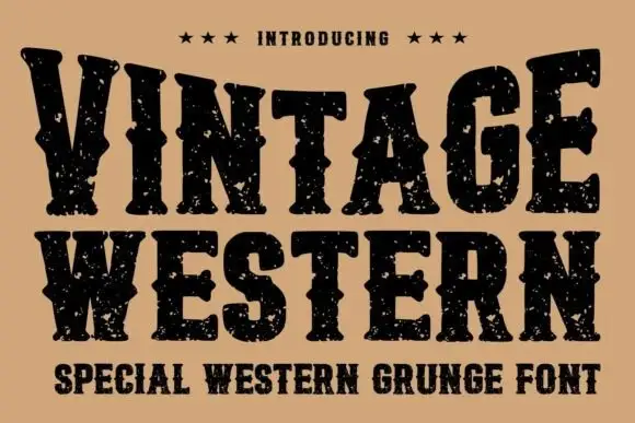
Grunge western slab
Vintage Western is a grunge western slab in black on tan: heavy bracketed serifs with deep notches, a swollen waist and thick stems, the whole surface eaten by a speckled wear, with three stars above and a tracked subtitle beneath in the same face.
Same independent foundry
Allow optional Google Analytics to measure visits and catalogue actions. Your search words and notes are not included. Privacy & storage