Modern Grotesque Body

Crackforge + Bielchon
Creates crisp high-hierarchy contrast beneath Crackforge headlines across menus, websites and labels.
Inspect Bielchon specimenDisclosure: MakerFileHub may earn a commission from qualifying purchases via paid links on this page. How our links work.
Heavy slab display with a cracked, weathered texture
Crackforge is a heavy slab display alphabet in which the stems stay thick, the serifs turn square and the surface breaks into fine cracks, so a word reads as a cast metal plate that has been outdoors for years.
Paid link
Get this fontProject & layout blueprintsAt-a-glance maker compatibility
Fine grain and micro-texture excel in 300 DPI print, sublimation, and screen print rather than small vinyl weeding.
Visual anatomy & craft review
The C cuts a square crescent, the r turns a blunt arm, the a closes a small bowl on a heavy stem, the c repeats the square cut, the k splays two thick diagonals and the f carries a wide bar, all at a bold slab weight with square serifs and a cracked texture drawn into the fill. The crack pattern is the character: it sits inside the strokes rather than on the outline, which is why the sample sets mixed case on a plain ground and lets the surface do the work. Because the strokes are solid, the face reads from 30 pt and prints in one ink; the cracks disappear below that size. The aged paper ground, the torn edges and the small caps line beneath are presentation; the black display word is the face.
Slab · Weathered · Heavy
Two-font hierarchy recipes
Tested contrast partners — pairing Crackforge with grounded secondary typography.
Crackforge + Bielchon
Creates crisp high-hierarchy contrast beneath Crackforge headlines across menus, websites and labels.
Inspect Bielchon specimen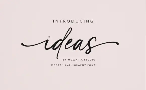
Crackforge + Ideas
Adds a warm human signature touch for 1-to-3-word callouts without competing against structured serif capitals.
Inspect Ideas specimenPractical applications
Concrete hierarchy, scale and production guidance tailored to Crackforge’s stroke geometry.
The cast texture suits a blacksmith workshop sign, and the heavy slabs read from the end of a lane at 90 mm in one painted colour.
Hierarchy & layout recipe
Paint a 700 by 250 mm board: set the word at 90 mm in one deep colour, keep 30 mm of border, and thin the paint slightly so the cracked detail does not fill in.
Pre-production check
Thick paint fills the drawn cracks and the texture disappears; check a test board and keep the coat thin rather than adding more pigment.
The weathered slab gives a feature about making a sturdy head, and the mixed case reads cleanly at 60 pt on an uncoated page.
Hierarchy & layout recipe
Print an A4 spread: set the header at 60 pt across the top, set the standfirst in a 10 pt serif beneath, and keep 18 mm of clearance so the square serifs have air.
Pre-production check
A cracked fill at 60 pt can print as noise on rough stock; check the proof and keep the header at 64 pt or above.
The worn slab gives a cider bottle a sense of years, and the heavy stems hold a short orchard name at 20 pt on a paper label.
Hierarchy & layout recipe
Print a 70 by 45 mm label: set the orchard name at 20 pt, set the volume in a 7 pt slab beneath, and keep 5 mm from the die so the square serifs stay inside the cut.
Pre-production check
A cracked texture printed on a small label closes into a solid block; check the printed label and keep the word at 22 pt or above.
Technical & licence verification
Confirm included OTF/TTF/WOFF formats, full glyph tables and licence coverage on the live store page before batch production.
Closest visual alternatives
Matched across letterform anatomy, stroke behaviour and craft applications.
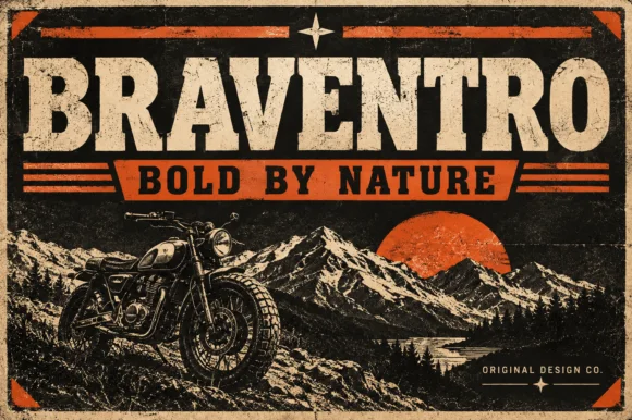
Heavy heritage slab with broad brackets and compact counters
Braventro is a heavy heritage slab in which the brackets run broad, the counters stay compact and the stems carry sign-letter weight, so a two-word heading reads as a stencilled tin sign for an outdoor brand.
Ideas for this font
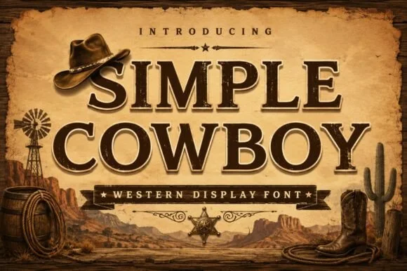
Inline-chiseled Western frontier slab serif
Simple Cowboy is a wide, authoritative Western slab serif featuring crisp bracketed block feet and fine interior inline bevel lines.
Ideas for this font
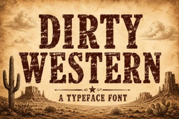
Heavily weathered Wild-West woodtype & saloon slab serif
Dirty Western is a rugged frontier slab serif stamped with coarse woodblock grain, pitted distress, and classic 1880s wanted-poster authority.
Ideas for this font
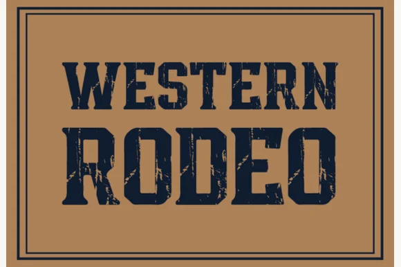
Distressed western slab in a ruled frame
Western Rodeo is a distressed western slab in navy on tan: heavy condensed capitals with flat serifs and worn edges, printed inside a double rule frame, with the first line in a lighter weight than the second.
Ideas for this font
Same independent foundry
Allow optional Google Analytics to measure visits and catalogue actions. Your search words and notes are not included. Privacy & storage