High-Contrast Display Serif

Modern Vintage + Wolles Elegant Modern Serif
Pairs sculptural editorial warmth with Modern Vintage's clean modern geometry.
Inspect Wolles Elegant Modern Serif specimenDisclosure: MakerFileHub may earn a commission from qualifying purchases via paid links on this page. How our links work.
Tall distressed vintage capitals with speckled edges and tight fit
Modern Vintage is a tall capital alphabet with a distressed print texture, tight letterfit and vertical proportions, so a word reads as letterpress that has been used a hundred times.
Paid link
Get this fontProject & layout blueprintsAt-a-glance maker compatibility
Fine grain and micro-texture excel in 300 DPI print, sublimation, and screen print rather than small vinyl weeding.
Visual anatomy & craft review
The M holds two thin diagonals and a raised vertex, the O closes a narrow counter, the D keeps a square bowl and the R carries a short leg, all at a heavy even weight with edges broken by a fine speckle. That texture is what makes the face read as worn metal type rather than as a clean geometric sans. The fit is tight, so a two-word line builds a solid block at 60 pt, and the narrow counters close up below 16 pt where the speckle starts to look like dirt. Because the letters are tall, the face stacks well in two lines with minimal leading. The cream ground, the black ink and the small caption are presentation; the typeface is the two words.
Distressed · Tall · Printed
Two-font hierarchy recipes
Tested contrast partners — pairing Modern Vintage with grounded secondary typography.
Modern Vintage + Wolles Elegant Modern Serif
Pairs sculptural editorial warmth with Modern Vintage's clean modern geometry.
Inspect Wolles Elegant Modern Serif specimen
Modern Vintage + Honey
Introduces organic movement on pull-quotes, signatures and gift tags.
Inspect Honey specimenPractical applications
Concrete hierarchy, scale and production guidance tailored to Modern Vintage’s stroke geometry.
The worn capitals suit a screen print on canvas, and the tall proportions keep a cafe name readable across a working kitchen at 40 mm.
Hierarchy & layout recipe
Screen a 700 by 800 mm apron front: print the name at 40 mm through a 110-thread mesh, set the role in a 12 mm sans beneath, and stay 60 mm below the neckline seam so the print does not distort when the apron is worn.
Pre-production check
A speckled texture can clog on coarse canvas; check a pull on the actual fabric and reduce the speckle rather than the size.
The worn tall caps give a reissue its second-hand character, and the tight fit lets a long title fill a narrow cover band at 54 pt.
Hierarchy & layout recipe
Print an A5 cover band: set the title at 54 pt in two lines with 6 mm leading, set the edition note in a 9 pt caps sans at the foot, and keep 14 mm of margin so the distressed edges are not trimmed.
Pre-production check
Two tight lines with narrow counters can merge at small leading; check the proof and add 2 mm of leading rather than reducing the point size.
The worn capitals read at 12 pt on a small sticker and give a plain paper bag the look of stock bought at a market, which is the whole point of the shop.
Hierarchy & layout recipe
Print a 55 mm round sticker: set the shop name at 12 pt, set the city in a 5 pt caps sans beneath, and keep 5 mm inside the die so the speckled edges are not cut into slivers.
Pre-production check
A distressed edge under 0.2 mm cuts badly on vinyl; check the vector at full size and simplify the speckle on the smallest words.
Technical & licence verification
Confirm included OTF/TTF/WOFF formats, full glyph tables and licence coverage on the live store page before batch production.
Closest visual alternatives
Matched across letterform anatomy, stroke behaviour and craft applications.
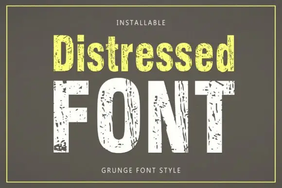
Tall condensed sans with chipped, distressed texture
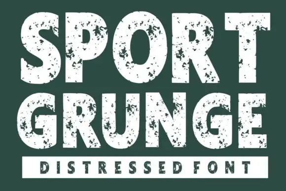
Distressed is a tall condensed sans whose strokes are eaten away by irregular chips, so the letters look printed, worn and flaked rather than cleanly drawn.
Ideas for this font
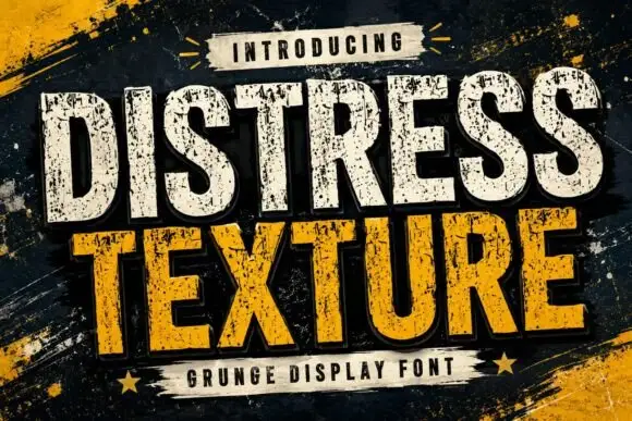
Tall heavy capitals with dense chipped texture and flat terminals
Distress Texture is a heavy tall sans in capitals only, its strokes eaten by dense irregular chips and its terminals cut flat, so a word looks stencilled, weathered and printed through a mask.
Ideas for this font
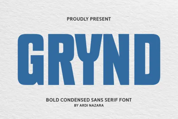
Angular geometric skate-deck lettering with cut corners and a shadow offset
Grynd sets a black word in angular geometric forms with several corners sliced away, a heavy even stroke and a pale shadow offset behind every letter, over a deck graphic.
Ideas for this font
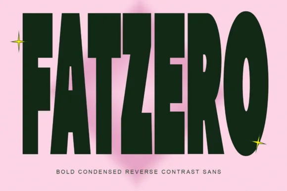
Bold condensed reverse-contrast sans with heavy bars and thin counters
Fatzero is a bold condensed reverse-contrast sans in which the horizontals run thick, the verticals thin and the counters close to slots, so a single word reads as a fashion poster rather than as a headline.
Ideas for this font
Same independent foundry
Allow optional Google Analytics to measure visits and catalogue actions. Your search words and notes are not included. Privacy & storage