Neutral Sans Workhorse

Industrial Grunge + Monure
Lets Industrial Grunge own the focal silhouette while handling secondary copy, sizing and subheads cleanly.
Inspect Monure specimenDisclosure: MakerFileHub may earn a commission from qualifying purchases via paid links on this page. How our links work.
Heavy stencil-slashed & weathered steel industrial block
Industrial Grunge is a heavy, blocky industrial display font combining vertical stencil cuts with chipped concrete/steel edge wear.
Paid link
Get this fontProject & layout blueprintsAt-a-glance maker compatibility
Open counter bridges hold interior islands intact on laser-cut wood, acrylic, and mylar stencils.
Visual anatomy & craft review
Industrial Grunge is a heavy stencil-slashed block with a weathered steel surface: fat square stems, cut-through stencil bridges across the closed letters, chipped edges and patches where the plate appears to have rusted through. The bridges are structural for cutting and the chips are the finest element, so both disappear when the face is reversed. It needs roughly 28 mm for the bridge and the chip to read, and it is best in one dense ink on uncoated stock, or a single white on a dark ground where the bridges print as cut-throughs.
Forged-steel · Stencil-worn · Heavy
Two-font hierarchy recipes
Tested contrast partners — pairing Industrial Grunge with grounded secondary typography.
Industrial Grunge + Monure
Lets Industrial Grunge own the focal silhouette while handling secondary copy, sizing and subheads cleanly.
Inspect Monure specimen
Industrial Grunge + Wolles Elegant Modern Serif
Grounds bold display lettering with classic typographic authority on posters, badges and apparel.
Inspect Wolles Elegant Modern Serif specimenPractical applications
Concrete hierarchy, scale and production guidance tailored to Industrial Grunge’s stroke geometry.
A stencil-slashed block reads as a sprayed crate mark rather than a designed logo, which is what a workshop wants on timber. The bridges hold at 30 mm on a crate, and one ink covers the crate and the cards in one order.
Hierarchy & layout recipe
Crate print 300 x 200 mm, word 60 mm with 10 mm bridge clearance, 20 mm margins. Card 85 x 55 mm, word 16 mm, 5 mm margins. Door plate 300 x 80 mm, word 40 mm, 10 mm margins.
Pre-production check
A 300 x 80 mm door plate at 40 mm closes the bridges and the mark reads as a solid black bar. Raise the plate to 50 mm or keep the bridges at 3 mm, and check one plate before the run.
A weathered stencil block gives an industry feature the look of a sprayed crate. The chips hold at 44 pt on an uncoated page, and one ink prints the header and the opener in one pass.
Hierarchy & layout recipe
Header 44 pt with 8 mm bridge clearance, body 9/13 pt over two columns of 82 mm, 18 mm margins and a 12 mm head. Opener 36 pt with 10 mm of clear ground. Caption 8/11 pt in a 40 mm outer-margin rail, 4 mm below the image.
Pre-production check
At 36 pt on the opener the rust patches silt into the paper and the word reads as a smudge. Keep the face at 44 pt and above, and proof one spread at 1:1.
A slashed stencil block suits a horror night better than a cartoon monster face because the cuts read as damage. The bridges hold at 120 mm on a poster, and one ink prints the poster and the tickets in one order.
Hierarchy & layout recipe
Poster A2, word 120 mm with 14 mm bridge clearance, details 40 mm, 20 mm margins. Ticket 100 x 50 mm, word 12 mm, 4 mm perforation. Door sign 250 x 350 mm, word 60 mm, 20 mm margins.
Pre-production check
A 100 x 50 mm ticket at 12 mm merges the chips into a solid edge and the word reads as a barbed bar. Raise the ticket to 18 mm, and print one ticket before the batch.
Technical & licence verification
Confirm included OTF/TTF/WOFF formats, full glyph tables and licence coverage on the live store page before batch production.
Closest visual alternatives
Matched across letterform anatomy, stroke behaviour and craft applications.
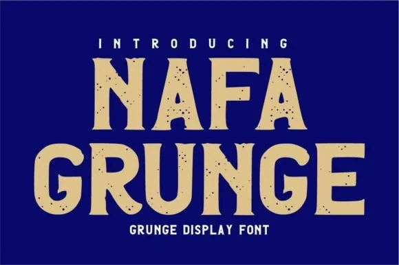
Rough-edged vintage sign-painter & stencil-notched sans
Nafa Grunge is a bold vintage sans-display font pairing subtly notched outer contours with clean, solid interiors.
Ideas for this font
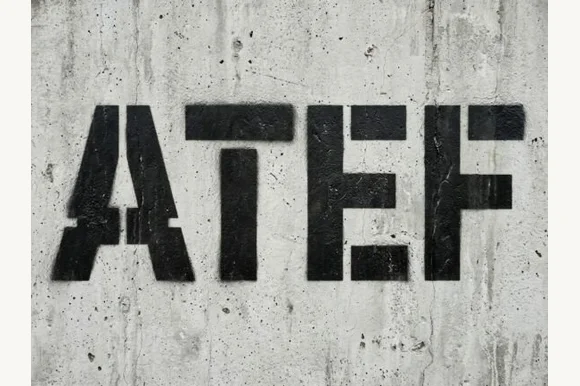
Heavy industrial concrete & military spray-stencil sans
Atef is a heavy, weathered industrial stencil sans featuring bold military bridge cuts and raw concrete spray-paint texture.
Ideas for this font
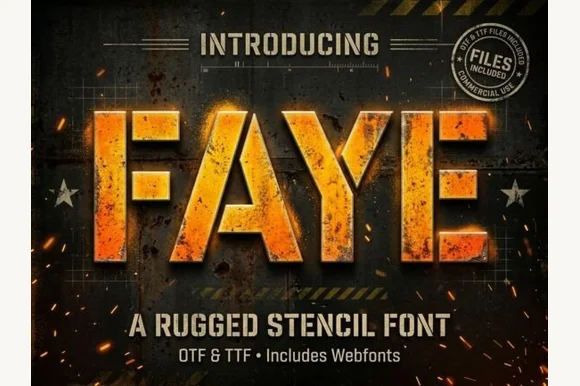
Heavy tactical steel-plate stencil sans (OTF, TTF & Webfonts)
Faye is a wide, ultra-heavy industrial stencil sans featuring diagonal tactical bridge cuts across massive block capitals (OTF, TTF & Webfonts).
Ideas for this font
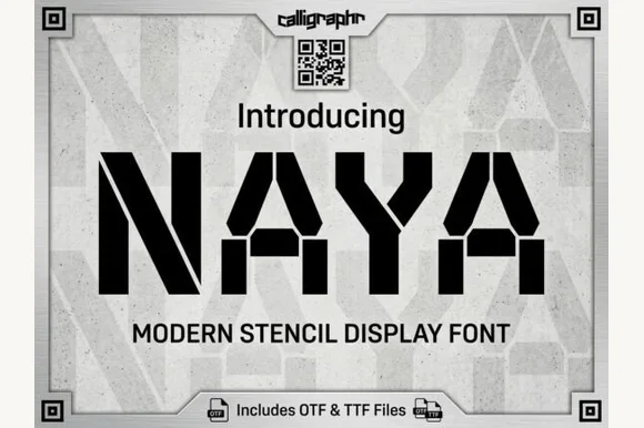
Heavy geometric military & cargo stencil sans
Naya is a heavy, wide-stance industrial stencil sans featuring clean angled bridge cuts and zero trapped enclosed counters.
Ideas for this font
Same independent foundry
Allow optional Google Analytics to measure visits and catalogue actions. Your search words and notes are not included. Privacy & storage