Modern Grotesque Body

Great Grit + Godthem
Creates crisp high-hierarchy contrast beneath Great Grit headlines across menus, websites and labels.
Inspect Godthem specimenDisclosure: MakerFileHub may earn a commission from qualifying purchases via paid links on this page. How our links work.
Heavy wide-stance rough-stamped slab display (102 glyphs)
Great Grit is a wide, muscular distressed slab-display font (102 glyphs, uppercase & lowercase) with notched outer edges and sparse surface grit.
Paid link
Get this fontProject & layout blueprintsAt-a-glance maker compatibility
Fine grain and micro-texture excel in 300 DPI print, sublimation, and screen print rather than small vinyl weeding.
Visual anatomy & craft review
Great Grit is a wide, muscular slab display with notched outer edges and sparse surface grit, supplied with uppercase and lowercase across 102 glyphs. The slabs are heavy and the stance is wide, so a word fills a broad panel and reads at a distance, while the notches keep the outline from looking like a plain rectangle. Grit is sparse, so the face survives a small print, and it needs roughly 20 mm before the notches read as stamped rather than damaged. It is a sign, packaging and apparel face.
Grit · Wide-slab · Rebellious
Two-font hierarchy recipes
Tested contrast partners — pairing Great Grit with grounded secondary typography.
Great Grit + Godthem
Creates crisp high-hierarchy contrast beneath Great Grit headlines across menus, websites and labels.
Inspect Godthem specimen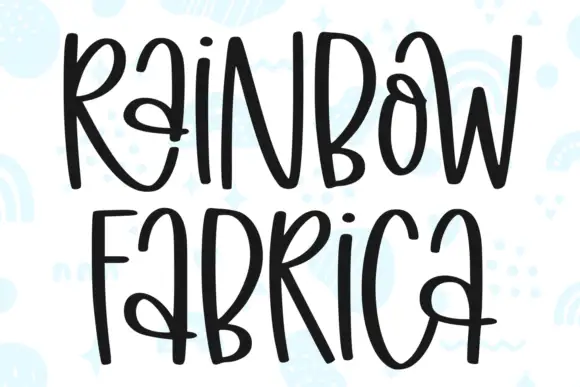
Great Grit + Rainbow Fabrica
Adds a warm human signature touch for 1-to-3-word callouts without competing against structured serif capitals.
Inspect Rainbow Fabrica specimenPractical applications
Concrete hierarchy, scale and production guidance tailored to Great Grit’s stroke geometry.
A stamped wide slab reads as a mark pressed into a crate, which is what a brewery or workshop wants. Sparse grit holds at 18 mm on a bottle where heavy distress would fill.
Hierarchy & layout recipe
Label 90 x 110 mm, word 18 mm, abv 4.5 pt, 5 mm top arc. Sign 1200 x 400 mm, word 240 mm, 80 mm margins. Crate 400 x 200 mm, word 90 mm, 25 mm margins.
Pre-production check
Bottle labels pass through a cooler and a notched edge plus condensation reads as a printing fault. Use a matt synthetic label, and check one chilled bottle before the run.
Wide slabs give a cover a headline that fills the width, which is the job of a sports or event cover. Notched edges keep the face from looking like a generic heavy sans.
Hierarchy & layout recipe
Cover 210 x 297 mm, title 120 pt, cover lines 11/15 pt, 20 mm margins. Poster A2, word 300 mm, details 22/28 pt. Jacket 152 x 229 mm, title 54 pt, 18 mm margins.
Pre-production check
A wide slab at 120 pt on a cover leaves little room for a cover line, and the line gets pushed into the trim. Lay out the headline first at its final size, then fit the cover lines around it.
Stamped slabs read as a sign painted on a barn board, which suits a harvest fair. The wide stance is legible from a parked car.
Hierarchy & layout recipe
Sign 900 x 600 mm, word 170 mm, 60 mm margins. Label 70 x 95 mm, word 15 mm, 5 mm top arc. Board 600 x 400 mm, item 36 mm, price 32 mm, 40 mm margins.
Pre-production check
Outdoor harvest signs face low autumn sun, and a dark word on kraft disappears in backlight. Print one sign and look at it against the sun before the fair opens.
Technical & licence verification
Confirm included OTF/TTF/WOFF formats, full glyph tables and licence coverage on the live store page before batch production.
Closest visual alternatives
Matched across letterform anatomy, stroke behaviour and craft applications.
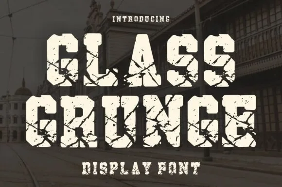
Shattered-glass & cracked-concrete heavy slab serif
Glass Grunge is a massive, chunky slab serif fractured across every stem and foot by sharp shattered-glass crack lines.
Ideas for this font
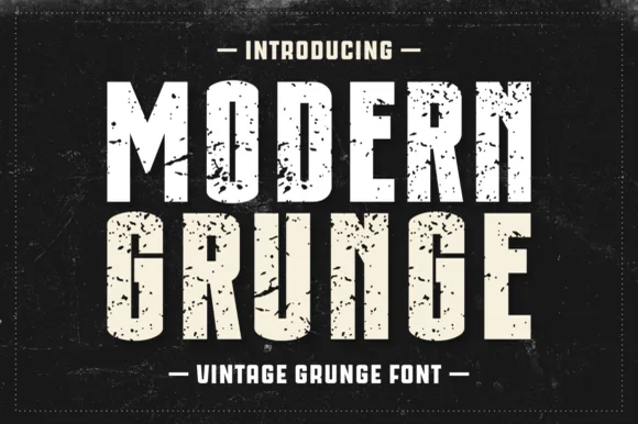
Condensed heavy grunge sans
Modern Grunge is a condensed heavy sans in white and cream on black: tall narrow caps, thick even stems, and a distress that flakes out of the fills in sharp fragments, framed by a dashed rule on a scratched ground.
Ideas for this font
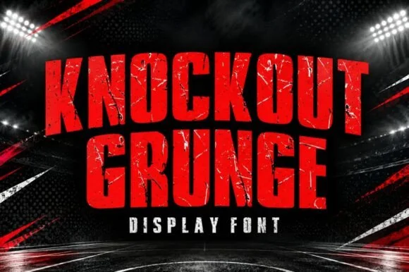
Heavy weathered stadium & boxing-poster athletic slab
Knockout Grunge is a towering, heavy-impact athletic slab-display font textured with gritty stadium-concrete and fight-poster wear.
Ideas for this font
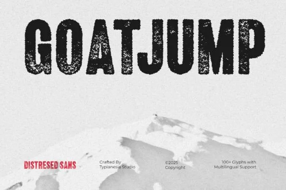
Tall condensed dry-roller & woodblock distressed sans (100+ glyphs, Multilingual)
Goatjump is a commanding, tall condensed distressed sans (100+ glyphs, Multilingual) stamped with vertical woodgrain & dry-roller grit!
Ideas for this font
Same independent foundry
Allow optional Google Analytics to measure visits and catalogue actions. Your search words and notes are not included. Privacy & storage