Neutral Sans Workhorse

Vintage + Cultivo
Lets Vintage own the focal silhouette while handling secondary copy, sizing and subheads cleanly.
Inspect Cultivo specimenDisclosure: MakerFileHub may earn a commission from qualifying purchases via paid links on this page. How our links work.
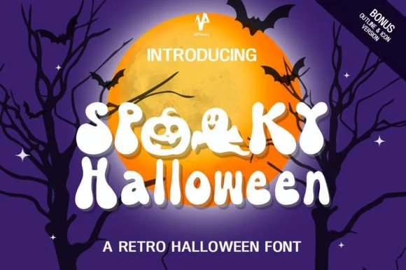
Slanted cream lettering with worn multicolour offset shadows
Vintage Npnaay sets a fat rounded display face, wears the fill down with a printed grain and stacks two offset copies behind it in warm colours so the word reads as a seventies print.
Paid link
Get this fontProject & layout blueprintsAt-a-glance maker compatibility
Sturdy stroke walls and open counters weed cleanly on adhesive vinyl, HTV apparel film, and cut cardstock.
Visual anatomy & craft review
The word leans a few degrees off the horizontal, the navy face speckled with wear, and behind it a red and a cream offset repeat step down and to the left, giving the lettering the depth of a misregistered screen print. Bowls are wide, the serifs rounded and the joins soft, so the shape stays cheerful even though the texture is rough. Corner labels name the file types and a bonus version, and a tracked caption sits under the sample. The layers are the design, so the face is sold as artwork as much as a font, and a plain single-colour setting loses most of what the cover shows.
Slanted cream lettering with worn multicolour offset shadows
Two-font hierarchy recipes
Tested contrast partners — pairing Vintage with grounded secondary typography.
Vintage + Cultivo
Lets Vintage own the focal silhouette while handling secondary copy, sizing and subheads cleanly.
Inspect Cultivo specimen
Vintage + Bulgary
Grounds bold display lettering with classic typographic authority on posters, badges and apparel.
Inspect Bulgary specimenPractical applications
Concrete hierarchy, scale and production guidance tailored to Vintage’s stroke geometry.
The stacked layers and the worn fill carry a seventies mood without a photograph, and the rounded shapes stay friendly at poster scale.
Hierarchy & layout recipe
Print an A2 poster: set the title at 110 pt across one row, keep 30 mm of clear ground beneath before the date at 18 pt, and keep 32 mm of border so the offset layers stay inside the sheet.
Pre-production check
Offset layers need registration; check the proof before a two-colour print of the poster. Order one sample before committing to the run.
The retro depth makes a number and a name feel like a printed invitation, and the rounded shapes keep the card warm rather than formal.
Hierarchy & layout recipe
Print a 148 by 105 mm card: set the greeting at 36 pt across one row, keep 14 mm of clear ground beneath before the details at 9 pt, and keep 12 mm of margin so the offset shadow is not trimmed.
Pre-production check
Grain disappears on cheap card; check a printed sample before the batch. Test it on the real material before the run is booked.
The layered colour treatment gives a small bottle shelf presence, and a short flavour name fits the fat letterforms on a narrow wrap.
Hierarchy & layout recipe
Print a 55 by 110 mm wrap label: set the flavour at 20 pt on one row, keep 9 mm of clear ground beneath before the volume at 6 pt, and keep 6 mm of clear area at each side of the wrap.
Pre-production check
Three layers on a curved label crowd; check a wrapped mock-up before the print run. Verify the result on the printed piece, then approve.
Technical & licence verification
Confirm included OTF/TTF/WOFF formats, full glyph tables and licence coverage on the live store page before batch production.
Closest visual alternatives
Matched across letterform anatomy, stroke behaviour and craft applications.
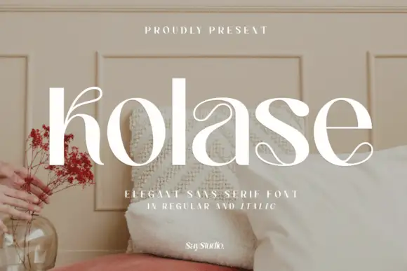
Contrast-rich lowercase with fine curled terminals inside broad bowls
Kolase places white lettering over a pale furnished interior, where heavy upright stems meet hairline curves and the initial k, the a and the final e carry fine curled strokes, while the straight l offers a quiet pause among the rounded details and the caption names a regular and an italic.
Ideas for this font
Textured tall slab
Oldstone is a textured slab in off-white on a dark green ground: tall condensed slabs with heavy bracketed serifs, a worn surface that chips the edges and fills the counters at random, offered in regular and stamp, with small flanking notes and a bordered strip beneath, so the plate reads as an aged print.
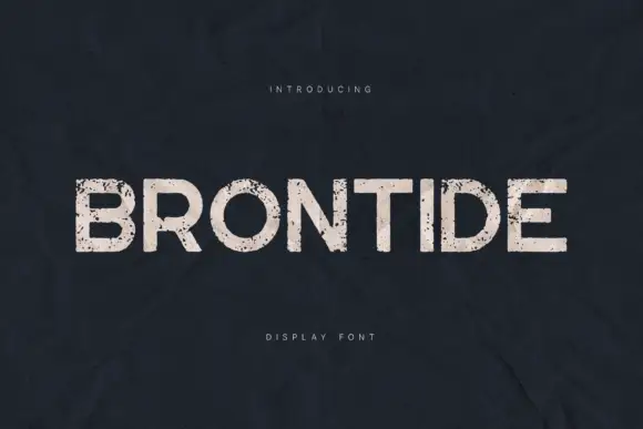
Broad distressed capitals with round O bowls and irregular pale surface breaks
Brontide sets pale uppercase lettering on dark blue-grey, where round O and D bowls contrast with the straight N diagonal and the flat T and E arms while irregular speckles and larger chipped patches interrupt the fill.
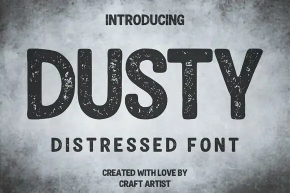
Rounded distressed capitals with broad strokes
Dusty shows thick mostly upright capitals with rounded corners and wide open letter spaces on a mottled grey field, where numerous small pale speckles interrupt the dark strokes without turning the letters into thin outlines.
Ideas for this font
Same independent foundry
Allow optional Google Analytics to measure visits and catalogue actions. Your search words and notes are not included. Privacy & storage