Neutral Sans Workhorse

Nafa Grunge + Taught
Lets Nafa Grunge own the focal silhouette while handling secondary copy, sizing and subheads cleanly.
Inspect Taught specimenDisclosure: MakerFileHub may earn a commission from qualifying purchases via paid links on this page. How our links work.
Rough-edged vintage sign-painter & stencil-notched sans
Nafa Grunge is a bold vintage sans-display font pairing subtly notched outer contours with clean, solid interiors.
Paid link
Get this fontProject & layout blueprintsAt-a-glance maker compatibility
Open counter bridges hold interior islands intact on laser-cut wood, acrylic, and mylar stencils.
Visual anatomy & craft review
Nafa Grunge is a bold vintage sans display with subtly notched outer contours, hand-chipped edges and clean solid interiors, so a word reads as sign-painter lettering with a chipped edge rather than as a distressed texture. The notches sit only on the contour, which keeps the counters clean at 20 mm, and the heavy weight holds in one ink. It needs roughly 26 mm for the chipping to read, and it is best in sand tan on cobalt or in one dark ink on board.
Rugged · Vintage-sign · Bold
Two-font hierarchy recipes
Tested contrast partners — pairing Nafa Grunge with grounded secondary typography.
Nafa Grunge + Taught
Lets Nafa Grunge own the focal silhouette while handling secondary copy, sizing and subheads cleanly.
Inspect Taught specimen
Nafa Grunge + Brenco
Grounds bold display lettering with classic typographic authority on posters, badges and apparel.
Inspect Brenco specimenPractical applications
Concrete hierarchy, scale and production guidance tailored to Nafa Grunge’s stroke geometry.
A chipped-edge sans reads as a hand-lettered workshop sign, which is what a small maker prints on a carton. The clean counters keep a long product name legible at 18 mm, and the chipping gives the mark age without a vintage texture pass.
Hierarchy & layout recipe
Carton 200 x 150 x 80 mm, word 44 mm on the lid, 25 mm margins. Panel 900 x 400 mm, word 160 mm, 60 mm margins and 25 mm frame clearance. Merch print 280 x 160 mm, word 60 mm, 40 mm margins.
Pre-production check
A plastisol print at 60 mm bridges the 0.8 mm contour notch and the edge reads as a smooth cut. Keep notches at 1.5 mm on garment artwork, and approve a strike-off before the run.
Chipped sign-painter caps read as a fairground board, which is what an autumn market posts at the gate. The heavy fill holds at 170 mm in one ink, and the chipping gives the poster a painted-once texture without a photograph.
Hierarchy & layout recipe
Sign 900 x 600 mm, word 170 mm, 60 mm margins and 25 mm frame clearance. Label 70 x 95 mm, word 16 mm, 5 mm top arc and 4 mm die margin. Board 600 x 400 mm, header 60 mm, items 24 mm on a 34 mm pitch.
Pre-production check
A 16 mm label name closes the contour notches into a ragged edge and the word looks badly cut. Keep the label at 20 mm or use the clean outlines at small sizes, and check one applied label.
Sign-painter weight reads as a summer fair bill, which is what a small festival prints on a banner and a ticket. The chipped contour holds at 340 mm in vinyl, and the clean interior keeps the act names legible on a 90 mm ticket.
Hierarchy & layout recipe
Banner 2000 x 600 mm, word 340 mm, 120 mm margins with eyelets every 500 mm. Ticket 90 x 50 mm, word 12 mm, 3 mm margins. Stage sign 1200 x 500 mm, word 200 mm, 80 mm margins.
Pre-production check
A vinyl-cut banner loses a 0.8 mm chip during weeding and the letters arrive with flat edges. Keep chips at 1.5 mm on cut artwork, and weed one panel before the run.
Technical & licence verification
Confirm included OTF/TTF/WOFF formats, full glyph tables and licence coverage on the live store page before batch production.
Closest visual alternatives
Matched across letterform anatomy, stroke behaviour and craft applications.
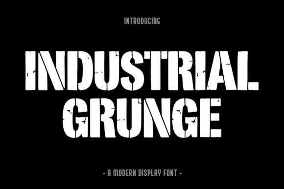
Heavy stencil-slashed & weathered steel industrial block
Industrial Grunge is a heavy, blocky industrial display font combining vertical stencil cuts with chipped concrete/steel edge wear.
Ideas for this font
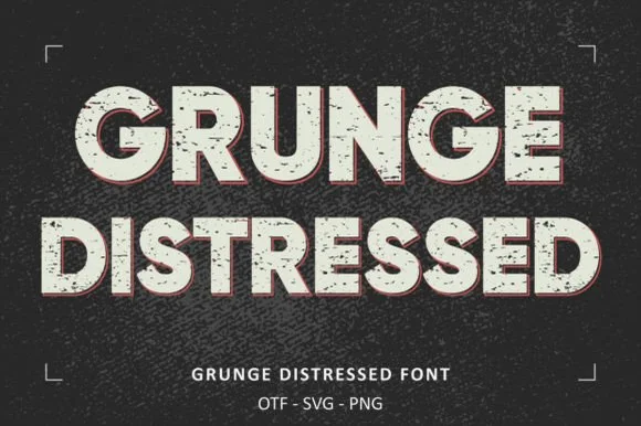
Heavy wide stamp-weathered sans + SVG & PNG letter sets!
Grunge Distressed is a wide, heavy stamp-textured sans serif bundled with OTF, SVG, and PNG files for rugged posters, shirts, and badges!
Ideas for this font
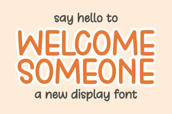
Tall rounded monoline display with keyline
Welcome Someone is a tall rounded monoline display in orange with a white keyline: narrow capitals of even stroke weight, softly squared corners, a slight bounce, and a wide white outline that separates the word from a pale ground.
Ideas for this font
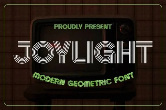
5-line concentric 1980s CRT-TV & synth-funk multiline sans
Joylight is a sleek retro-futuristic multilinear display font tracing geometric uppercase letters in five crisp parallel neon-ready tracks.
Ideas for this font
Same independent foundry
Allow optional Google Analytics to measure visits and catalogue actions. Your search words and notes are not included. Privacy & storage