Modern Grotesque Body

Creative Vintage + Montreal
Creates crisp high-hierarchy contrast beneath Creative Vintage headlines across menus, websites and labels.
Inspect Montreal specimenDisclosure: MakerFileHub may earn a commission from qualifying purchases via paid links on this page. How our links work.
Distressed curled vintage serif
Creative Vintage is a high-contrast serif in which the terminals curl into swash shapes, the C turns inward, the t finishes in a broad low hook and scattered distressed marks break the fill, so a title reads as a worn printed label.
Paid link
Get this fontProject & layout blueprintsAt-a-glance maker compatibility
Fine grain and micro-texture excel in 300 DPI print, sublimation, and screen print rather than small vinyl weeding.
Visual anatomy & craft review
The C curls its terminal inward, the t ends in a broad low hook, the V and g stretch long curved extensions and the fill carries scattered marks that thin the strokes. The distressed curl is the character: the wear sits in the outline rather than over it, which is why the sample suits a printed label. Because the marks are small, the face wants 30 pt before they read as texture rather than dirt, and the thin curls need coated stock. The extra characters are PUA-encoded, so decorative access is a separate step.
Distressed · Curled · Vintage
Two-font hierarchy recipes
Tested contrast partners — pairing Creative Vintage with grounded secondary typography.
Creative Vintage + Montreal
Creates crisp high-hierarchy contrast beneath Creative Vintage headlines across menus, websites and labels.
Inspect Montreal specimen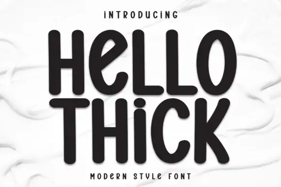
Creative Vintage + Hello Thick
Adds a warm human signature touch for 1-to-3-word callouts without competing against structured serif capitals.
Inspect Hello Thick specimenPractical applications
Concrete hierarchy, scale and production guidance tailored to Creative Vintage’s stroke geometry.
The worn serif sets a period feature, and the curled terminals give a two-word title character at 52 pt across a spread. The curled terminals keep a worn face from looking merely damaged.
Hierarchy & layout recipe
Print a 210 mm spread: set the title at 52 pt on one row across the opening page, keep 22 mm of clear ground beneath for the low hooks, and set the standfirst at 10 pt in a serif with 14 mm of clear space.
Pre-production check
Distress marks printed at 20 pt read as smudges; check the proof and keep the title at 40 pt or above. Use a coated sheet for the run.
The worn label look suits a jar, and the curled caps stay clear at 18 pt on a 50 mm panel in one ink. The worn outline reads at jar scale without extra artwork on the label.
Hierarchy & layout recipe
Print a 50 by 45 mm label: set the preserve name at 18 pt, keep 5 mm inside the die so the curl stays whole, and set the weight in a 6 pt caps at the foot with 4 mm of clear ground.
Pre-production check
A curl printed under 1 mm breaks at the die edge; check the artwork and keep the word at 18 pt with 6 mm of border.
The curled serif gives a shop a period mark, and the high contrast stays readable at 26 pt on a shopfront card in one colour. The inner curl needs a coated stock to survive at that size.
Hierarchy & layout recipe
Print an 85 by 55 mm card: set the wordmark at 26 pt, keep 14 mm of clear ground beneath for the long extension, and set the address in a 7 pt caps at the foot with 10 mm of clear space.
Pre-production check
Fine hairlines printed on an uncoated card spread at 20 pt; check the proof and keep the wordmark at 24 pt or above.
Technical & licence verification
Confirm included OTF/TTF/WOFF formats, full glyph tables and licence coverage on the live store page before batch production.
Closest visual alternatives
Matched across letterform anatomy, stroke behaviour and craft applications.
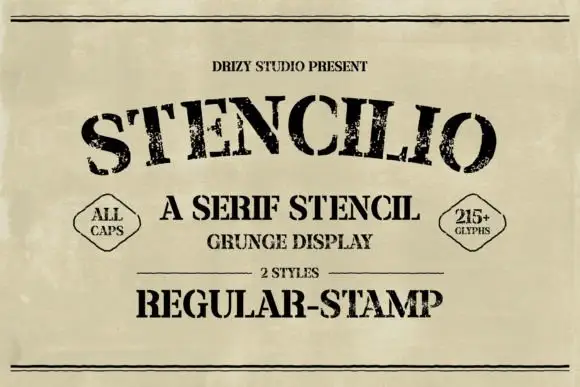
Distressed serif stencil
Stencilio is a distressed serif stencil in black on aged paper: heavy caps with interrupted bowls and rough feet, the letters set on a shallow arc, with a tracked line above, a small caps line and a two-diamond label beneath and a full second line in the stamp style.
Ideas for this font
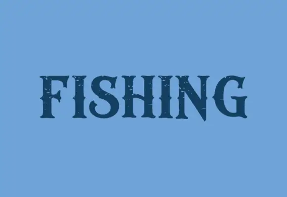
Dark contrast capitals with pointed serifs and sparse rough openings
Fishing is a contrasting display serif in which the stems run heavy, the serifs finish in points, the S turns compactly and the N takes a steep diagonal, with small rough openings near the edges, so one word reads as a bold label.
Ideas for this font
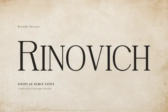
Narrow traditional serif
Rinovich is a narrow traditional serif in black on aged paper across a wooden surface: tall caps with fine bracketed serifs, a much taller initial R and a tight but even spacing, with a small line at the upper left and two lines beneath naming the style and the studio.
Ideas for this font
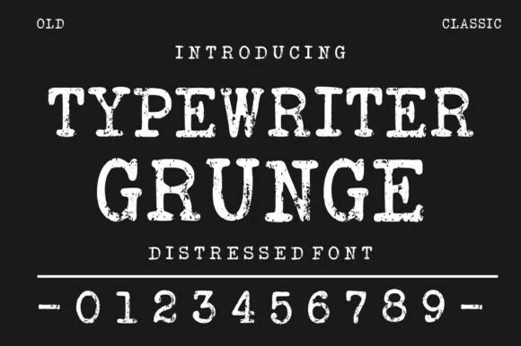
Distressed typewriter face with stamped edges
Typewriter Grunge is a distressed serif in white on near black: wide capitals with slab serifs and worn, ink-stamped edges, shown with a full row of digits and two small tracked labels at the corners.
Ideas for this font
Same independent foundry
Allow optional Google Analytics to measure visits and catalogue actions. Your search words and notes are not included. Privacy & storage