Neutral Sans Workhorse

Boom Grunge + Hermano
Lets Boom Grunge own the focal silhouette while handling secondary copy, sizing and subheads cleanly.
Inspect Hermano specimenDisclosure: MakerFileHub may earn a commission from qualifying purchases via paid links on this page. How our links work.
Heavy sponge-stamped & spray-speckled urban display sans
Boom Grunge is a wide, chunky urban sans-display font heavily textured inside and out with coarse asphalt and sponge-stamp grit.
Paid link
Get this fontProject & layout blueprintsAt-a-glance maker compatibility
Fine grain and micro-texture excel in 300 DPI print, sublimation, and screen print rather than small vinyl weeding.
Visual anatomy & craft review
Boom Grunge is a wide urban sans whose surface is stamped with coarse sponge grit and spray speckle inside the strokes and along the outer edges, so the face looks sprayed onto asphalt rather than distressed in software. The capitals are geometric and heavy with short, blunt terminals, and the speckle is fine enough that a large word keeps a solid silhouette. Wear this coarse needs about 30 mm to read as texture rather than dirt, and the face is best in one flat colour on a mid-tone ground, where the speckle shows without a second ink.
Speckled · Urban · Heavy-stamp
Two-font hierarchy recipes
Tested contrast partners — pairing Boom Grunge with grounded secondary typography.
Boom Grunge + Hermano
Lets Boom Grunge own the focal silhouette while handling secondary copy, sizing and subheads cleanly.
Inspect Hermano specimen
Boom Grunge + The Avenue Editorial
Grounds bold display lettering with classic typographic authority on posters, badges and apparel.
Inspect The Avenue Editorial specimenPractical applications
Concrete hierarchy, scale and production guidance tailored to Boom Grunge’s stroke geometry.
Spray speckle reads as a stencil hit on a wall, which is the register a skate or energy brand is buying, and the heavy geometry keeps the name legible under the noise. Wide capitals fill a chest panel without extra graphics.
Hierarchy & layout recipe
Tee print 300 x 160 mm, word 60 mm, 35 mm margins and 50 mm from the collar. Hoodie print 280 x 200 mm, word 70 mm, 30 mm above the hem. Pouch 130 x 200 mm, word 30 mm, nutrition panel 5.5 pt on a 100 mm measure at 12 mm from the base.
Pre-production check
A high-mesh screen print closes the speckle into a solid and the texture vanishes. Specify 110 mesh or coarser and approve a strike-off, or the printed result will look like a plain heavy sans.
The stamped surface gives a single cover grit without a photographed wall, and wide capitals survive a small wristband where a detailed face would smear. One ink keeps a banner run affordable.
Hierarchy & layout recipe
Cover 312 x 312 mm plus 3 mm bleed, word 180 mm, artist 16 pt, 20 mm margins. Wristband 250 x 25 mm, word 8 mm, 3 mm fold clearance. Banner 2000 x 600 mm, word 340 mm, 120 mm margins.
Pre-production check
Wristbands are printed on woven polyester that stretches about 8 percent once worn, and a speckled edge then looks like print misregistration. Keep 4 mm of dead space inside the die and test one on a wrist.
Stamped grit and hard geometry read as a poster pasted over a shutter, which is the urban register a warehouse haunt needs. Solid silhouettes stay legible in venue lighting.
Hierarchy & layout recipe
Poster A2, title 240 mm, times 24/30 pt, 30 mm margins. Zone sign 900 x 300 mm, word 140 mm, 60 mm margins. Flyer A5, title 100 mm, details 9/12 pt, 12 mm margins.
Pre-production check
Venue lighting is low and warm, and a black word on a mid-tone ground loses its edge at ten metres. Check one 1:1 print under stage lighting, and add a light keyline if the silhouette closes into the background.
Technical & licence verification
Confirm included OTF/TTF/WOFF formats, full glyph tables and licence coverage on the live store page before batch production.
Closest visual alternatives
Matched across letterform anatomy, stroke behaviour and craft applications.
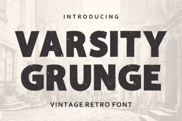
Weathered vintage athletic block sans
Varsity Grunge is a bold, stamp-weathered athletic block sans built for vintage gym tees, tailgate coolers, and throwback sweatshirts.
Ideas for this font
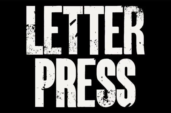
Heavy woodblock-grunge condensed poster grotesk
Letterpress is a tall, heavy condensed sans-display font stamped with authentic wood-type ink voids, chipped edges, and poster-press grit.
Ideas for this font
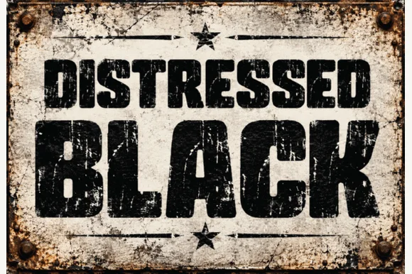
Heavy asphalt-cracked industrial grunge block sans
Distressed Black is an ultra-heavy industrial block sans (NOT delicate handwriting!) blasted with authentic scratched-paint & rusted-sign distressing!
Ideas for this font
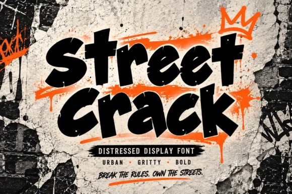
Gritty urban brush-tag & distressed street display
Street Crack is a muscular, forward-driving urban display font with chunky graffiti-marker strokes and rugged concrete-textured edges.
Ideas for this font
Same independent foundry
Allow optional Google Analytics to measure visits and catalogue actions. Your search words and notes are not included. Privacy & storage