High-Contrast Display Serif

Heavy Grunge + Majestic Letters
Pairs sculptural editorial warmth with Heavy Grunge's clean modern geometry.
Inspect Majestic Letters specimenDisclosure: MakerFileHub may earn a commission from qualifying purchases via paid links on this page. How our links work.
Tall condensed asphalt-scuffed grunge grotesk
Heavy Grunge is a tall, condensed distressed sans-serif font stamped with authentic scratched-asphalt and worn-paint texture.
Paid link
Get this fontProject & layout blueprintsAt-a-glance maker compatibility
Cut solid base, outline, and shadow layers in separate vinyl colors and align on registration marks.
Visual anatomy & craft review
Heavy Grunge is a tall condensed grotesk with scratched-asphalt texture and worn-paint edges, so a word looks stamped onto a rough surface rather than printed on paper. The caps are flat-sided and narrow, which fits a long title in a column, and the distress is fine enough to survive a small print while the silhouette stays solid at distance. It needs roughly 20 mm for the scratch detail to read, and it is at its best in one flat colour on a mid-tone ground where the wear shows without a second ink.
Asphalt-worn · Condensed · Gritty
Two-font hierarchy recipes
Tested contrast partners — pairing Heavy Grunge with grounded secondary typography.
Heavy Grunge + Majestic Letters
Pairs sculptural editorial warmth with Heavy Grunge's clean modern geometry.
Inspect Majestic Letters specimen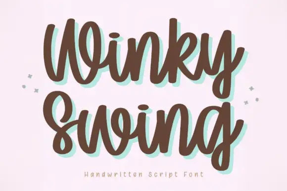
Heavy Grunge + Winky Swing
Introduces organic movement on pull-quotes, signatures and gift tags.
Inspect Winky Swing specimenPractical applications
Concrete hierarchy, scale and production guidance tailored to Heavy Grunge’s stroke geometry.
Asphalt texture reads as a poster pasted on a wall, which suits an industrial or dance subject. Condensed caps fit a long lineup in a narrow column.
Hierarchy & layout recipe
Poster A2, word 280 mm, details 22/28 pt, 30 mm margins. Flyer A5, word 120 mm, lineup 10/13 pt in two columns. Zine A5, header 50 mm, body 8.5/12 pt.
Pre-production check
A fine scratch texture under 0.3 mm disappears on a digital press at 120 mm and the word looks flat. Check one 1:1 proof, and increase the texture scale rather than the resolution.
Worn grotesk reads as a stencil hit on a shutter, which is the register a skate or workwear brand wants. Heavy condensed strokes survive a one-colour screen print.
Hierarchy & layout recipe
Chest print 260 x 160 mm, word 60 mm, 40 mm from the collar. Sign 1200 x 400 mm, word 220 mm, 80 mm margins and 30 mm from the frame. Crate 400 x 200 mm, word 80 mm, 25 mm margins.
Pre-production check
Screen printing at 110 mesh closes a fine scratch and the texture disappears, leaving a plain condensed sans. Approve a strike-off, or use a coarser texture cut if the print must show wear.
Scuffed lettering reads as a sign that has been up for years, which suits an urban haunt. The condensed weight holds a long attraction name on one board.
Hierarchy & layout recipe
Poster A2, word 280 mm, times 22/28 pt, 30 mm margins. Board 900 x 400 mm, word 160 mm, 60 mm margins. Crate label 150 x 100 mm, word 26 mm, 6 mm border.
Pre-production check
Venues light signs unevenly and a flat distressed fill on grey board reads as dirt under amber light. Check one 1:1 print in the space, and lighten the ground if the letters lose edge.
Technical & licence verification
Confirm included OTF/TTF/WOFF formats, full glyph tables and licence coverage on the live store page before batch production.
Closest visual alternatives
Matched across letterform anatomy, stroke behaviour and craft applications.
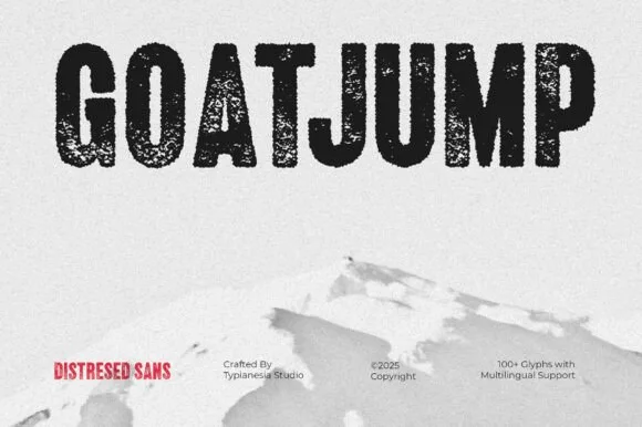
Tall condensed dry-roller & woodblock distressed sans (100+ glyphs, Multilingual)
Goatjump is a commanding, tall condensed distressed sans (100+ glyphs, Multilingual) stamped with vertical woodgrain & dry-roller grit!
Ideas for this font
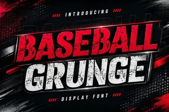
Slanted heavy distressed athletic & racing sans
Baseball Grunge (by Dreamspace.studio) is a forward-slanted, heavy athletic sans scarred with gritty chalk-and-asphalt distress streaks.
Ideas for this font
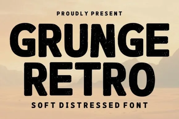
Bold soft-distressed vintage geometric sans display
Grunge Retro is a wide, bold geometric sans display font carrying rounded corners and light, tasteful vintage speckle wear.
Ideas for this font
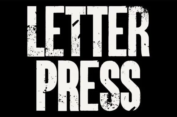
Heavy woodblock-grunge condensed poster grotesk
Letterpress is a tall, heavy condensed sans-display font stamped with authentic wood-type ink voids, chipped edges, and poster-press grit.
Ideas for this font
Same independent foundry
Allow optional Google Analytics to measure visits and catalogue actions. Your search words and notes are not included. Privacy & storage