High-Contrast Display Serif

Grunge Style + Wolles Elegant Modern Serif
Pairs sculptural editorial warmth with Grunge Style's clean modern geometry.
Inspect Wolles Elegant Modern Serif specimenDisclosure: MakerFileHub may earn a commission from qualifying purchases via paid links on this page. How our links work.
Heavy uppercase forms crossed by fine scratches and broken surface marks
Grunge Style stacks pale capital words against a rough dark wall. Broad upright stems and rounded G and U bowls remain visible beneath thin scratches and uneven dark breaks, while the R leg and the Y fork provide sharper diagonals and the small split numerals suggest a limited date example.
Paid link
Get this fontProject & layout blueprintsAt-a-glance maker compatibility
Fine grain and micro-texture excel in 300 DPI print, sublimation, and screen print rather than small vinyl weeding.
Visual anatomy & craft review
The stems stay heavy, the bowls round, the scratches cut across the strokes and the breaks vary from letter to letter. That wear is the character: the face reads as a sprayed sign that has weathered rather than a clean face with a filter, which is why the sample sets two rows on a wall. The composite image cannot separate every mark from the artwork texture, so check the actual file texture, keep 36 pt before the scratches eat the forms and test the numerals before you promise a distressed date.
Heavy uppercase forms crossed by fine scratches and broken surface marks
Two-font hierarchy recipes
Tested contrast partners — pairing Grunge Style with grounded secondary typography.
Grunge Style + Wolles Elegant Modern Serif
Pairs sculptural editorial warmth with Grunge Style's clean modern geometry.
Inspect Wolles Elegant Modern Serif specimen
Grunge Style + Wishful Women
Introduces organic movement on pull-quotes, signatures and gift tags.
Inspect Wishful Women specimenPractical applications
Concrete hierarchy, scale and production guidance tailored to Grunge Style’s stroke geometry.
The scratched caps set a haunted poster, and the heavy stems hold a short title at 58 pt on an A2 sheet, where the worn marks read as age rather than noise.
Hierarchy & layout recipe
Print an A2 poster: set the title at 58 pt on one row, keep 24 mm of clear ground beneath before the times at 15 pt, and keep the background flat so the scratches stay legible.
Pre-production check
Scratches over a busy background turn to mush; check the proof and keep 40 percent of the field empty behind the title.
The worn caps give a bottle character, and the heavy strokes hold a two-word name at 22 pt on a 55 by 65 mm label, where the breaks stay readable on a dark stock.
Hierarchy & layout recipe
Print a 55 by 65 mm label: set the name at 22 pt on one row, keep 10 mm of clear ground beneath before the strength at 6 pt, and print the letters pale on a dark ground so the breaks read as wear.
Pre-production check
A distressed file printed at 16 pt looks smudged; check the plate proof and hold the name at 20 pt.
The scratched blocks suit a street sign, and the broad stems hold a two-word sign at 60 mm on a printed panel, where the diagonal R leg keeps the row sharp.
Hierarchy & layout recipe
Print a 700 by 350 mm panel: set the sign at 60 mm on one row, keep 24 mm of clear ground beneath before the rules at 16 pt, and keep 26 mm of border so the wear marks are not cut by the trim.
Pre-production check
Fine damage vanishes at banner distance; check the panel from three metres and keep the letter shapes intact.
Technical & licence verification
Confirm included OTF/TTF/WOFF formats, full glyph tables and licence coverage on the live store page before batch production.
Closest visual alternatives
Matched across letterform anatomy, stroke behaviour and craft applications.

Tall distressed vintage capitals with speckled edges and tight fit
Modern Vintage is a tall capital alphabet with a distressed print texture, tight letterfit and vertical proportions, so a word reads as letterpress that has been used a hundred times.
Ideas for this font
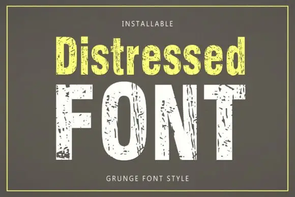
Tall condensed sans with chipped, distressed texture
Distressed is a tall condensed sans whose strokes are eaten away by irregular chips, so the letters look printed, worn and flaked rather than cleanly drawn.
Ideas for this font
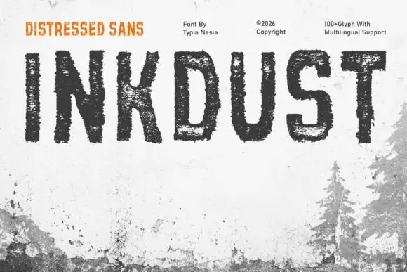
Narrow distressed capitals with broken interiors and ragged edges
Inkdust is a narrow distressed sans in which the stems stay tall, the bowls stay simple and heavy erosion breaks the fill with white gaps and ragged edges, so a single name reads as paint worn off a shipping crate.
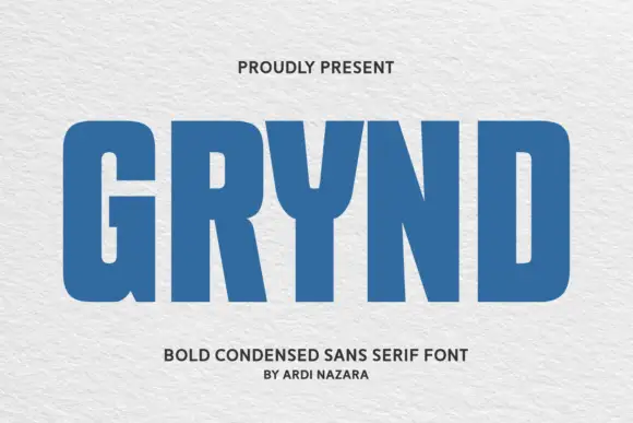
Angular geometric skate-deck lettering with cut corners and a shadow offset
Grynd sets a black word in angular geometric forms with several corners sliced away, a heavy even stroke and a pale shadow offset behind every letter, over a deck graphic.
Ideas for this font
Same independent foundry
Allow optional Google Analytics to measure visits and catalogue actions. Your search words and notes are not included. Privacy & storage