Neutral Sans Workhorse

Dreadora + Nyxar
Lets Dreadora own the focal silhouette while handling secondary copy, sizing and subheads cleanly.
Inspect Nyxar specimenDisclosure: MakerFileHub may earn a commission from qualifying purchases via paid links on this page. How our links work.
Stately broad-nib medieval manuscript blackletter
Dreadora is a stately medieval blackletter pairing classic broad-nib manuscript rhythm with smooth, highly legible lowercase bowls.
Paid link
Get this fontProject & layout blueprintsAt-a-glance maker compatibility
Weld or Unite overlapping script joins into one continuous vector path before sending to the blade.
Visual anatomy & craft review
Dreadora is a stately broad-nib medieval blackletter drawn with the pen angle visible in every stroke: thick diagonal stems, hairline exits, diamond feet and a dense even texture that reads as a manuscript page rather than a display face. The hairline exits are the weakest element in print, and the diamond feet are what survive at large sizes. It needs roughly 30 mm for the diamond foot and the exit to read, and it is best in one dense black on cream and parchment tones, or a single dark red for rubrication, and it should never be reversed at small sizes.
Regal-medieval · Smooth-fraktur · Readable
Two-font hierarchy recipes
Tested contrast partners — pairing Dreadora with grounded secondary typography.
Dreadora + Nyxar
Lets Dreadora own the focal silhouette while handling secondary copy, sizing and subheads cleanly.
Inspect Nyxar specimen
Dreadora + Medvilea Editorial
Grounds bold display lettering with classic typographic authority on posters, badges and apparel.
Inspect Medvilea Editorial specimenPractical applications
Concrete hierarchy, scale and production guidance tailored to Dreadora’s stroke geometry.
A broad-nib blackletter reads as a hand-ruled imprint rather than a modern logo, which is what a small press wants on a bookplate. The dense texture holds at 24 mm, and one black pass prints the bookplate and the box stamp without a second plate.
Hierarchy & layout recipe
Bookplate 90 x 60 mm, word 18 mm with 5 mm foot clearance, 6 mm margins. Box stamp 100 x 60 mm, word 22 mm, 6 mm margins. Card 85 x 55 mm, word 14 mm, 5 mm margins.
Pre-production check
On an 85 x 55 mm card the hairline exits fill and the name reads as a dark block with pale specks. Keep the card word at 18 mm or use a companion serif, and check one card before the run.
A stately blackletter reads as a manuscript page rather than a modern cover, which is what an issue about the book wants. The dense texture gives the title mass at 60 pt, and the even rhythm lets a long word sit inside a narrow measure.
Hierarchy & layout recipe
Cover 148 x 210 mm, title 60 pt with 8 mm foot clearance, cover lines 10/14 pt, 15 mm margins and 5 mm trim. Drop cap 4 lines, text 9.5/13 pt with 14 pt leading. Section head 24 pt with 10 mm above and 6 mm below.
Pre-production check
At 24 pt on the section head the diamond feet merge and the head reads as a black bar. Keep the face at 36 pt and above, set section heads in the body serif, and proof one signature.
A dense blackletter reads as a period warning rather than a cartoon monster, which is what a quiet scare event wants. The diamond feet hold at 120 mm across a poster, and one black plus a spot red prints the poster, the ticket and the candle labels for one night.
Hierarchy & layout recipe
Poster A2, word 120 mm with 12 mm foot clearance, times 40 mm, 20 mm margins. Ticket 100 x 50 mm, word 14 mm, 4 mm perforation. Candle label 60 x 40 mm, word 10 mm, 3 mm margins.
Pre-production check
Reversed white on black at 14 mm the hairline exits fill and the ticket word becomes an unreadable smear. Print the ticket black on pale stock or raise it to 20 mm, and check one ticket before the batch.
Technical & licence verification
Confirm included OTF/TTF/WOFF formats, full glyph tables and licence coverage on the live store page before batch production.
Closest visual alternatives
Matched across letterform anatomy, stroke behaviour and craft applications.
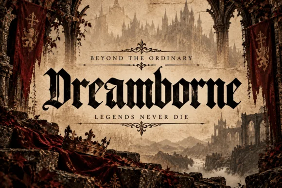
Clean medieval cathedral blackletter display
Dreamborne is a bold, clean-edged medieval blackletter display typeface balancing gothic diamond spurs with high fantasy cover legibility.
Ideas for this font

Swashed Victorian-psychedelic ornamental blackletter
Honey Star is a whimsical, medium-bold ornamental blackletter blending diamond gothic stems with sweeping celestial spiral curls.
Ideas for this font
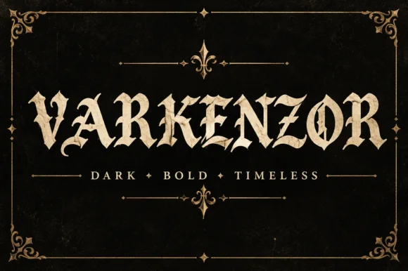
Condensed blackletter with sharp spurs
Varkenzor is a condensed blackletter in ochre on black inside an ornamental frame: tall narrow strokes, sharp spurs on the capitals, tight spacing that fuses the word into a band, and small diamond ornaments separating the motto words.
Ideas for this font
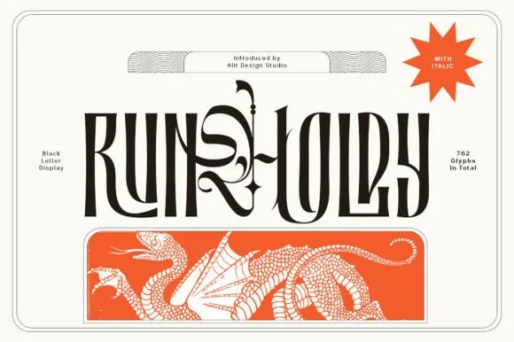
Condensed blackletter display with swashes
Runholdy is a condensed blackletter in black on bone: heavy narrow letters with long hairline swashes that leave the word entirely, sharp spurs on the capitals, and a red dragon illustration printed as a band beneath.
Ideas for this font
Same independent foundry
Allow optional Google Analytics to measure visits and catalogue actions. Your search words and notes are not included. Privacy & storage



