Neutral Sans Workhorse

Medieval Newspaper + Corven
Lets Medieval Newspaper own the focal silhouette while handling secondary copy, sizing and subheads cleanly.
Inspect Corven specimenDisclosure: MakerFileHub may earn a commission from qualifying purchases via paid links on this page. How our links work.
Authentic Belgian-abbey historical Fraktur blackletter
Medieval Newspaper is an authentic historical blackletter digitized from an antique Belgian abbey newspaper masthead.
Paid link
Get this fontProject & layout blueprintsAt-a-glance maker compatibility
Sturdy stroke walls and open counters weed cleanly on adhesive vinyl, HTV apparel film, and cut cardstock.
Visual anatomy & craft review
An authentic Belgian-abbey style Fraktur shown over an illustrated shield-and-sword pattern: crimson broad-nib capitals with split diamonds and a crisp vertical rhythm, so the word reads as a historical gazette masthead rather than as a fantasy gothic. The broad nib gives the strokes their angled stress, and the split-diamond capitals are the detail that makes a period headline look right. The rhythm is even, which is why a long masthead stays readable in a narrow measure. The shield pattern behind is staging. Uses are historical props, tavern broadsheets, game handouts and period event programmes.
Belgian-abbey · Historical-press · Old-newspaper
Two-font hierarchy recipes
Tested contrast partners — pairing Medieval Newspaper with grounded secondary typography.
Medieval Newspaper + Corven
Lets Medieval Newspaper own the focal silhouette while handling secondary copy, sizing and subheads cleanly.
Inspect Corven specimen
Medieval Newspaper + Evoire
Grounds bold display lettering with classic typographic authority on posters, badges and apparel.
Inspect Evoire specimenPractical applications
Concrete hierarchy, scale and production guidance tailored to Medieval Newspaper’s stroke geometry.
A broad-nib Fraktur with split diamonds reads as a period newspaper rather than as a fantasy poster, and the even rhythm keeps a long masthead legible across a narrow measure, which is what a gazette prop needs to convince.
Hierarchy & layout recipe
A3 broadsheet: the masthead at 90 mm cap height across the full measure, the dateline in a 12 pt serif, and two columns of 10 pt body. Keep 24 mm margins and keep the split diamonds above 1.5 mm.
Pre-production check
Check the masthead at 90 mm, where a split diamond can clot; open the tracking. Confirm the 10 pt body reads in hand and that the columns align to the rule beneath the masthead.
A period blackletter programme gives a themed ceremony a prop with real authority, and the crimson on cream reads on a folded sheet where a dark cover would look like a poster rather than a keepsake.
Hierarchy & layout recipe
A4 folded to A5: the masthead at 44 mm cap height, the order of events at 11 pt, and two colours on a cream stock. Keep 18 mm margins and keep the text block 10 mm clear of the fold.
Pre-production check
Check the 44 mm masthead across the fold, where a letter can land on the crease; shift the block. Confirm the 11 pt order reads in low light and that the crimson does not offset inside the fold.
A Fraktur menu reads as a banquet document rather than a restaurant card, and the vertical rhythm lets a long list of courses sit in a narrow measure without the raggedness a modern serif would show.
Hierarchy & layout recipe
A5 menu: the heading at 28 mm cap height, the courses at 10 pt, and one ink on a heavy card. Keep 20 mm margins, set the courses in capitals with +8 tracking, and leave 15 mm at the foot for the date.
Pre-production check
Check the 10 pt courses at arm's length, where a capital can fill in a letterpress run; proof the plate first. Confirm the heading clears the trim and that the card stands upright on the table.
Technical & licence verification
Confirm included OTF/TTF/WOFF formats, full glyph tables and licence coverage on the live store page before batch production.
Closest visual alternatives
Matched across letterform anatomy, stroke behaviour and craft applications.
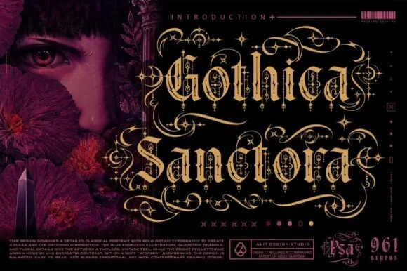
961-glyph cathedral-filigree & Victorian-scroll blackletter
Gothica Sanctora is an opulent 961-glyph gothic blackletter crowning Victorian-medieval letters with intricate filigree halos and scroll cages.
Ideas for this font
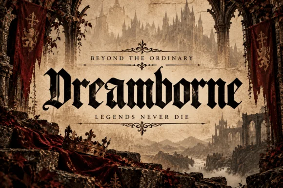
Clean medieval cathedral blackletter display
Dreamborne is a bold, clean-edged medieval blackletter display typeface balancing gothic diamond spurs with high fantasy cover legibility.
Ideas for this font
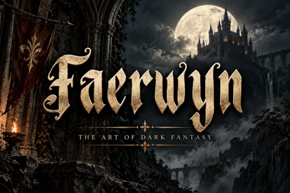
Elven-medieval dark-fantasy calligraphic blackletter
Faerwyn is a mystical dark-fantasy blackletter blending sharp medieval broad-nib calligraphy with sweeping elven ascender curls.
Ideas for this font
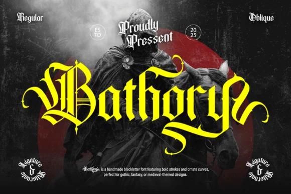
Ornate medieval blackletter family (Regular & Oblique)
Bathory is a lush, handmade medieval blackletter family (Regular & Oblique) featuring double-barred capitals and sweeping flame-curled descenders.
Ideas for this font
Allow optional Google Analytics to measure visits and catalogue actions. Your search words and notes are not included. Privacy & storage