Neutral Sans Workhorse

Roslenk Volume 2 Font + Corven
Lets Roslenk Volume 2 Font own the focal silhouette while handling secondary copy, sizing and subheads cleanly.
Inspect Corven specimenDisclosure: MakerFileHub may earn a commission from qualifying purchases via paid links on this page. How our links work.
Tall calligraphic blackletter with fine waist lines and extended loops
Roslenk Volume 2 is a blackletter drawn without a single curve: every stroke is a straight cut, the joins are mitred, the spurs end in diamonds, and the last letter throws a long angular swash under the word.
Paid link
Get this fontProject & layout blueprintsAt-a-glance maker compatibility
Sturdy stroke walls and open counters weed cleanly on adhesive vinyl, HTV apparel film, and cut cardstock.
Visual anatomy & craft review
ROSLENK fills the card in a chrome finish over a dark blurred ground, and the letters look cut from sheet metal: the R is a stack of angled bars, the O is a hexagon, the S is built from three straight segments, and the K ends in a tail that swings out below the baseline and returns in a sharp hook. Small caps captions in the corners describe the style, the studio and the features, and a round badge at the right marks the second volume. The chrome fill is a photograph-style gradient rather than flat colour, which is what makes the shapes read as metal at poster size. The face belongs to streetwear, tattoo studios, metal covers and dark editorial, and it is built for large sizes: the mitred joins and the thin diamond points lose their edge quickly when the type is set small.
Tall calligraphic blackletter with fine waist lines and extended loops
Two-font hierarchy recipes
Tested contrast partners — pairing Roslenk Volume 2 Font with grounded secondary typography.
Roslenk Volume 2 Font + Corven
Lets Roslenk Volume 2 Font own the focal silhouette while handling secondary copy, sizing and subheads cleanly.
Inspect Corven specimen
Roslenk Volume 2 Font + Kernova
Grounds bold display lettering with classic typographic authority on posters, badges and apparel.
Inspect Kernova specimenPractical applications
Concrete hierarchy, scale and production guidance tailored to Roslenk Volume 2 Font’s stroke geometry.
The angular cuts give a clothing brand a mark that reads as cut rather than drawn, and the long swash fills a chest print without a second graphic element.
Hierarchy & layout recipe
Print a 300 by 400 mm chest print: set the brand name at 150 pt on one row, keep 40 mm of clear ground beneath before the size tab at 12 pt, and hold 34 mm from the swash end to the print edge.
Pre-production check
Screen printing closes the diamond points; print one pull on the actual shirt and check the sharpest cut before the run.
The metal-cut letterforms give an issue a hard edge that matches its subject, and the geometric shapes stay readable when the cover is seen as a thumbnail.
Hierarchy & layout recipe
Print a 210 by 297 mm cover: set the cover line at 90 pt across two rows, keep 24 mm of clear ground beneath before the issue line at 10 pt, and hold 18 mm from the outer points to the trim.
Pre-production check
Chrome fills band on uncoated paper; print one cover on the intended stock and check the gradient before the issue closes.
The sharp gothic cut sets the scene for a dark arts night, and the heavy strokes stay legible on a wall poster seen from across a room.
Hierarchy & layout recipe
Print a 500 by 700 mm board: set the event name at 110 pt across two rows, keep 28 mm of clear ground beneath before the date at 14 pt, and hold 26 mm of border so the diamond spurs stay whole.
Pre-production check
Foam board shows every mitre; print one board at the final size and inspect the joins under a raking light.
Technical & licence verification
Confirm included OTF/TTF/WOFF formats, full glyph tables and licence coverage on the live store page before batch production.
Closest visual alternatives
Matched across letterform anatomy, stroke behaviour and craft applications.
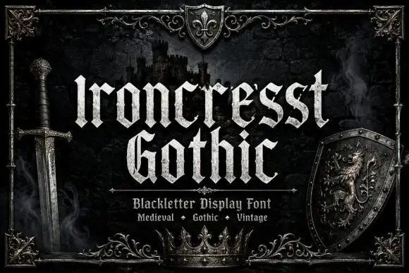
Dense angular blackletter with forked tops and textured fill
Ironcrest Gothic is a medieval display blackletter with a strong vertical stress, diamond feet and a slightly worn fill, framed by heraldic pieces: a shield, a crown, a sword and a lion.
Ideas for this font
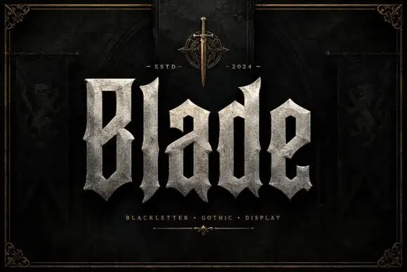
Broad faceted blackletter with deep angular counters
Blade is a heavy blackletter display face whose strokes look carved from granite: thick stems, chiselled counters, weathered edges and a fill that reads as stone rather than ink.
Ideas for this font
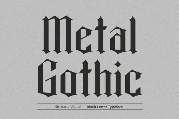
Spare geometric blackletter
Metal Gothic is a spare blackletter in black on a pale textured paper: narrow angular counters, straight shoulders, diamond-shaped terminals and tight fitting, set in two stacked words with a fine rule and a plain credit line beneath.
Ideas for this font
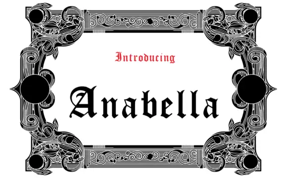
Open blackletter with a looped A and sharp narrow ascenders
Anabella sits in black within an elaborate black-and-white frame, where the A carries a rounded upper loop and a sweeping diagonal inner stroke, the lowercase alternates between sharp narrow ascenders and open interiors, and the ornament sits in the frame rather than in the word.
Same independent foundry
Allow optional Google Analytics to measure visits and catalogue actions. Your search words and notes are not included. Privacy & storage