Neutral Sans Workhorse

Dreamborne + Inkora
Lets Dreamborne own the focal silhouette while handling secondary copy, sizing and subheads cleanly.
Inspect Inkora specimenDisclosure: MakerFileHub may earn a commission from qualifying purchases via paid links on this page. How our links work.
Clean medieval cathedral blackletter display
Dreamborne is a bold, clean-edged medieval blackletter display typeface balancing gothic diamond spurs with high fantasy cover legibility.
Paid link
Get this fontProject & layout blueprintsAt-a-glance maker compatibility
Sturdy stroke walls and open counters weed cleanly on adhesive vinyl, HTV apparel film, and cut cardstock.
Visual anatomy & craft review
Dreamborne is a clean-edged medieval blackletter display with gothic diamond spurs and an ornate open-bowled D, drawn so a fantasy cover title reads at thumbnail size without the tight texture of a traditional Textura. The stems are heavy and evenly spaced, the lowercase is knit but open enough for a 16 pt line, and the capitals carry the ornament so a word can begin with incident and continue legibly. It is a title face for books, games and themed signage, comfortable from 20 mm upward, and honest about its limits: long copy would collapse into texture.
Epic-gothic · Cathedral · Legible
Two-font hierarchy recipes
Tested contrast partners — pairing Dreamborne with grounded secondary typography.
Dreamborne + Inkora
Lets Dreamborne own the focal silhouette while handling secondary copy, sizing and subheads cleanly.
Inspect Inkora specimen
Dreamborne + Amor Hadena
Grounds bold display lettering with classic typographic authority on posters, badges and apparel.
Inspect Amor Hadena specimenPractical applications
Concrete hierarchy, scale and production guidance tailored to Dreamborne’s stroke geometry.
Clean-edged gothic gives a fantasy title the book-historical reference readers expect while staying legible at spine size, which is where most covers fail. Heavy stems survive being set over painted illustration.
Hierarchy & layout recipe
Jacket 152 x 229 mm, title 42 pt, author 16 pt, 18 mm margins, spine 9 pt. Header 700 px wide on a 1920 x 1080 screen, safe margin 5 percent. Map label 100 x 30 mm, name 12 mm.
Pre-production check
Blackletter at 9 pt on a spine becomes a grey bar in a bookshop photograph. Check the spine title at 9 pt in a phone photo of the shelf, and switch the spine to a plain serif if the letters merge.
Manuscript letterforms read as a prop that belongs to the setting rather than a party supply, which matters for a tabletop group or a themed event. Even spacing keeps a word readable across a folding screen.
Hierarchy & layout recipe
Screen 900 x 600 mm, three panels at 300 mm, word 90 mm on the centre panel, 40 mm margins. Chalice decal 60 mm wide, word 14 mm, 3 mm cut margin. Candle label 55 x 45 mm, word 8 mm, 3 mm top arc.
Pre-production check
Folding screens are printed on canvas and the weave eats anything under 1 mm, so a gothic at 90 mm holds while a 14 mm decal does not. Match the size to the substrate, and check one panel stretched on its frame.
Clean gothic reads as a storybook rather than a Christmas card, which is what a fantasy reader wants for a solstice greeting. Tight but open lowercase holds a short message at 9 pt on a card.
Hierarchy & layout recipe
Card 120 x 170 mm, greeting 22 mm, message 8/12 pt, 14 mm margins. Journal A5, headings 16 mm, ruled area 7 mm pitch. Sleeve 80 x 80 mm wrap, word 16 mm, 5 mm die margin.
Pre-production check
Winter cards are often printed on textured stock that breaks up a blackletter's thin spurs at 8 pt. Keep the message in a companion serif and the gothic to the heading, then check one copy in daylight.
Technical & licence verification
Confirm included OTF/TTF/WOFF formats, full glyph tables and licence coverage on the live store page before batch production.
Closest visual alternatives
Matched across letterform anatomy, stroke behaviour and craft applications.
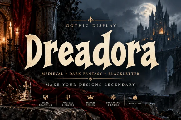
Stately broad-nib medieval manuscript blackletter
Dreadora is a stately medieval blackletter pairing classic broad-nib manuscript rhythm with smooth, highly legible lowercase bowls.
Ideas for this font
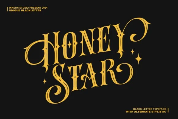
Swashed Victorian-psychedelic ornamental blackletter
Honey Star is a whimsical, medium-bold ornamental blackletter blending diamond gothic stems with sweeping celestial spiral curls.
Ideas for this font
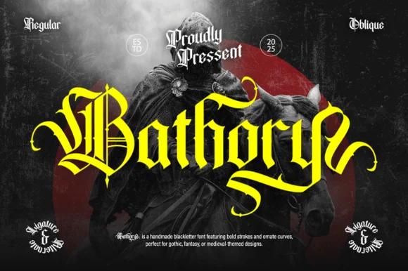
Ornate medieval blackletter family (Regular & Oblique)
Bathory is a lush, handmade medieval blackletter family (Regular & Oblique) featuring double-barred capitals and sweeping flame-curled descenders.
Ideas for this font
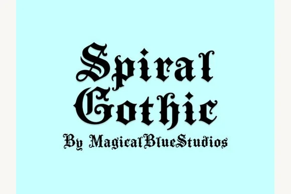
Blackletter with spiral flourishes
Spiral Gothic is a blackletter in black on pale mint: heavy vertical stems, hairline joins and sharp terminals, with spiral flourishes growing out of the S and the G and a small line beneath in the same hand.
Ideas for this font
Same independent foundry
Allow optional Google Analytics to measure visits and catalogue actions. Your search words and notes are not included. Privacy & storage