Neutral Sans Workhorse

The Gradley + Furion
Lets The Gradley own the focal silhouette while handling secondary copy, sizing and subheads cleanly.
Inspect Furion specimenDisclosure: MakerFileHub may earn a commission from qualifying purchases via paid links on this page. How our links work.
Ornate blackletter with hairline inner strokes and long curling swashes
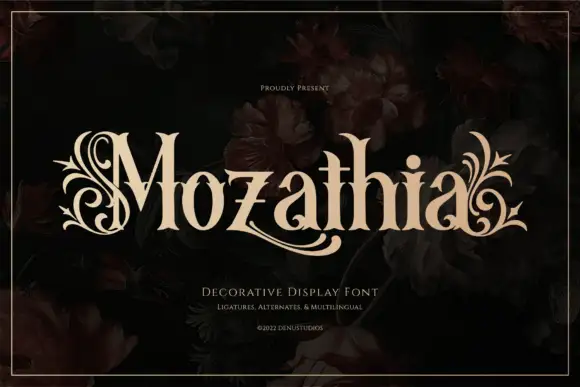
The Gradley is an ornate blackletter display face: heavy letters with a fine inline running through the stems, long swashes on several capitals, and stars scattered between the words.
Paid link
Get this fontProject & layout blueprintsAt-a-glance maker compatibility
Set Cricut or Silhouette operation to Pen, Foil Quill, or Laser Score — not Basic Blade Cut.
Visual anatomy & craft review
the over gradley sits across the card in white on a dark interior, the letters drawn in a blackletter skeleton but decorated with an inline that follows each stem and a set of flourishes that reach out at the top and the foot of the line. The T throws a swash to the left, the g and the y drop long tails below the baseline, and four-pointed stars of two sizes are scattered in the gaps between the letters. The inline is drawn at the same fine weight in every letter, which is what holds the busy word together, and the swashes are kept to the beginning and the end of each line so the middle stays readable. Two small captions in a plain sans name the style and the number of alternates. It is a display blackletter for posters, album art and merch, and it needs a dark ground and a large size.
Ornate blackletter with hairline inner strokes and long curling swashes
Two-font hierarchy recipes
Tested contrast partners — pairing The Gradley with grounded secondary typography.
The Gradley + Furion
Lets The Gradley own the focal silhouette while handling secondary copy, sizing and subheads cleanly.
Inspect Furion specimen
The Gradley + Vanielst Elegant Serif Display Stylistic
Grounds bold display lettering with classic typographic authority on posters, badges and apparel.
Inspect Vanielst Elegant Serif Display Stylistic specimenPractical applications
Concrete hierarchy, scale and production guidance tailored to The Gradley’s stroke geometry.
The ornament sets a period and a mood at once, and the white letters hold against a dark cover image without a panel behind them.
Hierarchy & layout recipe
Print a 140 by 216 mm cover: set the title at 56 pt across two rows, keep 22 mm of clear ground beneath before the editor line at 10 pt, and hold 16 mm from the lowest tail to the trim.
Pre-production check
The fine inline fills in at small trim sizes; print one cover at the final size and check the stems before the run.
The ornament gives a bottle a period character, and the inline keeps the label from reading as a flat black block on a dark shelf.
Hierarchy & layout recipe
Print a 65 by 105 mm label: set the spirit name at 22 pt on one row, keep 8 mm of clear ground beneath before the strength at 5 pt, and hold 6 mm from the swash to the die line.
Pre-production check
Foil stamping closes the inline; print one label in the intended finish and check the thin line before the batch.
The swashes and stars suggest a formal costume event rather than a modern party, and the heavy letters read across a dim hall from the doorway.
Hierarchy & layout recipe
Print a 500 by 700 mm poster: set the event name at 100 pt across two rows, keep 30 mm of clear ground beneath before the date at 14 pt, and hold 26 mm of margin so the outer stars stay inside the sheet.
Pre-production check
White on dark stock scuffs at the edges; print one poster and handle it before the run is approved.
Technical & licence verification
Confirm included OTF/TTF/WOFF formats, full glyph tables and licence coverage on the live store page before batch production.
Closest visual alternatives
Matched across letterform anatomy, stroke behaviour and craft applications.
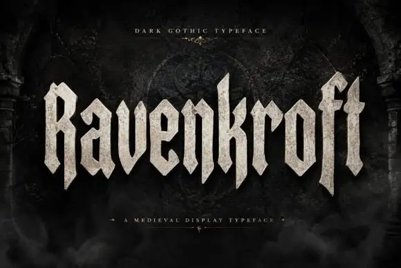
Faceted blackletter display
Ravenkroft is a faceted blackletter in bone on a dark stone ground: tall capitals with deep R and f descenders, sharp angular spurs, a stone texture on the fill and a slight forward lean, with a small line above and a plain line beneath that name the style.
Ideas for this font
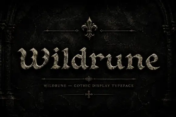
Uneven chipped gothic
Wildrune is an uneven gothic in pale stone on a black cracked ground: broad curved bowls, chipped pointed terminals, varied stroke widths, set as one word between a fine fleur ornament above and a tracked descriptor beneath, with small cross ornaments at the sides.
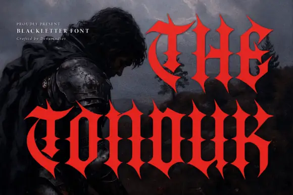
Concave-sided gothic display
The Tonduk is a solid red gothic display over a dark painted landscape: capitals with concave sides, sharp flared ends, narrow bowls and open counters, set in two lines of different sizes with a small presenting note and a credit at the upper left.
Ideas for this font
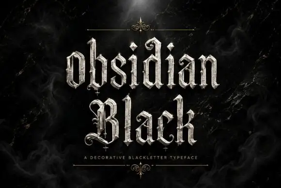
Slender outlined blackletter
Obsidian Black is a slender outlined blackletter in silver on a black marble ground: mixed case with small spirals at the terminals, long fine tips, doubled edges and a scaled texture on the fill, set in two lines with a small tracked line beneath between two hairline rules and drawn fleurons.
Ideas for this font
Same independent foundry
Allow optional Google Analytics to measure visits and catalogue actions. Your search words and notes are not included. Privacy & storage