Neutral Sans Workhorse

Pelysska + Mansory
Lets Pelysska own the focal silhouette while handling secondary copy, sizing and subheads cleanly.
Inspect Mansory specimenDisclosure: MakerFileHub may earn a commission from qualifying purchases via paid links on this page. How our links work.
Scroll-flourished scarlet gothic blackletter display
Pelysska is a dramatic gothic blackletter display typeface draped in curling calligraphy vines, looped ascenders, and regal manuscript spurs.
Paid link
Get this fontProject & layout blueprintsAt-a-glance maker compatibility
Sturdy stroke walls and open counters weed cleanly on adhesive vinyl, HTV apparel film, and cut cardstock.
Visual anatomy & craft review
Pelysska is a scarlet gothic blackletter display draped in curling calligraphy vines, with looped ascenders, symmetrical S-scroll tendrils above and below the x-height and regal manuscript spurs, so a word reads as an illuminated manuscript rather than a poster. The vines extend well past the letters, which means the artwork box grows in every direction, and the stems are dense. It needs roughly 32 mm for the scrolls to read, and it is best in vermilion or gold on a deep ground or in one ink on vellum cream.
Medieval · Flamboyant · Ornate
Two-font hierarchy recipes
Tested contrast partners — pairing Pelysska with grounded secondary typography.
Pelysska + Mansory
Lets Pelysska own the focal silhouette while handling secondary copy, sizing and subheads cleanly.
Inspect Mansory specimen
Pelysska + Things
Grounds bold display lettering with classic typographic authority on posters, badges and apparel.
Inspect Things specimenPractical applications
Concrete hierarchy, scale and production guidance tailored to Pelysska’s stroke geometry.
Manuscript blackletter reads as a period source, which is what a gothic edition puts on a cover. The vines give the title its subject without an illustration, and the dense stems hold at 54 pt on coated stock.
Hierarchy & layout recipe
Cover 152 x 229 mm, title 58 pt with 12 mm scroll clearance, author 14 pt, 18 mm margins and 10 mm trim. Spread 420 x 297 mm, opener 90 mm, body 10/15 pt. Panel 1200 x 800 mm, title 190 mm, notes 18/24 pt.
Pre-production check
The scrolls rise above the cap line and get trimmed when a cover is fitted to a template. Declare the full artwork box including the vines, and check one cover proof with trim marks.
Illuminated gothic lettering reads as an old order, which is what an immersive Halloween venue prints at the gate. The vines carry at 260 mm in one ink on a dark sheet, and the manuscript spurs give the poster its period weight.
Hierarchy & layout recipe
Poster A2, word 260 mm with 15 mm scroll clearance, times 22/28 pt, 30 mm margins and 20 mm trim. Card 105 x 148 mm, word 26 mm, details 8/11 pt. Prop label 90 x 140 mm, word 20 mm, 12 mm margins.
Pre-production check
Gold on charcoal under warm lamp light loses contrast and 26 mm scrollwork reads as a brown smear. Add a pale keyline behind the word, and check one card under the venue's actual lighting.
Draped blackletter reads as a stone church wedding with a dramatic register, which is what a couple marrying in a cathedral wants. The vines crown the names at 28 pt, and the dense stems foil into a confident line on matte card.
Hierarchy & layout recipe
Invitation 130 x 180 mm, names 28 pt with 10 mm scroll clearance, details 9/13 pt, 15 mm margins. Vow card 105 x 148 mm, heading 16 pt, text 8/11 pt. Sign 600 x 900 mm, names 90 mm, 25 mm frame clearance.
Pre-production check
A 9 pt detail line in a vine-draped blackletter closes its counters and the venue address becomes unreadable. Set details in a companion roman, and check one proof on the actual card stock.
Technical & licence verification
Confirm included OTF/TTF/WOFF formats, full glyph tables and licence coverage on the live store page before batch production.
Closest visual alternatives
Matched across letterform anatomy, stroke behaviour and craft applications.
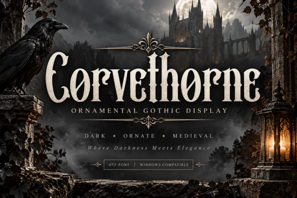
Raven-gothic ornamental blackletter with diamond counter flourishes
Corvethorne is a tall, condensed ornamental gothic display font accented with interior diamond crosshairs and curled medieval spurs.
Ideas for this font
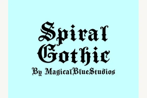
Blackletter with spiral flourishes
Spiral Gothic is a blackletter in black on pale mint: heavy vertical stems, hairline joins and sharp terminals, with spiral flourishes growing out of the S and the G and a small line beneath in the same hand.
Ideas for this font
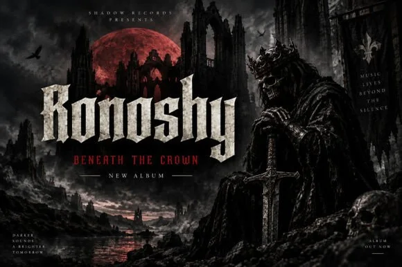
Sharp blackletter with stone texture
Ronoshy is a blackletter display in bone white on a dark gothic scene: tall spiked capitals with hairline joins and sharp terminals, textured like carved stone, set above a red subtitle in a small rounded capital face.
Ideas for this font
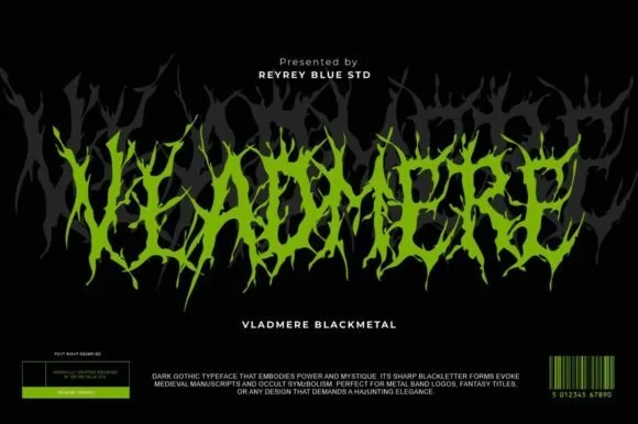
Black-metal jagged logo display
Vladmere is a black-metal logo face in lime green on black: letters built from thin jagged blades that lean and intersect, a mirrored grey copy behind the word, and a barcode-style badge at the foot that gives the specimen the look of a record sleeve.
Ideas for this font
Same independent foundry
Allow optional Google Analytics to measure visits and catalogue actions. Your search words and notes are not included. Privacy & storage