Neutral Sans Workhorse

Porphyria + Saltriver Grotesk
Lets Porphyria own the focal silhouette while handling secondary copy, sizing and subheads cleanly.
Inspect Saltriver Grotesk specimenDisclosure: MakerFileHub may earn a commission from qualifying purchases via paid links on this page. How our links work.
Sharp thorny dark-tattoo & metal blackletter display
Porphyria is an aggressive, sharp-spurred tattoo blackletter display font (not a flowing cursive script) built for gothic arches and heavy merch.
Paid link
Get this fontProject & layout blueprintsAt-a-glance maker compatibility
Sturdy stroke walls and open counters weed cleanly on adhesive vinyl, HTV apparel film, and cut cardstock.
Visual anatomy & craft review
Porphyria is a sharp-spurred tattoo blackletter with tall condensed gothic capitals, bronze-bevel detail and thorn spurs that grow from the shoulders rather than floating behind the word. The stems are heavy and tightly spaced, so a word reads as a carved arch, and the spurs give it the tattoo-flash silhouette without a separate ornament layer. It needs roughly 30 mm for the spurs to read as points, and it is a logo and merch device, best in one bone colour on a dark ground with a bevel or a second ink.
Dark-blackletter · Thorny · Ornate
Two-font hierarchy recipes
Tested contrast partners — pairing Porphyria with grounded secondary typography.
Porphyria + Saltriver Grotesk
Lets Porphyria own the focal silhouette while handling secondary copy, sizing and subheads cleanly.
Inspect Saltriver Grotesk specimen
Porphyria + Alerigue
Grounds bold display lettering with classic typographic authority on posters, badges and apparel.
Inspect Alerigue specimenPractical applications
Concrete hierarchy, scale and production guidance tailored to Porphyria’s stroke geometry.
Tattoo spurs read as a hand-drawn flash sheet, which suits a haunt that wants attitude rather than cartoon. Heavy stems hold under a one-colour print on black.
Hierarchy & layout recipe
Tee print 280 x 320 mm, word 200 mm, 40 mm margins. Arch sign 600 x 900 mm, word 120 mm curved over a 700 mm radius. Label 70 x 50 mm, word 12 mm, 4 mm die margin.
Pre-production check
A curved arch layout forces the spurs to collide at the join of two letters. Check the arch on a 1:1 paper template before printing, and open the curve if any pair overlaps.
Spurred gothic reads as a house mark rather than a band logo, which lets a small label use one device across a bottle and a deck. The bevel gives a two-tone effect from one separation.
Hierarchy & layout recipe
Deck 210 x 810 mm, word 140 mm on a 200 mm centre panel, 25 mm to the bolt holes. Label 90 x 110 mm, word 18 mm, abv 4.5 pt on a 6 mm baseline, 5 mm top arc. Chest print 260 x 140 mm, word 60 mm, 40 mm from the collar.
Pre-production check
Bevel detail under 0.5 mm at 18 mm on a bottle label closes and the word becomes flat. Use the solid cut for small labels, and keep the bevel for surfaces above 100 mm.
A tattoo blackletter reads as hand-lettered flash, which suits a book about tattoo art or a metal release. Tight spacing gives a title density without ornament.
Hierarchy & layout recipe
Sleeve 312 x 312 mm plus 3 mm bleed, word 210 mm, credits 7 pt. Book 210 x 297 mm, title 90 pt, captions 9/13 pt. Jacket 152 x 229 mm, title 54 pt, spine 9 pt.
Pre-production check
A spine at 9 pt closes a tight blackletter into a grey bar. Check the spine at shelf distance, and substitute a plain condensed for the spine while keeping the display face on the cover.
Technical & licence verification
Confirm included OTF/TTF/WOFF formats, full glyph tables and licence coverage on the live store page before batch production.
Closest visual alternatives
Matched across letterform anatomy, stroke behaviour and craft applications.
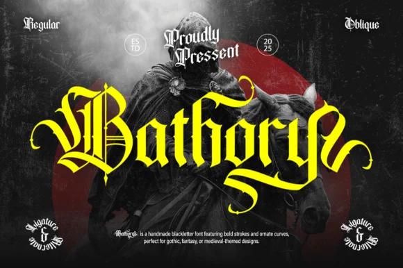
Ornate medieval blackletter family (Regular & Oblique)
Bathory is a lush, handmade medieval blackletter family (Regular & Oblique) featuring double-barred capitals and sweeping flame-curled descenders.
Ideas for this font
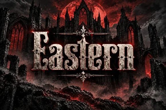
Weathered cathedral Fraktur blackletter display (OTF)
Eastern is a dramatic medieval Fraktur blackletter display font featuring bifurcated crown spurs and classic gothic lowercase (OTF).
Ideas for this font
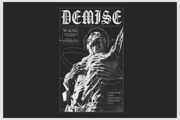
Sharp inline-highlighted underground metal blackletter
Demise is a razor-chiseled underground gothic blackletter featuring crisp vertical facets and grimdark poster presence.
Ideas for this font
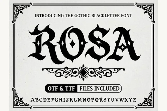
Gothic blackletter with ornaments
Rosa is a gothic blackletter display in black on white: heavy broken strokes with diamond-shaped counters, sharp spurs and a dense texture, set inside an ornamental corner frame with a scroll divider, a file badge and a complete alphabet line at the foot.
Ideas for this font
Same independent foundry
Allow optional Google Analytics to measure visits and catalogue actions. Your search words and notes are not included. Privacy & storage