Neutral Sans Workhorse

Ethoris + Lemon Milk Pro FTR
Lets Ethoris own the focal silhouette while handling secondary copy, sizing and subheads cleanly.
Inspect Lemon Milk Pro FTR specimenDisclosure: MakerFileHub may earn a commission from qualifying purchases via paid links on this page. How our links work.
Baroque horror blackletter family (Regular, Extrude & Outline)
Ethoris is an opulent dark-fantasy blackletter family offering matched Regular, Extrude, and Outline styles wrapped in thorny vine flourishes.
Paid link
Get this fontProject & layout blueprintsAt-a-glance maker compatibility
Cut solid base, outline, and shadow layers in separate vinyl colors and align on registration marks.
Visual anatomy & craft review
Ethoris is a Baroque horror blackletter family in a regular, an extrude and an outline cut: dense broken strokes with a heavy vertical rhythm, ornamented shoulders that curl into a small scroll and a third cut where the word is given carved depth. The family lets one poster carry a flat name and a carved second line in the same voice, which is how a period title page is usually built, without borrowing a second face. The scrolls are the finest element and they fill into a solid edge as soon as the face is reduced, and the outline cut needs the largest size of the three to survive. The regular needs roughly 32 mm and the extrude 36 mm for their detail to read.
Dark-fantasy · Intricate · Layered
Two-font hierarchy recipes
Tested contrast partners — pairing Ethoris with grounded secondary typography.
Ethoris + Lemon Milk Pro FTR
Lets Ethoris own the focal silhouette while handling secondary copy, sizing and subheads cleanly.
Inspect Lemon Milk Pro FTR specimen
Ethoris + Wolles Elegant Modern Serif
Grounds bold display lettering with classic typographic authority on posters, badges and apparel.
Inspect Wolles Elegant Modern Serif specimenPractical applications
Concrete hierarchy, scale and production guidance tailored to Ethoris’s stroke geometry.
A Baroque blackletter gives a dark serial the look of a printed book rather than a styled page. The regular holds at 64 pt, and the extrude layer carries the drop cap as a carved initial.
Hierarchy & layout recipe
Opener 210 x 297 mm, title 64 pt with 12 mm scroll clearance, standfirst 11/15 pt, body 9/13 pt over two columns of 82 mm, 18 mm margins. Drop cap 96 pt in the extrude cut. Section head 24 pt.
Pre-production check
At 24 pt on the section head the scrolls fill and the head reads as a black bar. Keep the face at 40 pt and above, and proof one spread at 1:1.
An ornamented blackletter reads as a period bill rather than a cartoon monster. The scrolls hold at 120 mm on a poster, and two flat inks print the poster and the tickets in one order.
Hierarchy & layout recipe
Poster A2, word 120 mm with 14 mm scroll clearance, details 40 mm, 20 mm margins. Ticket 100 x 50 mm, word 14 mm, 4 mm perforation. Door plate 200 x 300 mm, word 60 mm, 20 mm margins.
Pre-production check
A 100 x 50 mm ticket at 14 mm merges the scrolls into a solid edge and the word reads as a barbed bar. Raise the ticket to 20 mm, and print one ticket before the batch.
A Baroque blackletter reads as a hand-set imprint rather than a modern logo. The extrude holds at 30 mm in foil, and the family lets the plate and the spine share one voice.
Hierarchy & layout recipe
Bookplate 90 x 60 mm, extrude 30 mm with 8 mm scroll clearance, 6 mm margins. Foil block 40 x 20 mm, regular 12 mm, 3 mm margin. Card 85 x 55 mm, regular 16 mm, 5 mm margins.
Pre-production check
A 40 x 20 mm foil block at 12 mm bridges the scrolls and the mark prints as a filled shape. Keep foil blocks at 18 mm and above, and test one impression before the order.
Technical & licence verification
Confirm included OTF/TTF/WOFF formats, full glyph tables and licence coverage on the live store page before batch production.
Closest visual alternatives
Matched across letterform anatomy, stroke behaviour and craft applications.
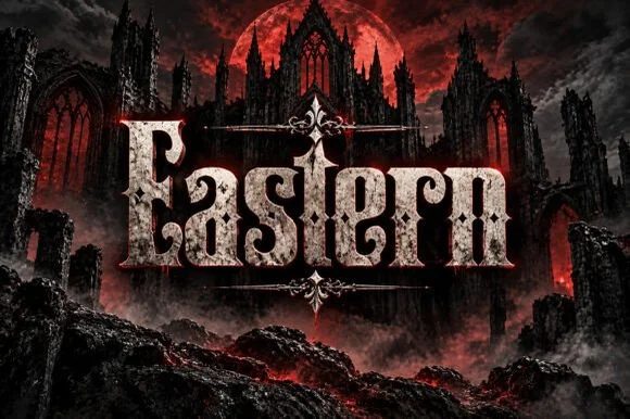
Weathered cathedral Fraktur blackletter display (OTF)
Eastern is a dramatic medieval Fraktur blackletter display font featuring bifurcated crown spurs and classic gothic lowercase (OTF).
Ideas for this font
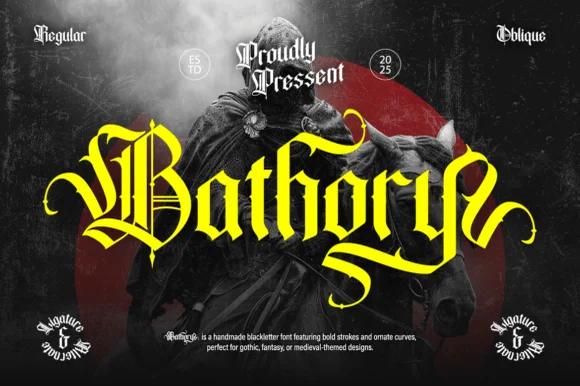
Ornate medieval blackletter family (Regular & Oblique)
Bathory is a lush, handmade medieval blackletter family (Regular & Oblique) featuring double-barred capitals and sweeping flame-curled descenders.
Ideas for this font
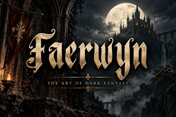
Elven-medieval dark-fantasy calligraphic blackletter
Faerwyn is a mystical dark-fantasy blackletter blending sharp medieval broad-nib calligraphy with sweeping elven ascender curls.
Ideas for this font
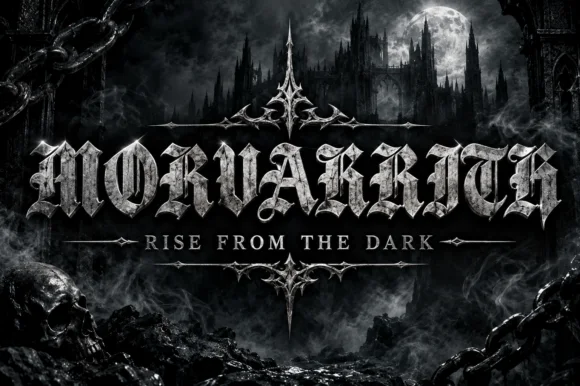
Blackletter with a metal bevel treatment
Morvakrith is a heavy blackletter shown with a metallic bevel: dense vertical strokes, sharp spurs and a narrow lowercase rhythm, rendered in polished silver over a moonlit castle scene with a skull, chains and a motto rule beneath.
Ideas for this font
Same independent foundry
Allow optional Google Analytics to measure visits and catalogue actions. Your search words and notes are not included. Privacy & storage