Neutral Sans Workhorse

Drakzevor + Memoir Slang
Lets Drakzevor own the focal silhouette while handling secondary copy, sizing and subheads cleanly.
Inspect Memoir Slang specimenDisclosure: MakerFileHub may earn a commission from qualifying purchases via paid links on this page. How our links work.
Armoured dark-fantasy gothic with pointed spurs and heavy blackletter structure
Drakzevor is an armoured dark-fantasy gothic alphabet in which each letter grows pointed spurs and the blackletter skeleton is thickened into metal plates.
Paid link
Get this fontProject & layout blueprintsAt-a-glance maker compatibility
Sturdy stroke walls and open counters weed cleanly on adhesive vinyl, HTV apparel film, and cut cardstock.
Visual anatomy & craft review
The D opens with a heavy left stem and a bowl that terminates in a spike rather than a curve, and every letter after it repeats that armour: the R carries a pointed leg, the A closes to a spike above the cap line, the K splays spurs from a single mass and the letters sit so tight that the word reads as a forged band. The underlying skeleton is blackletter, with broken strokes and narrow counters, but the strokes themselves are heavy and bevelled, which is what gives the face its fantasy-armour look rather than a manuscript one. Weight is maximal, the terminals are sharp and the counters are narrow slits. The stone ground, the shield, the swords and the small rule beneath are presentation; the typeface is the two words.
Armoured · Gothic · Spiked
Two-font hierarchy recipes
Tested contrast partners — pairing Drakzevor with grounded secondary typography.
Drakzevor + Memoir Slang
Lets Drakzevor own the focal silhouette while handling secondary copy, sizing and subheads cleanly.
Inspect Memoir Slang specimen
Drakzevor + Rosemode
Grounds bold display lettering with classic typographic authority on posters, badges and apparel.
Inspect Rosemode specimenPractical applications
Concrete hierarchy, scale and production guidance tailored to Drakzevor’s stroke geometry.
The armoured gothic reads as a warning on a dark poster and holds its shape at A2, where a thinner blackletter would break up.
Hierarchy & layout recipe
Set the first word at 110 pt on an A2 poster, set the date and venue in a small caps sans at 22 pt, and hold 35 mm below the lettering so the spurs do not crowd the details.
Pre-production check
Fine spurs under 1 mm disappear on dark stock; check the print at final size and thicken the shortest spur rather than shrinking the word.
The armoured blackletter gives a fantasy cover its tone in one line, and the heavy weight survives being printed over a painted background.
Hierarchy & layout recipe
Set the title at 64 pt on the upper half of the cover, set the author in a small caps serif at 12 pt, and leave 20 mm of margin so the spurs stay inside the trim.
Pre-production check
A gothic cover with spiked terminals can read as illegible at thumbnail size; check the cover reduced to 200 px and open the counters if the title blurs.
The forged gothic suits a games publisher and reproduces in one colour on a box edge where detail would otherwise be lost.
Hierarchy & layout recipe
Set the studio name at 16 pt on a 40 mm box spine, keep the volume note in a 6 pt sans beneath, and leave 4 mm of margin so the spurs stay clear of the fold.
Pre-production check
A box spine folds and rubs; check the artwork against the fold and move the spurs away from the crease before printing.
Technical & licence verification
Confirm included OTF/TTF/WOFF formats, full glyph tables and licence coverage on the live store page before batch production.
Closest visual alternatives
Matched across letterform anatomy, stroke behaviour and craft applications.
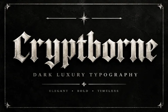
Crisp cathedral blackletter with flat tops and fine diamond spurs
Cryptborne is a crisp cathedral blackletter in which the letters are built from flat-topped stems, fine diamond spurs and thin hairlines against heavy mass, so a short word reads as carved stonework.
Ideas for this font
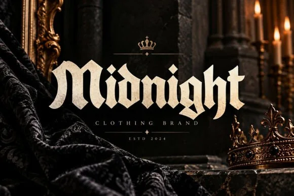
Bold street-gothic blackletter with compact forms and heavy verticals
Midnight is a bold blackletter in which the letters stay compact, the verticals run heavy and the breaks bend at sharp angles, so a word reads as a clothing label rather than as a manuscript.
Ideas for this font
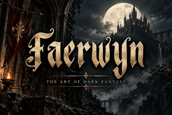
Elven-medieval dark-fantasy calligraphic blackletter
Faerwyn is a mystical dark-fantasy blackletter blending sharp medieval broad-nib calligraphy with sweeping elven ascender curls.
Ideas for this font
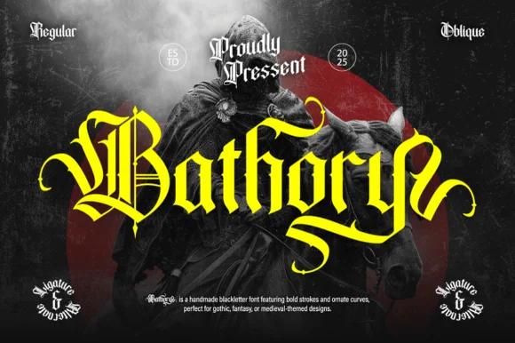
Ornate medieval blackletter family (Regular & Oblique)
Bathory is a lush, handmade medieval blackletter family (Regular & Oblique) featuring double-barred capitals and sweeping flame-curled descenders.
Ideas for this font
Same independent foundry
Allow optional Google Analytics to measure visits and catalogue actions. Your search words and notes are not included. Privacy & storage