Neutral Sans Workhorse

Strata Magic + Homies
Lets Strata Magic own the focal silhouette while handling secondary copy, sizing and subheads cleanly.
Inspect Homies specimenDisclosure: MakerFileHub may earn a commission from qualifying purchases via paid links on this page. How our links work.
Fine calligraphic blackletter with looping line-and-dot ornaments
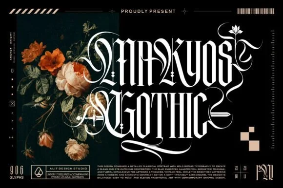
Strata Megic is a classical display serif with high contrast, sharp serifs and ornamental flourishes, shown in a technical drawing layout with glyph counts and swatch keys.
Paid link
Get this fontProject & layout blueprintsAt-a-glance maker compatibility
Sturdy stroke walls and open counters weed cleanly on adhesive vinyl, HTV apparel film, and cut cardstock.
Visual anatomy & craft review
strata over megic fills the right half of the card in a deep red, the letters drawn with strong contrast and a long tail on the g that reaches under the line, plus small diamond ornaments and fine rules between the two rows. On the left a classical bust is printed in blue line work inside a triangle, and the whole sheet is annotated like a specification: a glyph count at the lower left, a colour key along the bottom, a barcode at the upper right and a paragraph of small technical text. The layout is the point of the sample: it treats the typeface as a designed object with a specification, which is how a serious retail font is presented, and the ornament in the letterforms is restrained enough that the face would work on a cover or a bottle as well as on a specimen.
Fine calligraphic blackletter with looping line-and-dot ornaments
Two-font hierarchy recipes
Tested contrast partners — pairing Strata Magic with grounded secondary typography.
Strata Magic + Homies
Lets Strata Magic own the focal silhouette while handling secondary copy, sizing and subheads cleanly.
Inspect Homies specimen
Strata Magic + Aureline
Grounds bold display lettering with classic typographic authority on posters, badges and apparel.
Inspect Aureline specimenPractical applications
Concrete hierarchy, scale and production guidance tailored to Strata Magic’s stroke geometry.
The classical serif with its technical annotations gives a cover an editorial authority, and the ornaments provide detail without a photograph.
Hierarchy & layout recipe
Print a 230 by 300 mm cover: set the title at 100 pt across two rows, keep 30 mm of clear ground beneath before the volume line at 11 pt, and hold 20 mm from the tail of the g to the right trim.
Pre-production check
The fine serifs and hairlines close on uncoated covers; print one cover on the real stock and check the joins before the run.
The high contrast reads as a heritage product, and the flourish on the last letter gives a short brand name a mark to be recognised by.
Hierarchy & layout recipe
Print a 60 by 110 mm label: set the brand name at 24 pt on one row, keep 9 mm of clear ground beneath before the strength at 4.5 pt, and hold 6 mm from the long tail to the die line.
Pre-production check
Curved labels stretch the flourish; print one label and roll it onto the bottle before the order.
The classical proportions suit a formal invitation, and the ornamental details mean the card needs no second decorative element.
Hierarchy & layout recipe
Print a 148 by 210 mm invitation: set the names at 32 pt on one row, keep 22 mm of clear ground beneath before the venue at 9 pt, and hold 16 mm of margin left and right of the block.
Pre-production check
Hairlines drop out in letterpress; print one invitation in the intended process and check the ornaments first.
Technical & licence verification
Confirm included OTF/TTF/WOFF formats, full glyph tables and licence coverage on the live store page before batch production.
Closest visual alternatives
Matched across letterform anatomy, stroke behaviour and craft applications.
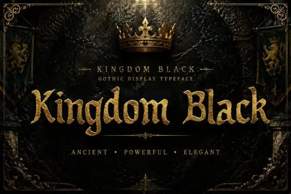
Weighty serif-like Gothic with rounded bowls and tapered sharp tips
Kingdom Black is a gothic display face filled with a textured gold, presented as a royal title plate with a crown above, lion banners at the sides and an ornamental frame.
Ideas for this font
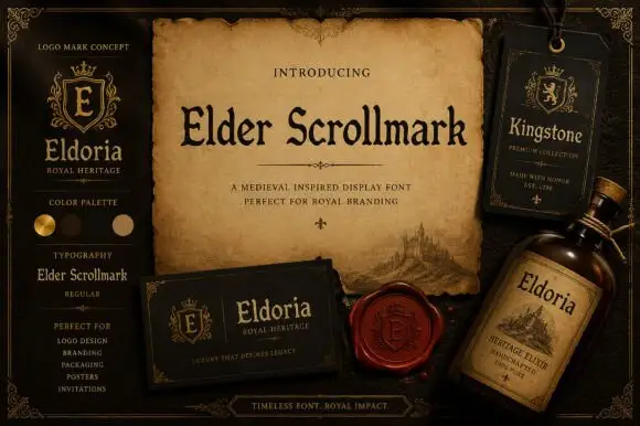
Compact manuscript-like display with narrow stems and rounded Gothic shoulders
Elder Scrollmark is a medieval-inspired display serif with narrow letters, sharp spurs and a printed-plate feel, shown across labels, a hang tag and a bottle.
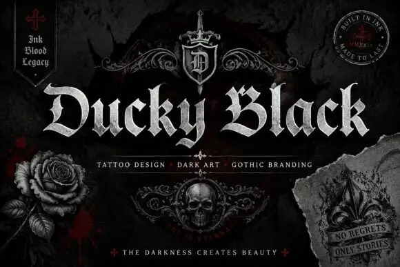
Wide blackletter with sweeping D and a densely split B
Ducky Black is a tattoo and dark-art blackletter with wide stems, sharp spurs and a distressed silver fill, framed by drawn roses, a skull and a fleur.
Ideas for this font
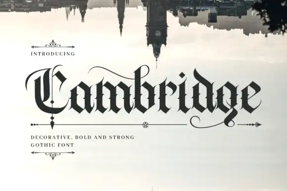
Dense blackletter with split C and long hairline swashes
Cambridge shows a black gothic word beneath an inverted skyline, where the C carries a thin parallel inner stroke and a wide upper arc, the heavy lowercase bodies meet in sharp diamond joins, fine curves extend above the middle and beneath the final g, and the i dot is a tilted diamond.
Same independent foundry
Allow optional Google Analytics to measure visits and catalogue actions. Your search words and notes are not included. Privacy & storage