MakerFileHub · Fonts4,091 curated & craft fonts · 93 curated collections · Original previews
MakerFileHubSaved 0

Foundry portfolio · Sans serif · Display · Serif

Typia Nesia Fonts
(27 typefaces).

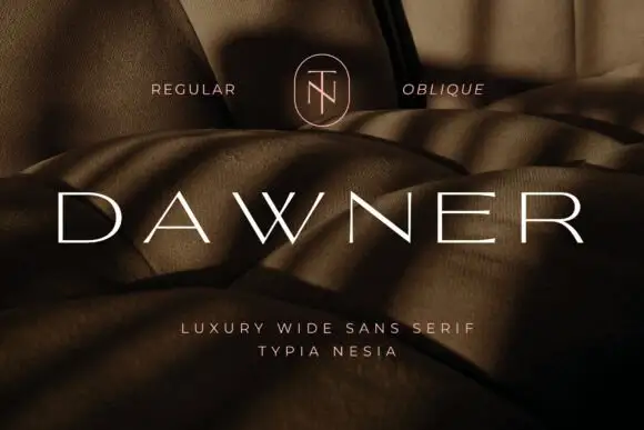
Typia Nesia builds the sober side of the catalogue. Dawner and Established both read as sans and display work for brands and signage, and the 27 releases behind them favour clean geometry, wide spacing and quiet authority over ornament.

Before you buy from this studio

Check the weight range on offer. A single light cut looks refined on screen and fails as a vinyl cut, while the bold cut of the same family is the one that behaves on a machine.

Typefaces by Typia Nesia

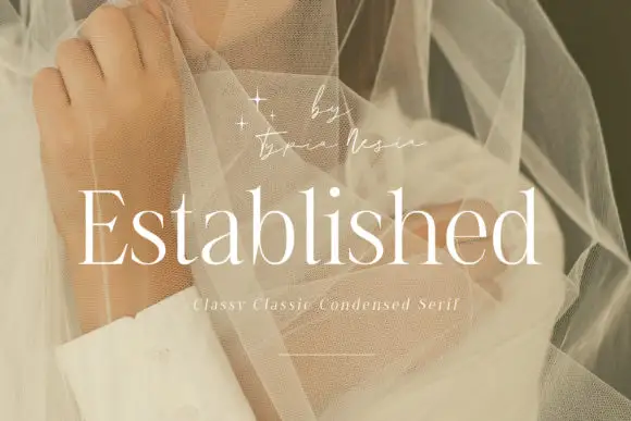
Original Established preview by Typia Nesia

Fine condensed mixed case with long straight ascenders

Established

Established shows light white serif letters with narrow rounded bowls and tall upright stems, where the thin horizontal strokes and small serifs keep a long word visually delicate, and the title overlays a pale portrait behind translucent fabric with a small script credit above.

Explore
Original Six Sound Font preview by Typia Nesia

Expanded heavy capitals with broad bowls and flat horizontal cuts

Six Sound Font

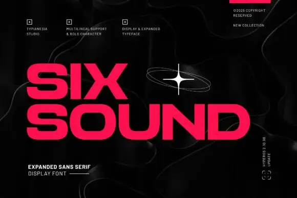
Six Sound Font shows hot-pink capitals in two rows against black, where the S has broad flat-ended curves, the O is wide and rounded, the X spans a strong diagonal cross and the title leaves a noticeably large horizontal footprint even in short words, with a white orbital star and faint contour lines around it.

Explore
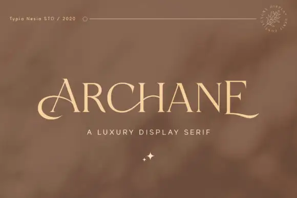
Original Archane preview by Typia Nesia

Fine capitals with a low A curl and extended final E foot

Archane

Archane shows pale high-contrast capitals on a warm brown field, where the A begins with a low curved entry, the C bowl stays open, the last E finishes with a long gently rising baseline extension and the counter spacing stays even across the row with a small sparkle mark beneath the centre.

Explore
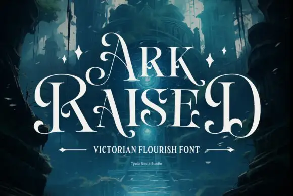
Original Ark Raised preview by Typia Nesia

Tall fantasy capitals with inward curls and long hooked feet

Ark Raised

Ark Raised shows white narrow capitals in two rows over a dark blue architectural scene, where large curling A and R entries flank the title, hooked feet and rounded inward terminals interrupt the tall upright stems and star marks plus arrow-like rules sit beneath.

Explore
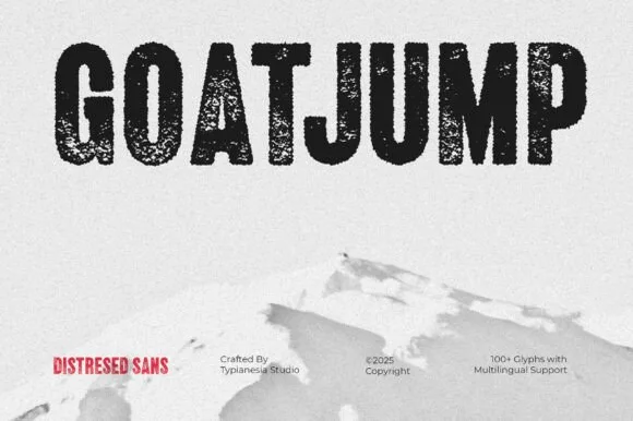
Original Goatjump preview by Typia Nesia

Tall condensed dry-roller & woodblock distressed sans (100+ glyphs, Multilingual)

Goatjump

Goatjump is a commanding, tall condensed distressed sans (100+ glyphs, Multilingual) stamped with vertical woodgrain & dry-roller grit!

Explore
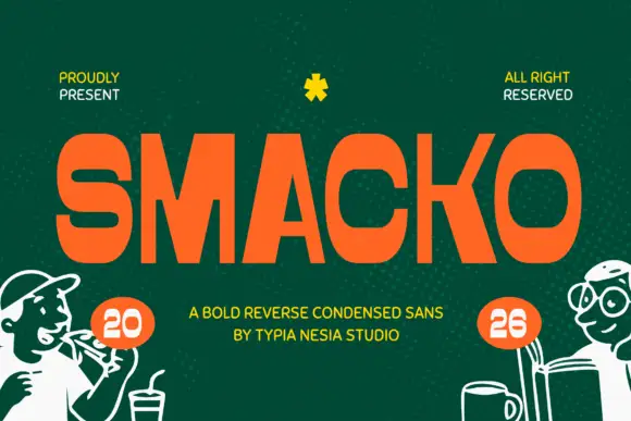
Original Smacko preview by Typia Nesia

Reverse-contrast compact sans

Smacko

Smacko is a compact reverse-contrast sans in orange on deep green: tall capitals whose horizontals are heavy slabs and whose uprights are thin, with flat terminals, a tight fit and a dotted texture in the field, set as one line with two small notes at the top and a two-line credit beneath.

Explore
Original Soltrue preview by Typia Nesia

Reverse-contrast rounded display with two treatments

Soltrue

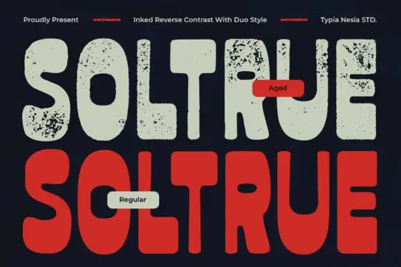
Soltrue is a heavy rounded reverse-contrast display on a near-black ground: fat capitals whose horizontals swell and whose uprights are slim, shown twice — once in a clean aged-cream fill and once in a solid red — with a small line at the top and two labels that name the treatments.

Explore
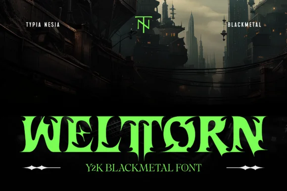
Original Welltorn preview by Typia Nesia

Y2K black-metal cut display

Welltorn

Welltorn is a Y2K black-metal display in lime green on a dark industrial scene: heavy letters cut with long horizontal blades, spurs that break the outline, and terminals that flare into wedges, so the word reads as a machine-cut sigil rather than a gothic text face.

Explore

Help improve the font catalogue?

Allow optional Google Analytics to measure visits and catalogue actions. Your search words and notes are not included. Privacy & storage

Original preview

Clear review data?