Neutral Sans Workhorse

Welltorn + Cenura
Lets Welltorn own the focal silhouette while handling secondary copy, sizing and subheads cleanly.
Inspect Cenura specimenDisclosure: MakerFileHub may earn a commission from qualifying purchases via paid links on this page. How our links work.
Y2K black-metal cut display
Welltorn is a Y2K black-metal display in lime green on a dark industrial scene: heavy letters cut with long horizontal blades, spurs that break the outline, and terminals that flare into wedges, so the word reads as a machine-cut sigil rather than a gothic text face.
Paid link
Get this fontProject & layout blueprintsAt-a-glance maker compatibility
Sturdy stroke walls and open counters weed cleanly on adhesive vinyl, HTV apparel film, and cut cardstock.
Visual anatomy & craft review
The word runs across the lower two thirds and each letter is a heavy shape broken by sharp cuts: the W and the N carry barbs that extend past the letter's width, the E loses its middle arm to a blade, and the spurs at the top and bottom are cut at an angle rather than tapered. The result is closer to a sci-fi stencil than to a historical blackletter, which is why the specimen pairs it with a Y2K frame and a dark city portal behind. The green on near-black gives the shape maximum contrast, and two star-like marks flank the caption, so the whole page is built from sharp silhouettes. Because the letters are heavy and the cuts are wide, the face holds at poster size and stays legible in a way that thinner metal cuts do not.
Black metal, sharp, futuristic, harsh
Two-font hierarchy recipes
Tested contrast partners — pairing Welltorn with grounded secondary typography.
Welltorn + Cenura
Lets Welltorn own the focal silhouette while handling secondary copy, sizing and subheads cleanly.
Inspect Cenura specimen
Welltorn + Vanielst Elegant Serif Display Stylistic
Grounds bold display lettering with classic typographic authority on posters, badges and apparel.
Inspect Vanielst Elegant Serif Display Stylistic specimenPractical applications
Concrete hierarchy, scale and production guidance tailored to Welltorn’s stroke geometry.
A cut black-metal face sets a dark electronic line-up better than a horror display, because the shape reads as machinery rather than as a costume.
Hierarchy & layout recipe
A2 portrait: the artist name at 170 mm wide, the line-up in a 12 mm grotesque, and the date at 30 mm. Keep the display on flat black with the green as a spot colour, and leave 30 mm of clear space beneath it.
Pre-production check
Check the blades at full size, where a cut under 1 mm will fill in; widen the narrowest cuts for print. Confirm the 12 mm line-up reads at two metres and that the star motifs do not overlap the lettering.
A cut display gives a speculative-fiction anthology a cover that signals its genre without an illustration, and the sharp silhouette reads at thumbnail size.
Hierarchy & layout recipe
Set the title at 140 mm wide on a 216 mm cover, the subtitle in a 9 pt serif, and the editor credit in 7 pt caps. Print green on black or black on bone, and keep the title above the lower third so the barcode area stays clear.
Pre-production check
Check the title at 120 px wide in an online listing, where the cuts can make the word unrecognisable; keep one letterform simple enough to read. Confirm the 7 pt credit survives the matte lamination and that the title clears the trim.
A cut black-metal face suits a record sleeve for a dark electronic release, and the single spot colour keeps the print affordable on a short run.
Hierarchy & layout recipe
Print a 300 mm sleeve: the artist name at 220 mm wide in green on black, the track list in a 6 pt grotesque at the lower right, and a 20 mm spine with the name repeated at 8 mm. Keep the blades clear of the spine fold by 12 mm.
Pre-production check
Check the spine version at 8 mm, where the cuts will close; use the plain letters there. Confirm the 6 pt track list reads on the sleeve and that the green prints evenly on an uncoated board.
Technical & licence verification
Confirm included OTF/TTF/WOFF formats, full glyph tables and licence coverage on the live store page before batch production.
Closest visual alternatives
Matched across letterform anatomy, stroke behaviour and craft applications.
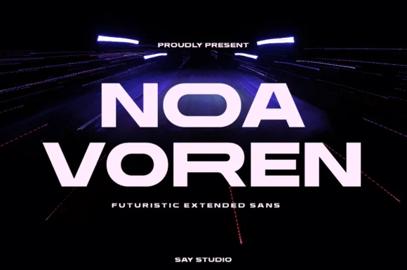
Wide extended futuristic & aerospace display grotesk
Noa Voren is a bold, wide-stance extended sans serif featuring stretched horizontal proportions and subtle speed-sliced diagonal cuts.
Ideas for this font
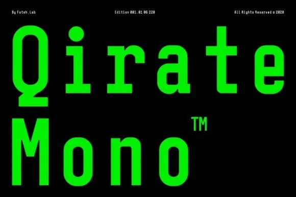
Condensed monospaced sans with square terminals
Qirate Mono is a condensed monospaced sans in neon green on black: tall narrow letters of even width, square terminals and short counters, set as two stacked words with small tracked credits in the corners.
Ideas for this font
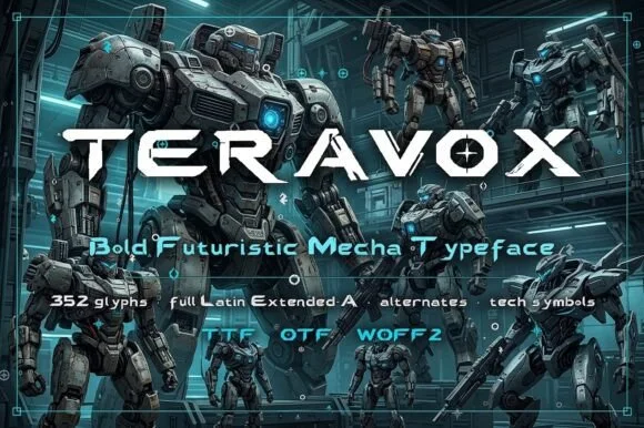
Futuristic mecha display
Teravox is a bold futuristic display in white on a mecha illustration: wide caps with cut corners, split strokes, small circular counter details and an X with a square notch, set across the plate with three tracked lines beneath listing the glyph count, the language support and the formats.
Ideas for this font
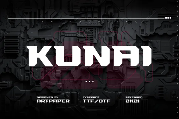
Blade-notched ninja & tactical cyberpunk sans (TTF / OTF)
Kunai slices sharp diagonal kunai-dagger notches into heavy industrial block capitals for tactical gaming and anime techwear (TTF / OTF).
Ideas for this font
Same independent foundry
Allow optional Google Analytics to measure visits and catalogue actions. Your search words and notes are not included. Privacy & storage