Modern Grotesque Body

Mortberg + Lemon Milk Pro FTR
Creates crisp high-hierarchy contrast beneath Mortberg headlines across menus, websites and labels.
Inspect Lemon Milk Pro FTR specimenDisclosure: MakerFileHub may earn a commission from qualifying purchases via paid links on this page. How our links work.
Drawn retro slab display
Mortberg is a drawn retro slab in cream on dark brown: wide capitals with slightly uneven strokes, soft slab ends, open bowls and hand-drawn edges, set as one word beneath an arced line, with small notes at the shoulders and two lines at the foot.
Paid link
Get this fontProject & layout blueprintsAt-a-glance maker compatibility
Fine grain and micro-texture excel in 300 DPI print, sublimation, and screen print rather than small vinyl weeding.
Visual anatomy & craft review
The word spans the plate and the drawing is a slab with drawn irregularities: the strokes are slightly uneven, the slab ends are soft rather than square, and the bowls stay open, which gives the face a sign-painted warmth without turning it into a novelty. That construction sets a moderate size floor, because the open bowls close below a certain size, and the plate sets the word large enough that the drawn edges read as character. The dark brown ground and the faint sketch behind the word are staging, and the arced line above and the two lines at the foot are plain caps that name the style and the studio. Because the letters are wide and warm, the face suits a cafe sign, a label and a poster rather than a paragraph.
Slab, retro, drawn, friendly
Two-font hierarchy recipes
Tested contrast partners — pairing Mortberg with grounded secondary typography.
Mortberg + Lemon Milk Pro FTR
Creates crisp high-hierarchy contrast beneath Mortberg headlines across menus, websites and labels.
Inspect Lemon Milk Pro FTR specimen
Mortberg + Abigail
Adds a warm human signature touch for 1-to-3-word callouts without competing against structured serif capitals.
Inspect Abigail specimenPractical applications
Concrete hierarchy, scale and production guidance tailored to Mortberg’s stroke geometry.
A drawn retro slab reads as a cafe sign rather than a corporate logo, and the open bowls hold on a painted board. Warmth sells on a high street of logos.
Hierarchy & layout recipe
Paint a 900 by 350 mm board: the roaster at 110 mm cap height, the hours in a 22 mm slab, and a 5 mm rule. Keep 25 mm margins and paint two colours on a primed board.
Pre-production check
Check the board at five metres, where a drawn edge can look like a bad cut; keep it even. Confirm the 22 mm hours read at two metres and that the rule survives a wet season.
A retro slab gives a bottle label a period feel, and the wide letters hold a short brand name across a small die. A bottle label needs a period voice.
Hierarchy & layout recipe
Print a 60 by 80 mm label: the brand at 15 pt, the flavour at 8.5 pt, and the volume at 7 pt. Keep 5 mm inside the die and keep the narrowest counter above 1.5 mm.
Pre-production check
Check the 15 pt brand on a curved bottle, where a counter can fill; keep it open. Confirm the 7 pt volume reads on the shelf and that the label holds in a cooler.
A drawn slab reads as a printed placard, which suits a fair where every stall competes for attention. A fair reads as printed, not digital.
Hierarchy & layout recipe
A2 poster: the fair at 100 mm cap height, the dates in a 24 mm sans, and the field at 11 mm. Keep 28 mm margins and print two colours on a light stock.
Pre-production check
Check the A2 at five metres, where the drawn edges can blur; keep them consistent. Confirm the 11 mm field reads at two metres and that the dates clear the block.
Technical & licence verification
Confirm included OTF/TTF/WOFF formats, full glyph tables and licence coverage on the live store page before batch production.
Closest visual alternatives
Matched across letterform anatomy, stroke behaviour and craft applications.
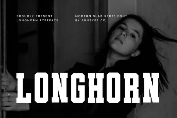
Very condensed clean slab
Longhorn is a very condensed slab in white over a black-and-white portrait: narrow capitals with thick square slabs, clipped rectangular bowls and flat terminals, set as one word across the lower third, with two small tracked notes at the upper left and right.
Ideas for this font
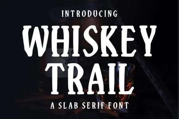
Narrow irregular slab
Whiskey Trail is a narrow irregular slab in cream over a dark still life of a bottle and a glass: tall capitals with soft angled slab ends, uneven stems and open bowls, set in two lines with a small tracked line above and a plain line beneath.
Ideas for this font

Condensed western capitals with stem ornaments
Saddlewick is a condensed western slab in dark brown on leather: very tall capitals, squared serifs and small nicked ornaments cut into the stems, with a spur and a star in the counters.
Ideas for this font
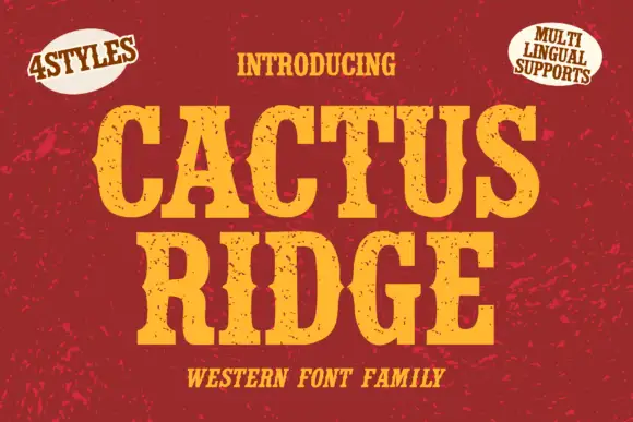
Tall notched Western slabs with small scattered erosion marks
Cactus Ridge shows yellow Western capitals on red, where pinched midsections and long broad slab ends create a tall sign shape and small dark chips interrupt the fill without any complete outline.
Ideas for this font
Same independent foundry
Allow optional Google Analytics to measure visits and catalogue actions. Your search words and notes are not included. Privacy & storage