Neutral Sans Workhorse

Prolazy + Bielchon
Lets Prolazy own the focal silhouette while handling secondary copy, sizing and subheads cleanly.
Inspect Bielchon specimenDisclosure: MakerFileHub may earn a commission from qualifying purchases via paid links on this page. How our links work.
Experimental organic hand-drawn display
Prolazy is an experimental hand-drawn display in orange on black: letterforms reduced to irregular blobs with a spiral inside the o, uneven webbing between strokes, and a baseline that wanders, so the word reads as a painted tag rather than as typography.
Paid link
Get this fontProject & layout blueprintsAt-a-glance maker compatibility
Fine grain and micro-texture excel in 300 DPI print, sublimation, and screen print rather than small vinyl weeding.
Visual anatomy & craft review
The word is set low in the frame and each letter is drawn as a shape rather than a constructed glyph: the P swells at the bowl, the r reduces to a nub, the o carries a spiral that winds inward, and the z and the y end in thick tails that hook back toward the line. Web-like bridges connect some of the letters at the baseline, which is what holds the tag together as one painted object, and the edges are deliberately uneven in a way that reads as a loaded brush rather than as a vector wobble. The ground is a dark blurred photograph with a light streak across the middle, so the orange shape sits in the darkest part of the frame and reads as a mark sprayed on a surface. A row of small tracked labels across the top describes the face in four fragments, which is the only conventional typography on the page.
Organic, blobby, experimental, loud
Two-font hierarchy recipes
Tested contrast partners — pairing Prolazy with grounded secondary typography.
Prolazy + Bielchon
Lets Prolazy own the focal silhouette while handling secondary copy, sizing and subheads cleanly.
Inspect Bielchon specimen
Prolazy + Gorga
Grounds bold display lettering with classic typographic authority on posters, badges and apparel.
Inspect Gorga specimenPractical applications
Concrete hierarchy, scale and production guidance tailored to Prolazy’s stroke geometry.
An organic hand-drawn tag gives a skate brand the credibility of a hand-painted mark, and the solid orange shape reads at the size of a deck graphic or a sticker.
Hierarchy & layout recipe
Die-cut a 70 mm sticker: the word at 22 pt with the spiral o kept at least 2 mm wide in its thinnest part, and a 2 mm gap to the die line. Keep the shape solid one-colour so the cut does not separate any letter.
Pre-production check
Check the die at 70 mm, where the webbing between letters will tear if it is under 1.5 mm; simplify the bridges for the cut version. Confirm the spiral inside the o survives the vinyl cut and that the shape still reads as a word at 40 mm wide.
An organic display energises a page of dense text without a photograph, and the irregular shape works as a texture where a clean heading would look institutional.
Hierarchy & layout recipe
Set the word at 120 pt across 90 mm on a black page, the accompanying text in a 9 pt grotesque in two columns to the right, and a 3 mm gutter. Keep the display shape clear of the column edge by 10 mm so the tails do not touch the type.
Pre-production check
Check the tails at 120 pt against the column, where a hook can look like a paragraph indent; inset the display shape. Confirm the 9 pt text keeps a 4.5:1 contrast on the black and that the display reads at thumbnail size online.
An irregular, blobby display reads as a hand-painted flyer, which suits a club night that wants to look improvised rather than corporate.
Hierarchy & layout recipe
A2 portrait: the word at 180 mm cap height in the lower half, the line-up in a 12 mm grotesque above, and the date at 30 mm. Keep the display in one flat colour against a dark ground and leave the upper third empty so the shape has contrast.
Pre-production check
Check the poster from six metres, where the wandering baseline can make the word hard to parse; keep the letter order legible by widening the bridges. Confirm the 12 mm line-up reads in low light and that no part of the display shape crosses the printer's trim.
Technical & licence verification
Confirm included OTF/TTF/WOFF formats, full glyph tables and licence coverage on the live store page before batch production.
Closest visual alternatives
Matched across letterform anatomy, stroke behaviour and craft applications.
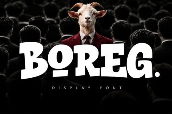
Stout heavy block urban display with rounded corners and tilted counters
Boreg is a stout urban display face in which the letters are short and wide, the strokes are fat and the counters tilt, so a short word reads as a painted hoarding rather than as a sign.
Ideas for this font

Heavy graffiti bubble caps with rough edges and paint splatter
Street Blaze is a heavy graffiti capital alphabet in which the letters swell into bubbles, the contours chip and the stems carry a rough inner edge, so a two-word title reads as something sprayed on a wall.
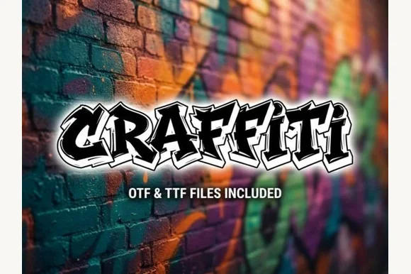
Explosive wildstyle arrow-bar urban graffiti display (OTF & TTF)
Graffiti (by clipartguru) is an energetic wildstyle street-art font armed with interlocking arrow extensions, sharp bevels, and OTF/TTF files.
Ideas for this font
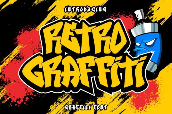
Angular graffiti display with a heavy outline
Retro Graffiti is an angular graffiti display in yellow on black: blocky letters with cut corners and a thick white-then-black outline, set at a tilt over spray strokes, with a spray can character at the side.
Ideas for this font
Same independent foundry
Allow optional Google Analytics to measure visits and catalogue actions. Your search words and notes are not included. Privacy & storage