High-Contrast Display Serif

Guns & Smoke + Marquis - Elegant Modern Serif
Pairs sculptural editorial warmth with Guns & Smoke's clean modern geometry.
Inspect Marquis - Elegant Modern Serif specimenDisclosure: MakerFileHub may earn a commission from qualifying purchases via paid links on this page. How our links work.
Heavy condensed capitals with rounded corners and a compact squared ampersand
Guns and Smoke is an ultra-bold condensed sans: stems nearly rectangular, counters cut to tall slots, and flat terminals that give a word the weight of a stencil on a crate.
Paid link
Get this fontProject & layout blueprintsAt-a-glance maker compatibility
Sturdy stroke walls and open counters weed cleanly on adhesive vinyl, HTV apparel film, and cut cardstock.
Visual anatomy & craft review
GUNS and SMOKE are stacked in cream on a dark photograph of cartridges and a compass, the letters so condensed that the two rows form one tall block across the frame. The stems are straight bars with no taper, the S is almost a set of right angles, and the G has a flat crossbar that closes the aperture to a slot. There is no contrast at all, so the face depends entirely on mass and spacing, and the spacing is tight enough that the rows nearly touch. Small credits sit in the corners at a fraction of the size: a studio banner on the left, the style at the foot, and a note about language support at the right. The face is built for headlines at the top of a poster, a crate stencil or a record sleeve, and it should never be set in a paragraph, where the slots merge and the words become a grey block.
Heavy condensed capitals with rounded corners and a compact squared ampersand
Two-font hierarchy recipes
Tested contrast partners — pairing Guns & Smoke with grounded secondary typography.
Guns & Smoke + Marquis - Elegant Modern Serif
Pairs sculptural editorial warmth with Guns & Smoke's clean modern geometry.
Inspect Marquis - Elegant Modern Serif specimen
Guns & Smoke + Silken Luxe
Introduces organic movement on pull-quotes, signatures and gift tags.
Inspect Silken Luxe specimenPractical applications
Concrete hierarchy, scale and production guidance tailored to Guns & Smoke’s stroke geometry.
The condensed mass holds a two-word title at thumbnail size, and the flat slots stay open in a small cover where a rounded bold face would go muddy.
Hierarchy & layout recipe
Print a 130 by 200 mm cover: set the title at 64 pt across two rows, keep 18 mm of clear ground beneath before the author at 11 pt, and hold 14 mm from the outer stem to the trim on each side.
Pre-production check
Slots fill in when the cover is laminated over dark art; print one cover and check the counters under a lamp before the run.
The flat bars stencil cleanly through a mask, and the condensed width fits a long company name onto the side of a crate without shrinking the letters.
Hierarchy & layout recipe
Print a 300 by 200 mm stencil: set the company name at 78 pt on one row, keep 22 mm of clear ground beneath before the depot code at 14 pt, and hold 18 mm of unbroken mask at the left and right of the word.
Pre-production check
Bridges between letters need room in a stencil; print one mask on card and test the cut before the paint goes on the crate.
The blunt weight matches the mood of a late show, and two stacked rows fill a poster that has no photograph and no budget for illustration.
Hierarchy & layout recipe
Print an A2 poster: set the event title at 160 pt across two rows, keep 30 mm of clear space beneath before the times at 13 pt, and hold 26 mm of margin so no terminal touches the edge of the sheet.
Pre-production check
Heavy cream ink on a dark ground needs two passes; print one poster and check the coverage in the middle of the block first.
Technical & licence verification
Confirm included OTF/TTF/WOFF formats, full glyph tables and licence coverage on the live store page before batch production.
Closest visual alternatives
Matched across letterform anatomy, stroke behaviour and craft applications.
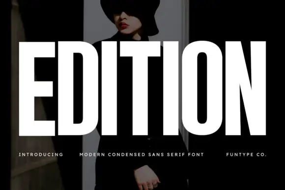
Very heavy condensed capitals with squared stems and narrow oval counters
Edition shows white capital lettering spanning most of a dark portrait cover: thick vertical strokes and broad flat arms build a rectangular title, the O keeps rounded outer sides around a small vertically elongated counter and the I stands as a plain bar.
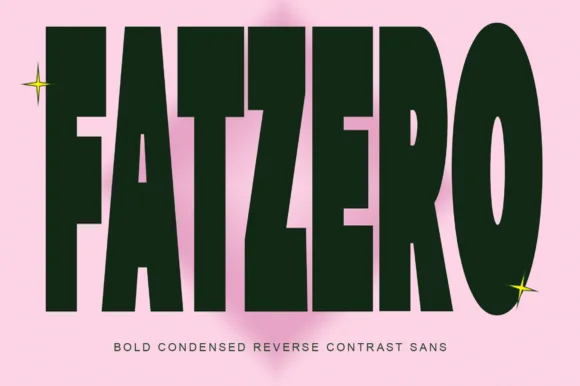
Bold condensed reverse-contrast sans with heavy bars and thin counters
Fatzero is a bold condensed reverse-contrast sans in which the horizontals run thick, the verticals thin and the counters close to slots, so a single word reads as a fashion poster rather than as a headline.
Ideas for this font
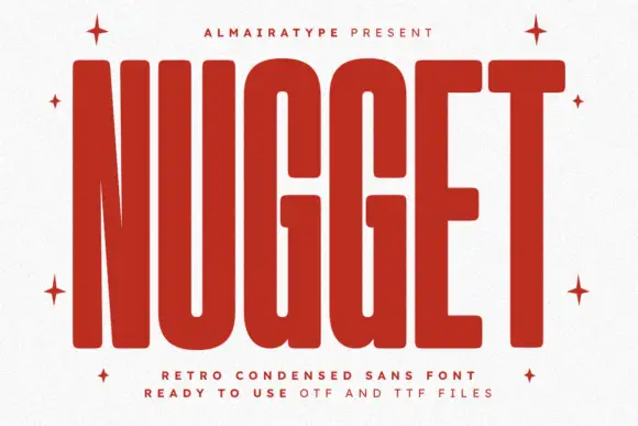
Very tall heavy capitals with rounded corners and narrow internal channels
Nugget shows red capitals filling most of a white cover, where thick near-even strokes leave thin vertical openings in the U and G, the N draws a sharply narrowing diagonal and every outer corner softens.
Ideas for this font
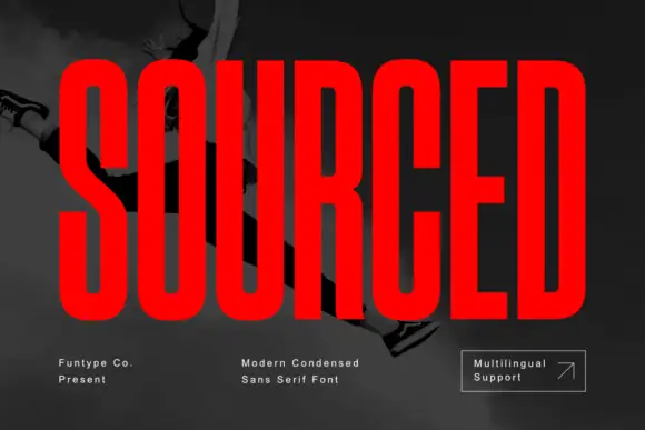
Very condensed heavy capitals with narrow rounded rectangular counters
Sourced shows vivid red capitals across a dark monochrome photograph, where tall heavy uprights and flat-ended arms leave thin rounded rectangular counters inside the O and D, the R carries a straight angled leg and the C opens only a small gap on its right side.
Ideas for this font
Same independent foundry
Allow optional Google Analytics to measure visits and catalogue actions. Your search words and notes are not included. Privacy & storage