Neutral Sans Workhorse

Jiotribe + Inkora
Lets Jiotribe own the focal silhouette while handling secondary copy, sizing and subheads cleanly.
Inspect Inkora specimenDisclosure: MakerFileHub may earn a commission from qualifying purchases via paid links on this page. How our links work.
Wavy organic bohemian & liquid-graffiti psychedelic font
Jiotribe is an experimental bohemian-psychedelic display font melting uppercase stems into organic roots and starburst 'O' wheels!
Paid link
Get this fontProject & layout blueprintsAt-a-glance maker compatibility
Sturdy stroke walls and open counters weed cleanly on adhesive vinyl, HTV apparel film, and cut cardstock.
Visual anatomy & craft review
Jiotribe melts upright uppercase stems into wavy, root-like forms that drift off the baseline and rejoin, with one glyph built as an eight-spoke sunburst wheel standing in for the O. The outline is soft and hand-corrected, so no two verticals curve identically, and the face reads as liquid lettering rather than a geometric experiment. Because the shapes are continuous and fattish, they hold as a silhouette on a screen or a vinyl cut, but the loose baseline means a long word needs to be set on one line rather than stacked.
Wavy-bohemian · Sunburst-O · Organic
Two-font hierarchy recipes
Tested contrast partners — pairing Jiotribe with grounded secondary typography.
Jiotribe + Inkora
Lets Jiotribe own the focal silhouette while handling secondary copy, sizing and subheads cleanly.
Inspect Inkora specimen
Jiotribe + Cronelo
Grounds bold display lettering with classic typographic authority on posters, badges and apparel.
Inspect Cronelo specimenPractical applications
Concrete hierarchy, scale and production guidance tailored to Jiotribe’s stroke geometry.
Root-like baselines echo heat shimmer and dune lines, so a festival poster gains atmosphere without a photographic background. The continuous silhouette stays readable on a flyer pinned to a wall and survives being printed as a single colour on cheap stock.
Hierarchy & layout recipe
Poster 500 x 700 mm, title 160 mm wide, 40 mm margins, lineup 10/16 pt in a neutral sans. Sleeve 312 x 312 mm plus 3 mm bleed, title 90 mm, credits 7 pt. Title card 1920 x 1080, title 220 px cap-height, safe margin 5 percent.
Pre-production check
The drifting baseline makes optical centring unreliable; alignment software will centre the bounding box and leave the word looking off. Manually centre on the tallest stroke and check against a printed 1:1 proof before the final export.
Melting forms read as hand-poured and organic, which is the register small-batch spirits use to distinguish themselves from industrial labels. The bubble letters cut cleanly in vinyl, so the same mark can move from a bottle to a board without redrawing.
Hierarchy & layout recipe
Bottle label 80 x 110 mm, name 20 mm, agave data 5/7 pt, 5 mm top arc clearance. Box 120 x 60 x 60 mm, name 22 mm on the front, description 7/9 pt. Decal 300 x 120 mm, name 80 mm, 10 mm cut margin.
Pre-production check
Vinyl on a surfboard sits under wax and salt water, and a wavy letter with a 2 mm waist will lift at the narrowest point. Add a 1 mm clear laminate border around the whole word rather than cutting to the letter edge.
Liquid letterforms read as sun-softened signage, which fits a beach bar better than a clean geometric face, and the heavy silhouette holds on a chalkboard painted by hand. One line of wide letters fills a board the way a painted sign would.
Hierarchy & layout recipe
Menu board 900 x 600 mm, sections 40 mm heads, items 18 mm, prices on a 20 mm right column. Invite A6, title 22 mm, details 4 mm. Window sign 500 x 300 mm, word 70 mm, 40 mm margins, applied as a reverse-cut vinyl.
Pre-production check
Reverse-cut window vinyl needs bridges, and a continuous melting word has no natural gap. Ask the sign shop to place bridges at the thinnest waist and approve a paper template on the glass before cutting.
Technical & licence verification
Confirm included OTF/TTF/WOFF formats, full glyph tables and licence coverage on the live store page before batch production.
Closest visual alternatives
Matched across letterform anatomy, stroke behaviour and craft applications.
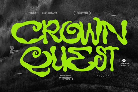
Wavy liquid street-graffiti & acid-tag display (Multilingual + Alternates)
Crown Quest is an organic psychedelic street-graffiti font twisting ribbon-flat marker strokes into fluid interlocking waves (with alternates & multilingual support).
Ideas for this font
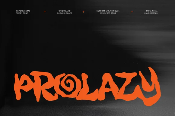
Experimental organic hand-drawn display
Prolazy is an experimental hand-drawn display in orange on black: letterforms reduced to irregular blobs with a spiral inside the o, uneven webbing between strokes, and a baseline that wanders, so the word reads as a painted tag rather than as typography.
Ideas for this font

Heavy graffiti bubble caps with rough edges and paint splatter
Street Blaze is a heavy graffiti capital alphabet in which the letters swell into bubbles, the contours chip and the stems carry a rough inner edge, so a two-word title reads as something sprayed on a wall.
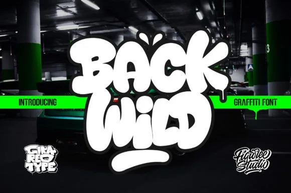
Puffy throw-up bubble graffiti
Back Wild delivers puffy throw-up street bubble graffiti, where the white letters inflate into overlapping blobs with a dark outline and a soft glow, a drip runs from the final letter and a thick rounded underline bar sits below on a dark garage photograph.
Ideas for this font
Same independent foundry
Allow optional Google Analytics to measure visits and catalogue actions. Your search words and notes are not included. Privacy & storage