 #1 · Best Overall
Disclosure: MakerFileHub may earn a commission from qualifying purchases via paid links on this page. How our links work.
Ribbon strikes, rubber stamps & archival ephemera
14 Best Typewriter & Junk Journal Fonts
A typewriter font has to earn the texture: uneven ink, a slightly high or low baseline, and letters that do not quite align. Folclorica and Inabitavek reproduce ribbon strikes with real irregularity, Widget and Enigma add the bled-cipher look, and American Typewriter and Autors Story keep a cleaner mechanical register. Rustic Endstory and Typewriter supply outline and stamp variants for layering.
Quick verdict
Folclorica is the most convincing archival typewriter, Autors Story is the cleanest for long text, and Rustic Endstory gives a stamp layer for mixed media. Enigma covers the bled, censored look.
Quick answer
Top 3 typewriter, stamp & junk journal picks right now.
Short on time? Start with our three highest-rated typewriter, stamp & junk journal standouts before scrolling the full breakdown.
#1 · Best Overall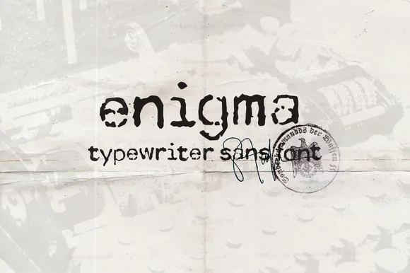 #2 · Runner-Up Pick
Enigma Typewriter Sans
Heavily ink-bled WWII cipher & dossier sans typewriter
Get fontPaid link
Read review ↓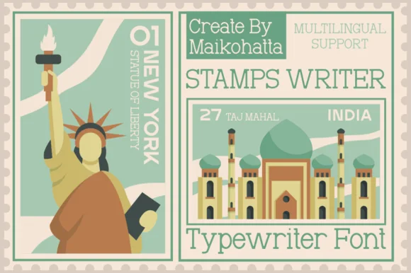 #3 · Editor's Choice
Stamps Writer
Clean travel-postage & passport monoline typewriter serif
Get fontPaid link
Read review ↓How we tested & selected these 14 fonts
We kept 21 of 64 candidates, a deliberately narrow pool. Judged on whether the ink texture repeats obviously, whether metrics stay monospaced, and how the face reads at 9 pt for junk-journal ephemera and at 2 inches for signage.
Side-by-side summary
Top 5 typewriter, stamp & junk journal picks at a glance.
Compare specimens, OpenType/PUA traits and primary project roles side by side.
| Rank & Font | Style & File Specs | Best Project Fit | Store Listing |
|---|---|---|---|
| HandwrittenSlender | Poetry chapbook cover, cozy-mystery title & journal quote | Get fontPaid link | |
| Sans serifArchival | Mystery escape-room clue, spy-thriller prop & archival zine | Get fontPaid link | |
| SerifPostage | Destination-wedding passport invite & boarding-pass RSVP | Get fontPaid link | |
| SerifWorn-ribbon | True-crime podcast cover, memoir jacket & lyric video | Get fontPaid link | |
| Slab SerifDocument-authentic | Full-page novel letter insert, screenplay prop & poetry page | Get fontPaid link |
Clean Sans & Handwritten Print
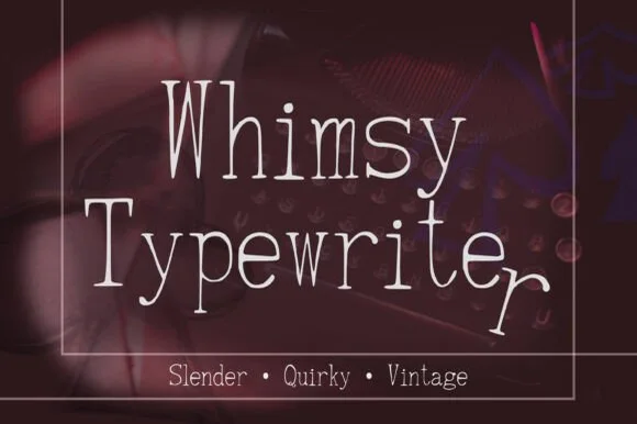
2 fonts#1 · Best OverallWhimsy Typewriter
Whimsy Typewriter is a tall, hairline-slender hand-drawn typewriter font with charmingly uneven baselines and playful dropped terminals.
Whimsy Typewriter is a slender hand-drawn vintage typewriter serif: uneven stems, small ink gaps where the drawn line lifted, a drifting baseline and serifs that taper rather than bracket. The hand-drawn irregularity is the point, so it reads light at any size and closes only when reversed. It needs roughly 22 mm for the drawn taper and the ink gap to read, and it is best in one weary black or blue on an uncoated text sheet, or a single sepia on cream.
Recommended project & layout
Poetry chapbook cover, cozy-mystery title & journal quote — Center 2-line titles at 42–68 pt with generous 1.25 line spacing inside thin vintage double-line box frames.
Before you cut or print
Hairline-thin hand-drawn strokes excel in print, digital graphics, and Cricut Pen/Foil Quill drawing—not small blade-cut vinyl.
Best paired with
Get fontPaid link
#2 · Runner-Up PickEnigma Typewriter Sans
Enigma Typewriter Sans is an authentic, heavily ink-bled sans-serif typewriter font modeled after wartime cipher machines and aged carbon copies.
Enigma Typewriter Sans is a cipher-and-dossier sans with heavy ink bleed: even strokes that swell where the type struck, blunted serifless feet, a drifting baseline and small ink blots where the ribbon was wet. The bleed is drawn into the contour, so a one-colour print keeps it, and the drifting baseline grows the word vertically. It needs roughly 22 mm for the bleed and the blot to read, and it is best in one heavy black or blue on a thin buff sheet, or a single stamp-pad colour on copy paper.
Recommended project & layout
Mystery escape-room clue, spy-thriller prop & archival zine — Type clues in lowercase or all-caps at 11–16 pt on tea-stained or parchment paper alongside rubber-stamp graphics.
Before you cut or print
Ragged ink-bleed edges and tiny toner specks are strictly for paper printing and digital art—do not blade-cut vinyl.
Best paired with
Get fontPaid link
Serifs & Slab Serifs
12 fonts#3 · Editor's ChoiceStamps Writer
Stamps Writer is a neat, slender monoline typewriter serif inspired by vintage postage cancels, travel passports, and archival index cards.
Stamps Writer is a monoline typewriter serif drawn from travel postage and passport stamps: even thin strokes, small slab serifs, a slight ink squash at the feet and a baseline that stays level so a word reads as stamped rather than typed. The monoline holds on absorbent paper, and the slab feet are what stop it reading as a plain sans. It needs roughly 20 mm for the slab foot and the monoline to read, and it is best in one passport blue or black on cream and buff stock, or a single stamp-pad colour on thin paper.
Recommended project & layout
Destination-wedding passport invite & boarding-pass RSVP — Set uppercase destination headers inside ruled stamp-grid boxes in sage green, navy, or postal red.
Before you cut or print
Clean, un-distressed strokes print sharply down to 9 pt and draw cleanly with Cricut fine-point pens.
Best paired with
Get fontPaid link
 #4 · Top Maker Utility
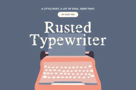
Rusted Typewriter
Rusted Typewriter is a warm, medium-weight serif typewriter font with organic ink-bleed edges that mimic a heavily used cloth ribbon.
Rusted Typewriter is a vintage serif typewriter face with an eroded ink-ribbon surface: even bracketed stems, open counters, a level baseline and edges that look eaten by a worn ribbon so the stroke breaks into patches. The erosion is the design and it silts at small sizes on uncoated stock. It needs roughly 20 mm for the erosion and the serif to read, and it is best in one dense ink on uncoated paper, or a single ink at 70 percent where the patches read as intentional.
Recommended project & layout
True-crime podcast cover, memoir jacket & lyric video — Center title-case headlines at 44–72 pt in off-white over muted slate, charcoal, or kraft paper.
Before you cut or print
Soft ink-eroded outer contours print and sublimate beautifully; on vinyl, cut at 1 in+ so rough edges don't snag.
Best paired with
Get fontPaid link
 #5 · Standout Silhouette
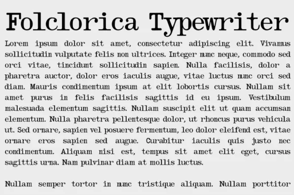
Folclorica Typewriter
Folclorica Typewriter is a true text-ready archival typewriter serif engineered to set full multi-line paragraphs with realistic ribbon wear.
Folclorica Typewriter is a slab serif drawn for body text and textured like an archival typewriter with a faded strike: even slabbed stems, open counters, a level baseline and a surface where the ink coverage varies so some letters print lighter than their neighbours. The faded strike is the design, so a long paragraph reads as a carbon copy, and the texture silts at small sizes. It needs roughly 18 mm for the fade and the slab to read, and it is best in one dense black on uncoated stock, or a single ink at 60 percent where the fade prints as intentional.
Recommended project & layout
Full-page novel letter insert, screenplay prop & poetry page — Set justified body blocks at 10.5–12 pt with 1.40 leading and 1-inch margins on warm ivory paper.
Before you cut or print
Designed specifically for paper printing, book interiors, and digital PDFs—never intended for vinyl cutting.
Best paired with
Get fontPaid link
 #6
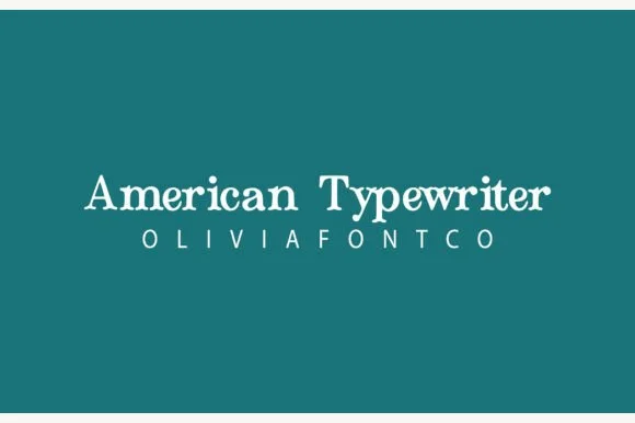
American Typewriter
American Typewriter (by OliviaFontCo) is a soft, hand-drawn rounded slab-serif font with gentle baseline bounce and cozy craft appeal.
American Typewriter is a soft hand-inked rounded slab with plump ball serifs, slightly dancing letter heights and a warm baseline bounce, drawn to read as a friendly typewriter rather than a mechanical one. The slab structure keeps a heading stable, while the bounce and rounded serifs stop it from looking institutional. Because the weight is even and the serifs are blunt, it prints on kraft and label stock without clogging, and it holds at about 11 mm. It is a craft and editorial face, best in mixed case and short phrases.
Recommended project & layout
Kitchen canister vinyl label, recipe card & teacher mug — Set single-line pantry or mug labels in title case at 1–1.5 inches tall above wide-spaced sans sublabels.
Before you cut or print
Zero grunge pits—weeds cleanly on glossy Oracal 651 and matte HTV down to 0.65 inches.
Best paired with
Get fontPaid link
 #7
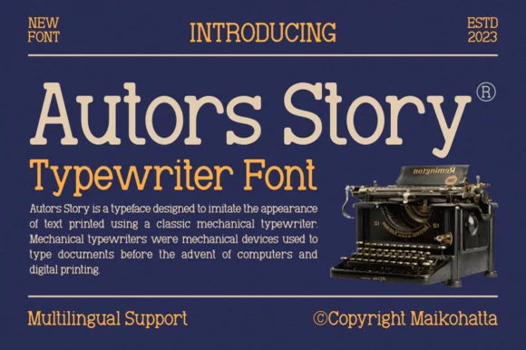
Autors Story
Autors Story is a clean, high-legibility mechanical typewriter serif with generous x-height, curled ball terminals, and multilingual coverage.
Autors Story is a clean mechanical typewriter serif built as a display and a text face: even bracketed stems, open counters, a level baseline and small slabbed feet, with the display size carrying a slightly heavier stroke than the text size. The pair lets a page set its title and body in one voice, and the mechanical regularity is the only texture. The display needs roughly 22 mm and the text runs honestly at 9 pt on uncoated stock, in one dense ink.
Recommended project & layout
Author newsletter header, literary podcast & book-back blurb — Set the main title at 48–68 pt in cream or ochre and run 11 pt flush-left body copy underneath.
Before you cut or print
Clean vector shapes print sharply at 9 pt+ and cut cleanly on 0.85 in+ bookstore window or laptop vinyl.
Best paired with
Get fontPaid link
 #8
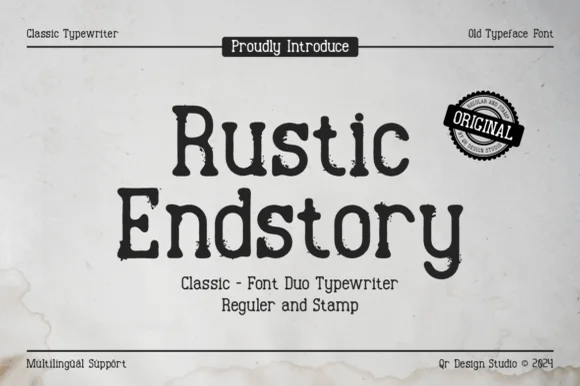
Rustic Endstory
Rustic Endstory is a two-style vintage typewriter family offering both a clean Regular cut and a weathered Stamp cut for flexible craft work.
Rustic Endstory is a two-cut vintage typewriter duo in a regular and a stamp version: even bracketed stems, open counters and a level baseline in the regular, plus a second cut that shows the worn ink and uneven strike of a rubber stamp. The pair lets a page set body text and then stamp a heading in the same voice, and the stamp cut is the weaker element in print. The regular holds at 9 pt and the stamp needs roughly 22 mm for its strike texture to read.
Recommended project & layout
Vinyl jar decal (Regular) + printed kraft hangtag (Stamp) — Stack 2 title-case words centered at 44–68 pt inside ruled archival header/footer frames.
Before you cut or print
Always choose the smooth Regular font file for Cricut vinyl/HTV weeding, and reserve the Stamp file for print or laser work.
Best paired with
Get fontPaid link
 #9
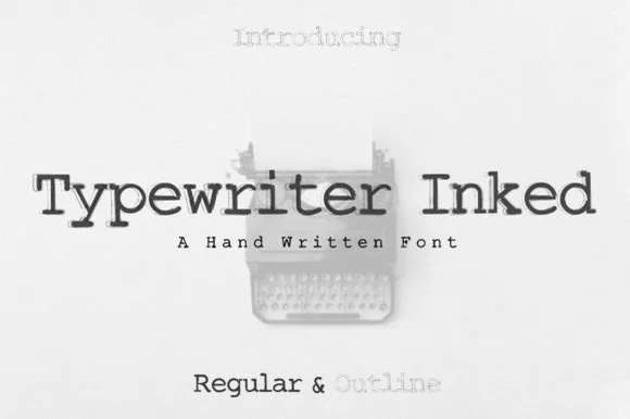
Typewriter
Typewriter (Inked) is a warm, hand-drawn vintage typewriter font family pairing a solid Inked Regular with a matching hollow Outline style!
Typewriter Inked is a hand-inked vintage typewriter slab family with a solid regular and a matching hollow outline, both carrying organic ribbon-ink warmth and rounded monoline slabs, so a word reads as typed on a machine rather than typeset. The outline style lets a designer layer a cut line under the solid, and the even weight keeps it legible at 10 pt. It needs roughly 14 pt for the ink edge to read, and it is best in charcoal on cream or in one ink on kraft.
Recommended project & layout
Poetry chapbook, journaling sticker sheet & bookish mug — Set main quotes in solid Regular (28–56 pt) and chapter numbers or watermarks in the matching Outline style.
Before you cut or print
100% solid, pinhole-free strokes in Regular cut and weed cleanly on Cricut Oracal 651 and HTV down to 0.55 inches!
Best paired with
Get fontPaid link
 #10
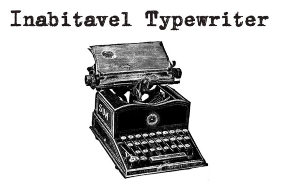
Inabitavek Typewriter
Inabitavek Typewriter ('Inabitavel Typewriter') is an authentic antique mechanical-ribbon font capturing true 1910s cloth-ink strike bleed.
Inabitavek Typewriter reproduces a 1910s mechanical typewriter strike, complete with cloth-ribbon feathering at the edges of each character, uneven ink density and tiny misalignments on the baseline. Because the irregularity is baked into every glyph, a page reads as a typed document rather than text with a texture applied. The weight is heavier than a modern typewriter revival, which helps at 10 to 12 pt and lets the face carry caption-length text on a prop. It is a period face, most convincing on off-white or buff paper, and it should never be set with justification.
Recommended project & layout
True-crime / mystery dossier prop, zine & archival film card — Set mixed-case lines at 18–48 pt left-aligned on aged manila, cream cotton, or newsprint stock.
Before you cut or print
Feathered cloth-ribbon edges are crafted for flat print, murder-mystery game props, DTF, and book design—not vinyl blade cutting.
Best paired with
Get fontPaid link
 #11
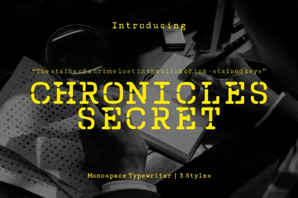
Chronicles Secret
Chronicles Secret is a 3-style monospaced crime-thriller typewriter family fractured with authentic hammer-miss stencil breaks and ink grain.
Chronicles Secret is a three-style stencil-broken monospace typewriter: even monospaced letters with a fine bridge cutting every closed counter, a slightly inked contour and a second cut that widens the breaks and a third that adds a stamp texture. The breaks are structural, so they must stay wide enough to read, and the monospace keeps a word level. It needs roughly 24 mm for the bridge and the contour to read, and it is best in one dense black on a buff sheet, or a single stamp-pad colour on copy paper where the breaks stay open.
Recommended project & layout
True-crime YouTube thumbnail, mystery podcast & thriller cover — Set all-caps titles at +25 tracking in bright crime-scene yellow or chalk white over dark shadowed photography.
Before you cut or print
Broken stroke segments and ink grain are designed for digital thumbnails, video titles, and print—not small vinyl weeding.
Best paired with
Get fontPaid link
 #12
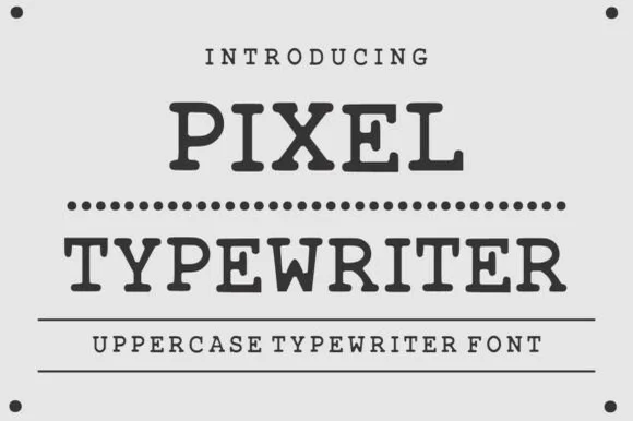
Pixel Typewriter
Pixel Typewriter is actually a classic vintage mechanical typewriter slab serif (not a blocky 8-bit pixel font) with warm ink-ribbon edges!
Pixel Typewriter is a vintage mechanical typewriter slab in caps, with wide square serifs, blunted ink edges and slightly uneven inking along each stroke, so a word reads as struck through a ribbon rather than set digitally. The uneven edge is the character, which means the face looks right at text sizes and weak when enlarged past a headline. It needs roughly 14 pt for the ink edge to read as ribbon, and it is best in charcoal on off-white index stock or in one ink on a coloured card.
Recommended project & layout
True-crime dossier header, poetry chapbook & library card — Set uppercase headers at 28–60 pt separated by dotted leader lines ('••••••••••••') and crisp horizontal rules.
Before you cut or print
Clean, solid, non-pixelated slab shapes cut cleanly on 0.9 in+ vinyl and print sharply down to 12 pt!
Best paired with
Get fontPaid link
 #13
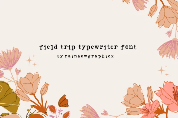
Field Trip Typewriter
Field Trip Typewriter is a charming, slightly bouncy vintage typewriter serif mimicking sticky-key mechanical charm on nature notes and scrapbooks.
A playful typewriter serif framed by autumn botanical blooms on cream: compact rounded lowercase with plump ball terminals and an uneven baseline, so the line reads as a page typed on a machine with a sticky key rather than as a neo-grotesque with a texture. The bounce is gentle and repeatable, which is what keeps a paragraph readable, and the ball terminals give the strokes their soft finish. No glyphs touch, so nothing needs welding. The botanical frame is staging and names the seasonal register. Uses are journals, classroom labels, pantry jars and storybook headings where warmth matters more than polish.
Recommended project & layout
Nature-walk field journal, classroom label & teacher tote — Set lowercase headers at 32–64 pt with +10 tracking on cream or kraft cardstock.
Before you cut or print
Clean, solid rounded strokes (zero interior dust holes!) cut smoothly on Cricut vinyl, HTV, and sticker labels down to 0.6 in!
Best paired with
Get fontPaid link
 #14
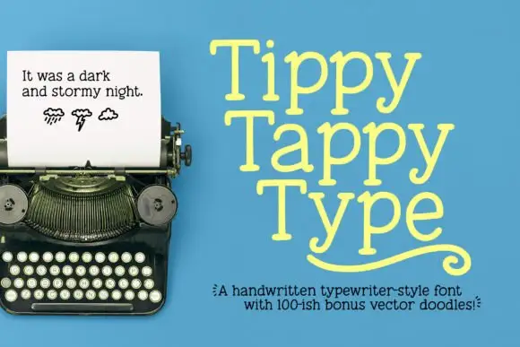
Tippy Tappy Type
Tippy Tappy Type shows yellow mixed-case lettering on blue in three stacked rows, where broad round bowls and uneven little feet give the line a handwritten rhythm and the final row carries a long curled underline-like flourish beneath it.
The strokes stay slab-ended, the bowls stay round, the feet wobble from letter to letter and the baseline drifts slightly. That wobble is the character: the sample reads as typing rather than typesetting, which is why the three rows stack tightly. The typewriter photograph, the weather doodles and the bonus-vector caption belong to the cover, and neither monospacing nor a doodle count is shown. Keep 30 pt so the feet stay distinct, check that your file has the flourish and set the rows tight only on a plain ground.
Recommended project & layout
A playful writing journal cover — Place Tiny Tales near the top of a pale-blue cover, with a plain author line at the bottom and no flourish until its source is checked.
Before you cut or print
Verify the lowercase y and any alternate or underline mechanism in the actual files.
Best paired with
Get fontPaid link
Practical buyer checklist
Frequently asked questions.
Key cutting, printing and pairing answers before choosing a typewriter, stamp & junk journal typeface.
Are typewriter fonts monospaced?
Historical typewriter faces are monospaced, with every character occupying the same width. Many modern fonts imitate the look without the metrics. If you need columns to align in a table, check that the numerals and letters share a width.
Can typewriter fonts be cut from vinyl?
Clean-edged versions cut well at 1 inch or more. Ink-speckled ribbon textures should not be cut, because the specks become loose pieces. Use them for print, and keep cutting for the clean slab variants.
What size should junk-journal ephemera text be?
Between 8 and 11 pt, which is where typewriter faces look most authentic. Below 8 pt the ink texture disappears on matte paper, and above 14 pt the irregularity starts to look like a mistake.
Do these fonts include the punctuation of old typewriters?
Usually yes, including the straight quotes and the underscore that define the look. Curly quotes and proper em dashes are often absent, so set them deliberately or convert to straight marks rather than letting software substitute them.
Keep exploring
Related collections & guides.
Explore adjacent maker roundups or check our practical pre-production checklists.
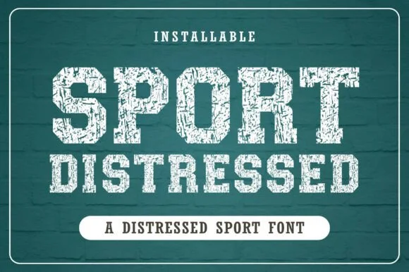
01 / Type Styles
Distressed stamp & vintage press
20 curated fonts · Previews & pairings
02 / Branding & Print
Soy candles, apothecary & skincare
29 curated fonts · Previews & pairings
03 / Branding & Print
Digital planner & GoodNotes
19 curated fonts · Previews & pairings



04 / Branding & Print
Editorial & posters
37 curated fonts · Previews & pairings
Guides: Invitation font checklist · Vinyl & cutting checklist · How to pair script & sans fonts