High-Contrast Display Serif

Dawner + Auretha
Pairs sculptural editorial warmth with Dawner's clean modern geometry.
Inspect Auretha specimenDisclosure: MakerFileHub may earn a commission from qualifying purchases via paid links on this page. How our links work.
Very wide light capitals with a crossed W and flattened rounded bowls
Dawner sets its capitals very wide and very light, spaced far apart across a warm brown photograph, so a single word reads as a line of quiet marks rather than as a sign.
Paid link
Get this fontProject & layout blueprintsAt-a-glance maker compatibility
Sturdy stroke walls and open counters weed cleanly on adhesive vinyl, HTV apparel film, and cut cardstock.
Visual anatomy & craft review
D A W N E R stretches the full width of the frame in a sans whose strokes stay thin and even, the bowls wide and the joins squared, with tracking so generous that the letters hardly touch. Above the word, a small monogram badge sits between the labels regular and oblique; below it, tracked capitals describe a luxury wide sans and name the foundry. Nothing else shares the page, and that is the design: the tracking and the light weight keep the composition from feeling heavy even though the word is large. On a dark or mid-tone ground the thin strokes lose contrast first, which is the practical limit of this style.
Very wide light capitals with a crossed W and flattened rounded bowls
Two-font hierarchy recipes
Tested contrast partners — pairing Dawner with grounded secondary typography.
Dawner + Auretha
Pairs sculptural editorial warmth with Dawner's clean modern geometry.
Inspect Auretha specimen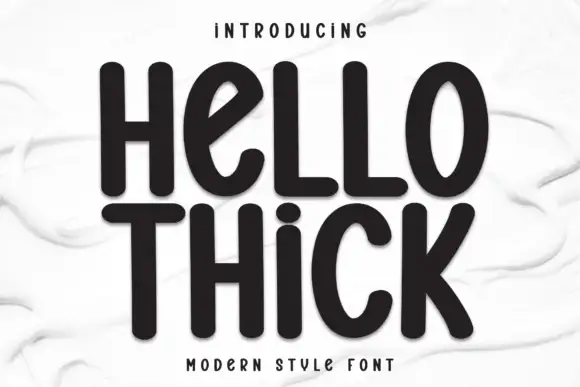
Dawner + Hello Thick
Introduces organic movement on pull-quotes, signatures and gift tags.
Inspect Hello Thick specimenPractical applications
Concrete hierarchy, scale and production guidance tailored to Dawner’s stroke geometry.
The wide light capitals read as understated luxury on a small printed card, and the tracking gives a short name an airy, considered feel.
Hierarchy & layout recipe
Print a 60 by 90 mm card: set the studio name at 13 pt with 3 mm of extra tracking, keep 8 mm of clear ground beneath before the address at 6 pt, and keep 7 mm of margin from the card edge.
Pre-production check
Thin strokes fade at 12 pt in offset; check the printed card before ordering a full box of printed cards.
The wide tracking fills a masthead width without a heavy weight, and a light cover line keeps the photography in charge of the page.
Hierarchy & layout recipe
Print a 230 by 300 mm cover: set the masthead at 72 pt with 6 mm of tracking, keep 24 mm of clear ground beneath before the issue line at 10 pt, and keep 20 mm of margin from the trim.
Pre-production check
Light type over photography needs a scrim; check the cover proof before it is signed off by the client.
The spaced capitals give a modern wedding a formal line with no calligraphy, and the light weight keeps a large heading from shouting.
Hierarchy & layout recipe
Print a 148 by 210 mm invitation: set the names at 20 pt with 2 mm of tracking, keep 18 mm of clear ground beneath before the venue at 9 pt, and keep 16 mm of margin on both sides of the card.
Pre-production check
Hairlines drop out on textured stock; check a printed sample on the actual invitation card.
Technical & licence verification
Confirm included OTF/TTF/WOFF formats, full glyph tables and licence coverage on the live store page before batch production.
Closest visual alternatives
Matched across letterform anatomy, stroke behaviour and craft applications.
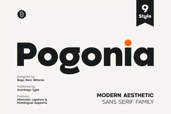
Modern heavy geometric sans
Pogonia is a modern geometric sans in near-black on off-white: heavy even strokes, circular counters, a raised dot on the i, and a set of ligatures, presented with a small badge, a ribbon label and two blocks of technical notes, so the plate reads as a contemporary type release.
Ideas for this font
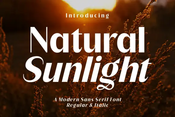
Contrast sans pair with curling italic
Natural Sunlight is a contrast sans shown in two words over a sunlit field: an upright word with high contrast and fine joins, and beneath it a slanted word whose final letter ends in a long curling tail, with a small line above and a plain line beneath that names the styles.
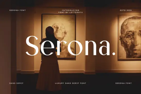
Light contrast sans
Serona is a light contrast sans in white over a warm gallery interior: mixed case with barely visible stroke modulation, broad rounded bowls, a large x-height and a plain period at the end, with four small tracked notes in the corners and a line beneath.
Ideas for this font
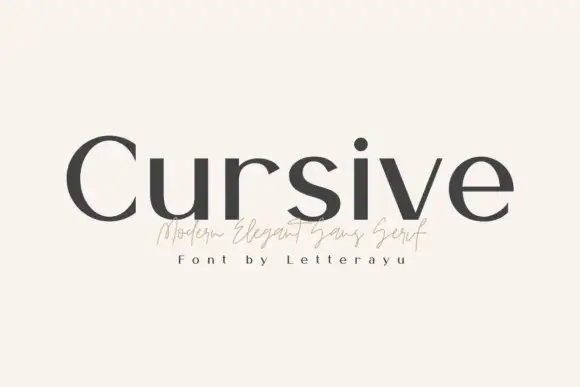
Upright contrast mixed case with a broad C and clean unconnected lowercase
Cursive sets a modern serif in lowercase, with low contrast, short thin serifs and a slightly wide e, and pairs it with a small signature script line under the word.
Ideas for this font
Same independent foundry
Allow optional Google Analytics to measure visits and catalogue actions. Your search words and notes are not included. Privacy & storage