Neutral Sans Workhorse

Snaxons + Swaraga
Lets Snaxons own the focal silhouette while handling secondary copy, sizing and subheads cleanly.
Inspect Swaraga specimenDisclosure: MakerFileHub may earn a commission from qualifying purchases via paid links on this page. How our links work.
Graffiti tag logo display
Snaxons is a graffiti tag in white on black: letters written as one continuous dripping line, a crown drawn above the word, and a heavy baseline shadow that turns the tag into a logo rather than a scrawl.
Paid link
Get this fontProject & layout blueprintsAt-a-glance maker compatibility
Sturdy stroke walls and open counters weed cleanly on adhesive vinyl, HTV apparel film, and cut cardstock.
Visual anatomy & craft review
The word is written as street artists write: the letters connect through loops that lift and fall, the stems run long and the drips hang below the baseline, and the whole tag ends with a horizontal stroke that runs under the word and out to the right. The line weight varies from heavy at the base to thin where the spray lifted, which is what makes it read as a marker rather than a typeface. A crown sits above the middle of the word, and two small colour labels sit at the corners, so the specimen reads as a photograph of a wall rather than a type sample. The ground is a black cement texture, and the white tag is the only bright element, which is exactly how the face would be used on a garment or a poster.
Graffiti, flowing, street, dripping
Two-font hierarchy recipes
Tested contrast partners — pairing Snaxons with grounded secondary typography.
Snaxons + Swaraga
Lets Snaxons own the focal silhouette while handling secondary copy, sizing and subheads cleanly.
Inspect Swaraga specimen
Snaxons + Cervelique
Grounds bold display lettering with classic typographic authority on posters, badges and apparel.
Inspect Cervelique specimenPractical applications
Concrete hierarchy, scale and production guidance tailored to Snaxons’s stroke geometry.
A tag reads as authenticity in streetwear, and a single-colour white marque holds on a dark garment where a detailed logo would break apart.
Hierarchy & layout recipe
Print a 280 mm chest graphic: the tag at 200 mm wide in one ink on a black shirt, the label name in a 5 mm condensed sans in the lower corner, and no keyline. Keep the drips at least 1.5 mm wide so the screen holds them.
Pre-production check
Check the screen at actual mesh, where a thin drip under 1 mm clogs; thicken the drips for print. Wash-test one shirt and confirm the tag still reads as one connected line rather than as separate letters.
A tag gives a street festival poster the credibility of the culture it is advertising, and the white on black reads at distance where a photographic poster would not.
Hierarchy & layout recipe
A2 portrait: the tag at 260 mm wide, the line-up in a 14 mm condensed sans, and the date at 30 mm. Keep 30 mm margins so the drips have space, and print white on a black ground with a matte finish.
Pre-production check
Check the tag at four metres, where the connected line can read as a smear; keep the letter joins distinct. Confirm the 14 mm line-up reads at two metres and that the drips never reach the frame.
A tag cover signals the subject immediately and can be printed as a single screen on a paperback, which keeps the cover budget low.
Hierarchy & layout recipe
Set the tag at 200 mm wide on a 240 mm cover, the subtitle in a 9 pt sans beneath, and the author in 8 pt caps at the foot. Keep the tag on a flat ground and print white on black stock.
Pre-production check
Check the tag at thumbnail size, where the dripping line can become a blur; keep the subtitle legible so the book is identifiable online. Confirm the 8 pt author survives the matte lamination and that the tag clears the trim.
Technical & licence verification
Confirm included OTF/TTF/WOFF formats, full glyph tables and licence coverage on the live store page before batch production.
Closest visual alternatives
Matched across letterform anatomy, stroke behaviour and craft applications.
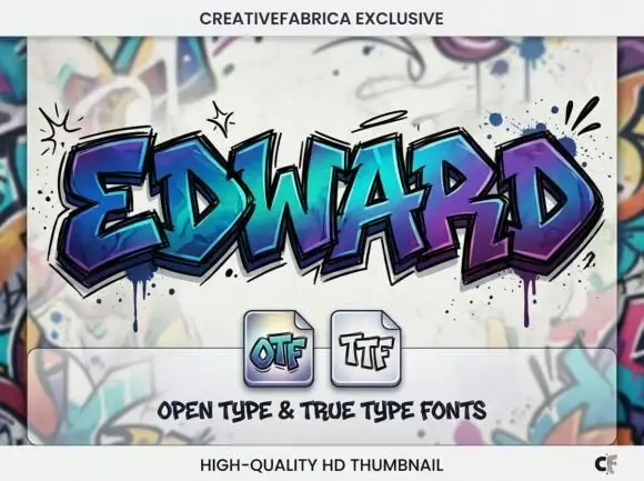
Angular graffiti capitals with overlapping facets and a dripped edge
Edward is an angular graffiti display alphabet in capitals only, built from overlapping faceted strokes in two colours, with short drips running off the lower edges and a hard shadow behind each letter.
Ideas for this font
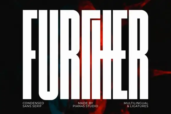
Extremely tall block capitals with narrow slots and a shared middle cross-stroke
Further shows white capitals filling most of a dark portrait cover, where extremely tall heavy stems leave narrow vertical slot counters, the U rounds only at its base and a long middle cross-stroke connects the central letters into a dense architectural arrangement.
Ideas for this font
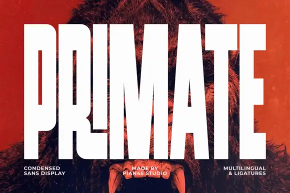
Ultra condensed display sans
Primate is an ultra condensed sans display in white on a red-tinted portrait: very tall narrow caps with flat terminals, a high waist and thin counters, set edge to edge so the letters nearly touch, with three small tracked labels along the foot.
Ideas for this font
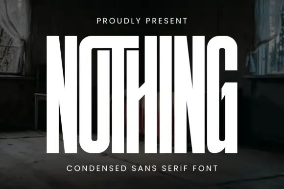
Very tall condensed display
Nothing is an extremely tall condensed display in white on a dark, peeling interior: narrow capitals whose tops join a shared bar, with a central diagonal joint across the middle of the word, flat terminals and hairline counters, and tracked caps above and beneath that name the style.
Ideas for this font
Same independent foundry
Allow optional Google Analytics to measure visits and catalogue actions. Your search words and notes are not included. Privacy & storage