Neutral Sans Workhorse

Ark Raised + Corven
Lets Ark Raised own the focal silhouette while handling secondary copy, sizing and subheads cleanly.
Inspect Corven specimenDisclosure: MakerFileHub may earn a commission from qualifying purchases via paid links on this page. How our links work.
Tall fantasy capitals with inward curls and long hooked feet
Ark Raised shows white narrow capitals in two rows over a dark blue architectural scene, where large curling A and R entries flank the title, hooked feet and rounded inward terminals interrupt the tall upright stems and star marks plus arrow-like rules sit beneath.
Paid link
Get this fontProject & layout blueprintsAt-a-glance maker compatibility
Sturdy stroke walls and open counters weed cleanly on adhesive vinyl, HTV apparel film, and cut cardstock.
Visual anatomy & craft review
The stems stay narrow and tall, the entries curl far to the left, the feet hook and the terminals round inward at several points. That flanking curl is the character: the title is wider than its letters because of the entries, which is why the cover leaves dark space on both sides. The scene, the stars and the arrow rules are artwork. Keep 48 pt so the curls stay open, allow 30 mm at each flank and check the hooked feet against the trim before printing.
Tall fantasy capitals with inward curls and long hooked feet
Two-font hierarchy recipes
Tested contrast partners — pairing Ark Raised with grounded secondary typography.
Ark Raised + Corven
Lets Ark Raised own the focal silhouette while handling secondary copy, sizing and subheads cleanly.
Inspect Corven specimen
Ark Raised + Papillon Serif – Elegant Modern Luxury
Grounds bold display lettering with classic typographic authority on posters, badges and apparel.
Inspect Papillon Serif – Elegant Modern Luxury specimenPractical applications
Concrete hierarchy, scale and production guidance tailored to Ark Raised’s stroke geometry.
The Victorian capitals set a jacket with period weight, and the flanking entries give the title a frame without a printed border.
Hierarchy & layout recipe
Print a 129 by 198 mm jacket: set the title at 52 pt across two rows, allow 26 mm at each flank for the entries, keep 22 mm of clear ground beneath, and keep 20 mm of margin.
Pre-production check
The flanking entries run into the trim on a narrow jacket; check the layout at final size first.
The ornamental capitals suit a themed masquerade, and the arrows and stars can become printed rules placed beside the title.
Hierarchy & layout recipe
Print a 500 by 300 mm board: set the title at 60 mm across two rows, allow 30 mm at each flank, keep 28 mm of clear ground beneath before the time at 15 pt, and keep 28 mm of border.
Pre-production check
Thin hooks blur when painted by hand; check the mask artwork and keep the stems above 6 mm.
The period display gives an antique dealer's label heritage, and the flanking curls supply the ornament at only 60 mm width.
Hierarchy & layout recipe
Print a 60 by 90 mm label: set the dealer name at 18 pt across two rows, allow 10 mm at each flank, keep 8 mm of clear ground beneath, and keep 6 mm to the die edge.
Pre-production check
Hooked feet close up under 16 pt; check the plate proof and hold the name at 18 pt or above.
Technical & licence verification
Confirm included OTF/TTF/WOFF formats, full glyph tables and licence coverage on the live store page before batch production.
Closest visual alternatives
Matched across letterform anatomy, stroke behaviour and craft applications.
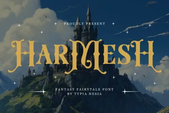
Angular fantasy capitals with hooked tops and curling feet
Harmesh shows gold-coloured capitals over a castle landscape, where tall stems end in pointed hooks and large curling feet, and the heavy H and M shapes use angular inner joins with broad triangular endings while small stars sit around the title.
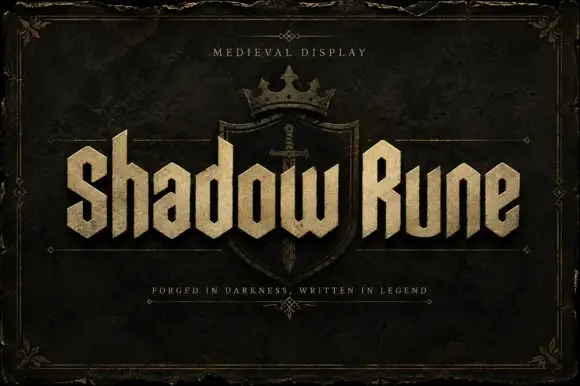
Squared narrow blackletter
Shadow Rune is a squared narrow blackletter in bone on a dark stone ground: capitals with diagonal shoulders, a clipped S, blunt stems and a small scale texture, set as two words across a shield device with a small tracked line above and a plain line beneath.
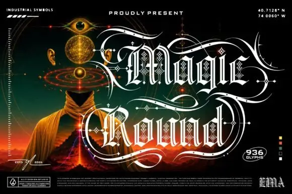
Outlined ornamental blackletter
Magic Round is an outlined ornamental blackletter in white on a dark illustrated scene: letters traced with a double line and filled with a diamond lattice, with huge swashes that sweep beneath and between the words, set in two lines above a landscape of a hooded figure, an eye and a volcano, with small technical marks at the corners.
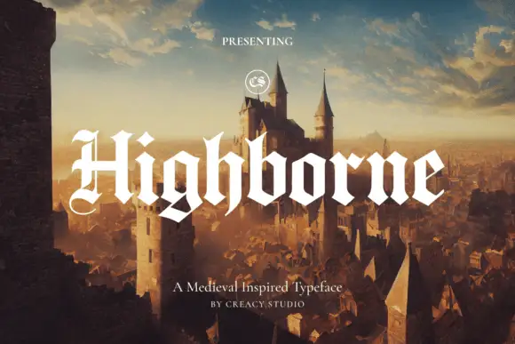
Solid blackletter with divided H and pointed angular shoulders
Highborne sets a solid blackletter across a painted castle town, its strokes rising into sharp peaks, the shoulders angled into points and the first capital divided down the middle.
Same independent foundry
Allow optional Google Analytics to measure visits and catalogue actions. Your search words and notes are not included. Privacy & storage