Modern Grotesque Body

Muntave + Cultivo
Creates crisp high-hierarchy contrast beneath Muntave headlines across menus, websites and labels.
Inspect Cultivo specimenDisclosure: MakerFileHub may earn a commission from qualifying purchases via paid links on this page. How our links work.
Pixelated oblique serif in solid and outline
Muntave is a pixelated oblique serif in white on a magenta gradient: letters stepped along a slanting grid with hollow serifs, shown twice, once solid and once as an outline, with small yellow labels naming each version.
Paid link
Get this fontProject & layout blueprintsAt-a-glance maker compatibility
Cut solid base, outline, and shadow layers in separate vinyl colors and align on registration marks.
Visual anatomy & craft review
The sheet shows one word twice, and the difference is the whole point: the first line is the solid cut, filled white and stepped along a slant, while the second is the same letterforms drawn as outlines with the interior left empty, so the word reads as a contour. The letterforms are serifs converted to a coarse grid, which means the curves of an o or a c arrive as short staircases, the serifs become small blocks of two or three pixels, and the slant carries through the grid so the steps lean with the letters. At this size the grid is readable as such, and that is what the face is for: it looks like type rendered on old hardware rather than type styled to look old. Small yellow labels mark the two versions, and a footer in a plain sans lists the specs, the language support and the studio. Muntave is a display face for posters, album art, event graphics and editorial covers with a technical mood.
Pixelated, oblique, technical
Two-font hierarchy recipes
Tested contrast partners — pairing Muntave with grounded secondary typography.
Muntave + Cultivo
Creates crisp high-hierarchy contrast beneath Muntave headlines across menus, websites and labels.
Inspect Cultivo specimen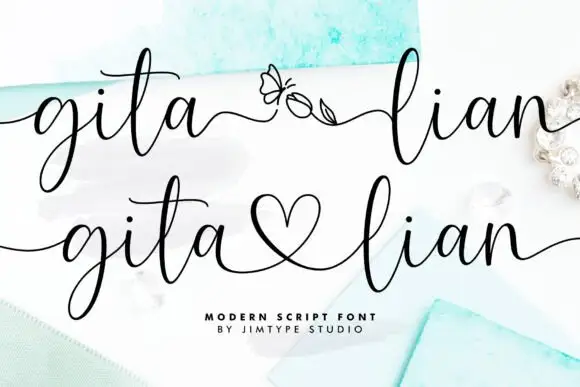
Muntave + Gita Lian
Adds a warm human signature touch for 1-to-3-word callouts without competing against structured serif capitals.
Inspect Gita Lian specimenPractical applications
Concrete hierarchy, scale and production guidance tailored to Muntave’s stroke geometry.
A pixelated serif gives a release the look of a screen rather than a page, and the outline cut lets a cover carry a second line without a second face.
Hierarchy & layout recipe
Print a 300 mm sleeve: set the title at 90 pt on one line, keep 24 mm of clear ground beneath before the catalogue line at 11 pt, and hold 20 mm of margin on all four sides.
Pre-production check
A stepped grid can break when scaled outside whole pixels; keep the size a multiple of the grid and proof the sleeve first.
A pixelated serif reads as technical without the usual geometric sans, and the two cuts give a studio a mark and a secondary line from one purchase.
Hierarchy & layout recipe
Print a 60 by 40 mm label: set the name at 14 pt on one line, keep 4 mm of clear ground beneath before the discipline at 4.5 pt, and hold 3.5 mm of margin on all four sides.
Pre-production check
Small pixel steps can vanish at fourteen points; print one label on the real stock and check the serifs.
A pixelated face holds its detail on a large sheet, and the magenta ground makes the white letters carry at a distance where a thin face would not.
Hierarchy & layout recipe
Print a 420 by 594 mm poster: set the stage name at 130 pt on one line, keep 36 mm of clear ground beneath before the times at 22 pt, and hold 26 mm of margin on all four sides.
Pre-production check
A bright gradient behind white type can shift on press; proof one sheet and compare the gradient before the run.
Technical & licence verification
Confirm included OTF/TTF/WOFF formats, full glyph tables and licence coverage on the live store page before batch production.
Closest visual alternatives
Matched across letterform anatomy, stroke behaviour and craft applications.
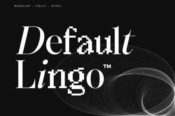
Hybrid serif family mixing smooth, italic and pixel-glitch cuts
Default Lingo is an experimental serif family in which a smooth regular, an italic and a pixel cut share one set of proportions, so a designer can glitch a letter or two inside a word and keep the baseline steady.
Ideas for this font

Crisp contemporary editorial serif duo (Regular + Italic, OTF/TTF/WOFF)
Svara is a sharp modern editorial serif family pairing an upright Regular with a lively true Italic across OTF, TTF & WOFF formats!
Ideas for this font
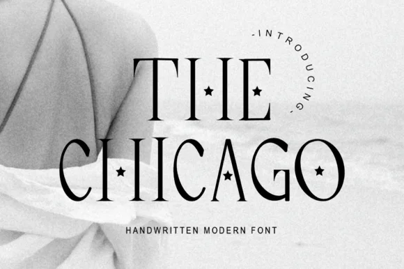
Tall thin display serif with star-cut counters
The Chicago is a tall display serif in which the stems stretch upward, the hairlines stay fine and a small star is punched into several counters, so a two-word title reads as a decorated magazine masthead.
Ideas for this font
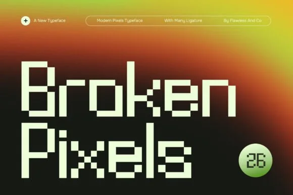
Architectural geometric pixel display with ligatures
Broken Pixels is a refined modern bitmap display font combining crisp architectural stems, stepped pixel curves, and smart ligatures.
Ideas for this font
Same independent foundry
Allow optional Google Analytics to measure visits and catalogue actions. Your search words and notes are not included. Privacy & storage